old is the wosrt new is the best
15 Logos of Famous Brands That Have Changed Over the Past 50 Years
BBC’s logo costs a whopping $1.8 billion. So it’s no surprise that the stakes are high when a company decides to change its logo. And it’s not just a financial risk since the brand can lose its identity if the logo isn’t done well. Fortunately, some companies we know took a chance and, over time, gave their logos a more modern look.
Bright Side is now showing you what brands’ logos looked like before you knew them. Be sure to stick around for the bonus at the end of the article.
1. Twitter
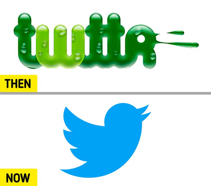
Twitter’s iconic bird logo as you know it had its debut in 2012 after a series of redesigns. “Larry the Bird,” as it’s endearingly called, originally dates back to some clip art created by a British graphic designer, Simon Oxley.
2. Apple
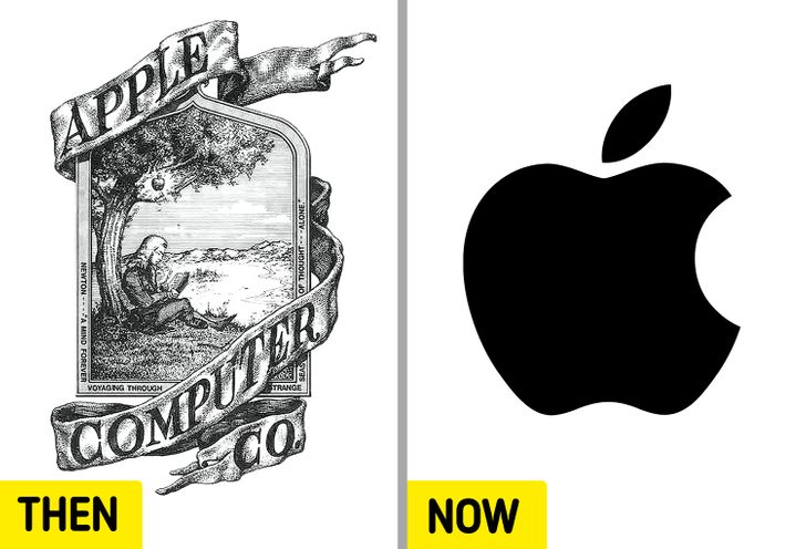
Apple’s first logo, featuring Sir Isaac Newton, was short-lived. The design by Ron Wayne was replaced with the “apple” we recognize today only a year after its first appearance. The “apple” had several color changes before settling on black.
3. Canon
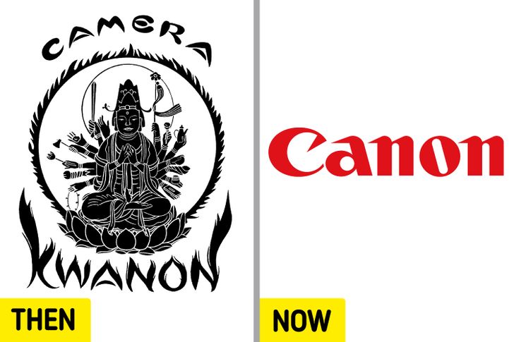
Canon’s original logo, from 1934, depicts a Bodhisattva Kwanon and a different spelling of the brand’s name. “Kwanon” was how the prototype for Japan’s first-ever 35 mm camera with a focal-plane-based shutter was named. In 1956, the company settled for its current red logo.
4. Amazon
The company founded by Jeff Bezos simplified its logo with each change that was made. In its debut, the website’s domain was featured alongside a triangle with a defined path, easily read as a capital “A.” In 2000, the “.com” was dropped, and an arrow that goes from “A” to “Z” clearly identified the brand’s line of business.
5. Nintendo
From 1889 to 1950, Nintendo’s logo was written in the language of the company’s place of birth, Japan. The following logos adopted a western spelling of the company’s name until 2016 when the public was introduced to its current version.
6. Ford
Since its first logo, which had its debut in 1903, the car manufacturer, Ford, went through 10 other logos before reaching the modern blue Ford nameplate design.
7. Burger King
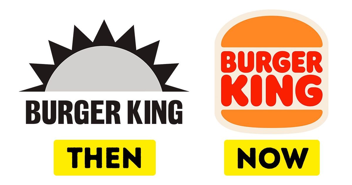
The American multinational chain of fast-food restaurants started out as “Insta-Burger King” in 1953, with a colorless rising sun logo. Since being purchased and renamed “Burger King,” the company has been choosing more colorful designs. The current version of the brand’s logo has been used since December 21, 2020.
8. Adidas
Adidas’ signature 3-stripe design came to be after the company purchased it from a Finnish athletic footwear brand, Karhu Sports, which had used it in their products during 1952’s Summer Olympics. Years later, in 1990, the company, which was started by Adolf Dassler, introduced the 3-bar logo designed by the Creative Director, Peter Moore.
9. Ikea
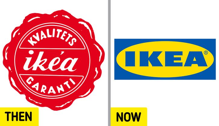
IKEA has long dropped the red and white in its original logo for the yellow and blue, the colors of the Swedish flag, the country of origin of the world’s largest furniture retailer.
10. McDonald’s
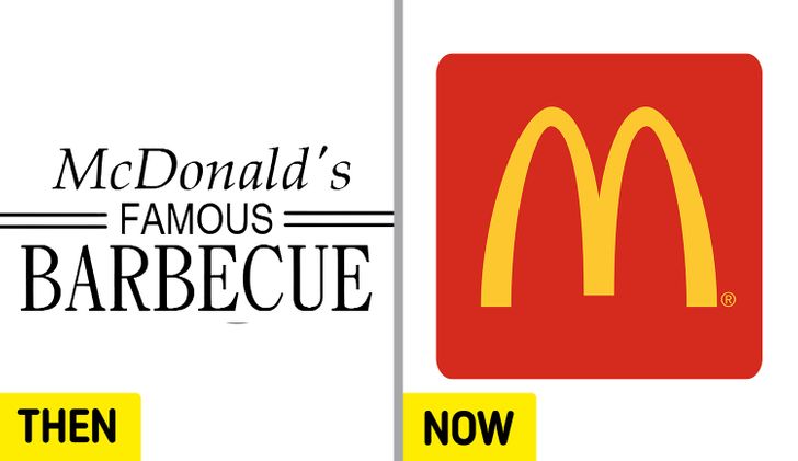
One of the most recognizable logos in the world, the McDonald’s “golden arches” were added to the chain’s logo in 1962. They are a great contrast to the company’s text-based black and white logo that made its debut in 1940.
11. Pepsi
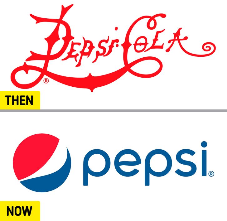
The drink we now know as Pepsi was first called “Brad’s Drink” and was then renamed “Pepsi-Cola” in 1898. It was that same year that the stylized red word logo premiered, lasting until 1905. The name changed again in 1961 after it was shortened to “Pepsi,” as is seen in the present logo.
12. Adobe Inc.
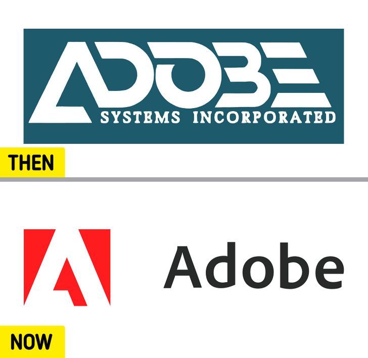
Adobe Inc.’s current logo has existed since May 2020. The stylized “A” was designed by Marva Warnock, a graphic designer who is married to one of the company’s founders, John Warnock.
13. Lay’s
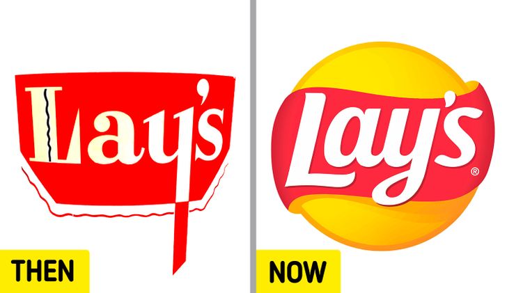
Introduced to the world in 1940, the Lay’s logo changed from a red cauldron to a modern red ribbon around a yellow sun.
14. Microsoft
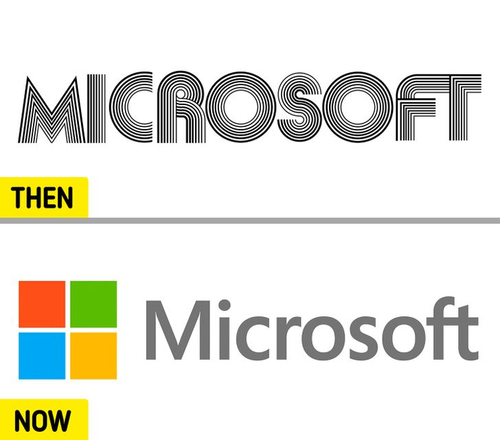
Microsoft’s first logo lasted for 5 years, from 1975 to 1980. Its fifth and present version, born in 2012, introduced 4 colors, which represent the company’s 4 major products: Windows (blue), Office (red), Excel (green), and Bing (yellow).
15. Starbucks
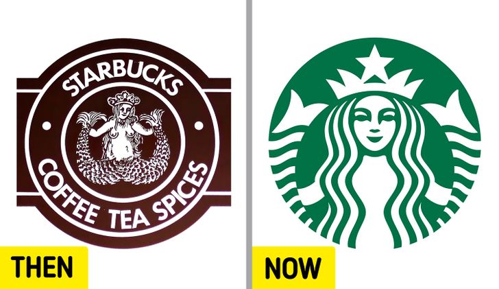
Valerie O’Neil, a Starbucks spokeswoman, explained in 2006 that the image in the logo is that of a “twin-tailed mermaid or siren, as she’s known in Greek mythology.” Since its original version in 1971, the logo’s image has been edited 3 times. The last and present one removed the wordmark and gave the siren the spotlight.
Bonus: BBC
BBC’s present logo is the fifth version of the 3-box design. The first was used from 1958 until 1963. As previously mentioned, BBC’s logo redesign was a pricey one. But without changing what the public recognizes the most about it, the UK national broadcaster was still able to modernize its image.
What logo do you think went through the biggest changes? Do you remember any logo changes that weren’t featured here? Let’s chat in the comments, it’s always a good time!
Comments
awesome thanks. i didn't Know BBC logo cost 1. something billion
Related Reads
I Paid Half the Mortgage for Years—Then I Refused to Be Used Anymore
15 Acts of Kindness That Prove Quiet Empathy Is the Only Real Superpower
10 Moments When Quiet Kindness Rewrote a Painful Story
15 Stories That Prove Meeting the Parents Is Funnier Than a Comedy Movie

12 Life Moments That Prove Kindness Costs Little but Leaves a Big Mark
14 Times Quiet Kindness Turned Someone’s Worst Day Around
I Refuse to Earn Less Just Because I’m Getting Older
My Sister Ruined My Child-Free Wedding—So I Served Her Cold Revenge
14 Stories That Prove Relationships Can Take the Wildest Turns
My MIL From Hell Said I Wasn’t “Family”, So I Made Her Regret It
15 Moments That Prove Kindness Is What the World Runs On
11 Moments That Prove Kindness Still Exists, Even When Our World Feels Dark
