15 Design Fails We Wouldn’t Even Try to Use
Design
4 years ago
One of the main rules of design is easy exercisability and user-friendliness. However, there seem to be designers that do not abide by common rules and have ideas of their own. Ideas like, “How can I make this absolutely impossible to use?”
Today at Bright Side, we are going to present you with 15 design fails that will stun you with their impracticality and sheer dose of absurdity.
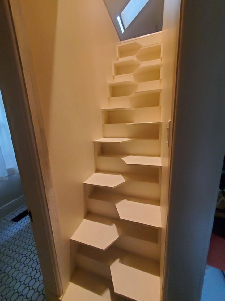
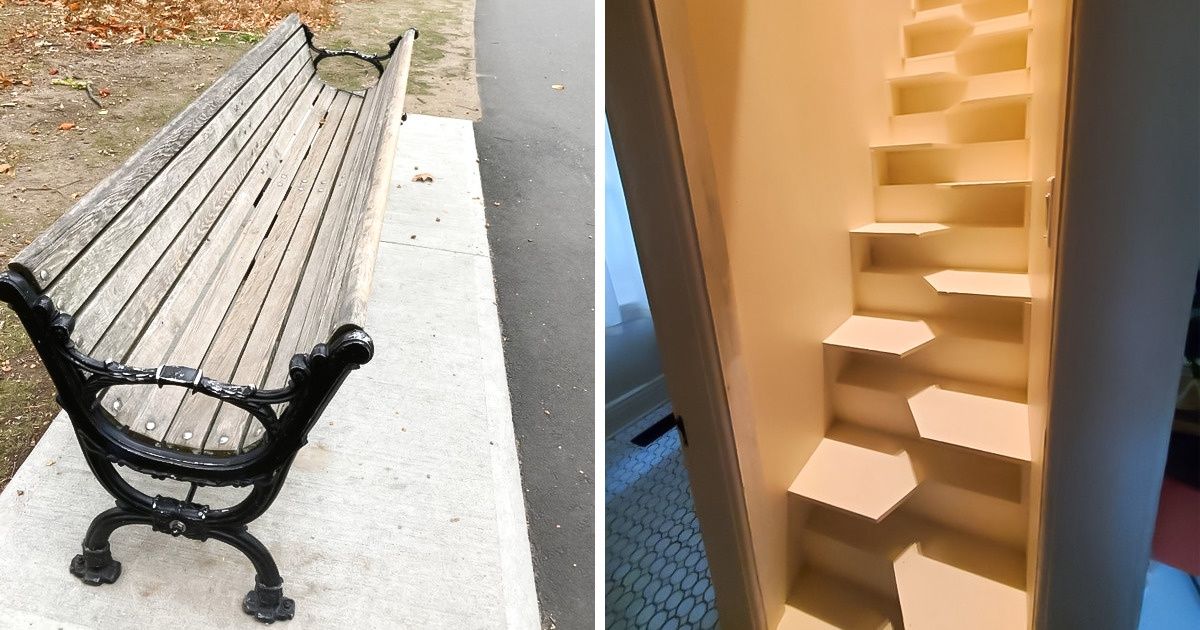
1. “Fish scale stairs at my grandma’s”
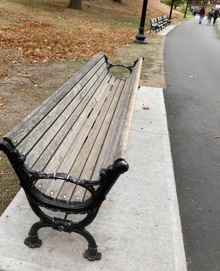
2. “This bench with 2 backs and no seat that I saw on a walk”
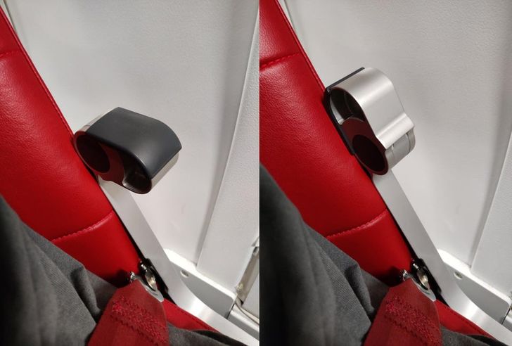
3. “The tiny armrest I had on my flight”
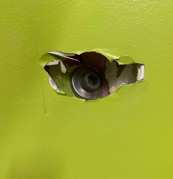
4. “This doorstop was unable to do the one thing it was designed to do.”
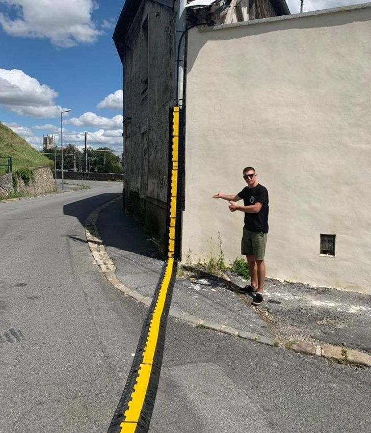
5. “For the wall traffic indeed”
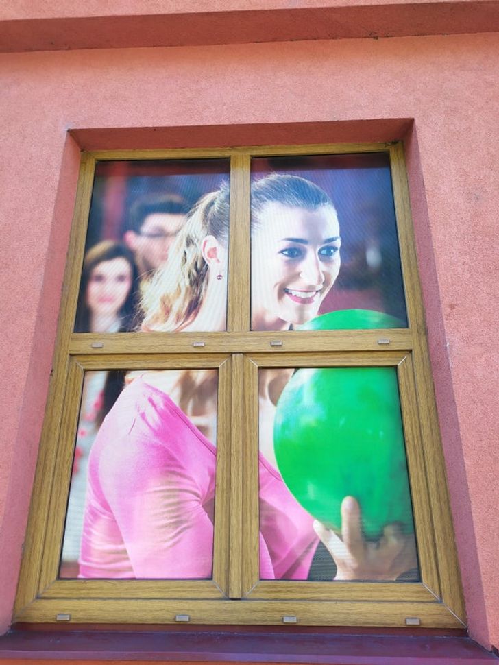
6. We feel like something’s a bit off...
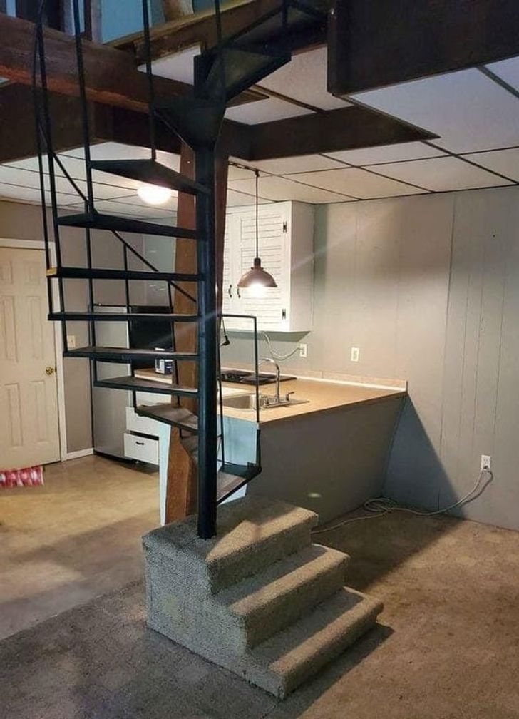
7. “Stairs to more stairs”
8. “The Australian Fanta can”
9. We are big fans of this design.
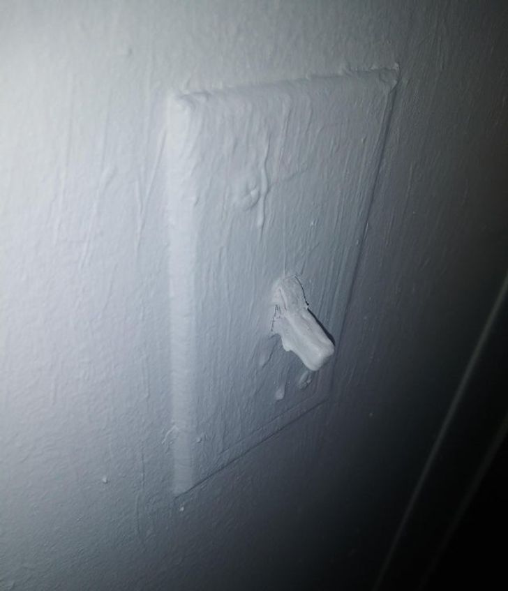
10. “In the house I’m moving into the guy painted over the light switch.”
11. “I’ll... use the other door.”
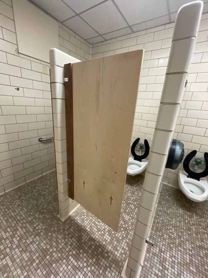
12. “This bathroom stall at my school”
13. “A bear is a bear, right?”
14. Not the smoothest ride for your spine
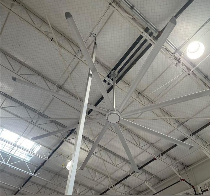
15. “Finish carpentry is too fiddly.”
Have you ever encountered poor design? Tell us your story!
Subscribe to our podcast on Spotify or Apple podcasts to enjoy our best stories and give a real treat to your ears.
Comments
Get notifications
All is bears🐨🐻🐼....
Reply
imagine going up these stairs in the night...
Reply
who would even use those 🤦♀️
Reply
Related Reads
10+ Peculiarities in Supermarkets in Different Countries That Make Foreigners Gasp With Surprise

Places
4 years ago
19 People Shared Things That Are Pretty Normal in Their Country but Might Be Considered Weird in the Rest of the World

Places
4 years ago
16 Times People Lied on Social Media So Hard, It’s Hilarious

Curiosities
8 years ago
15+ People That Know Exactly How to Make Employees’ Days Fun

Curiosities
5 years ago
17 Pics That Prove First Time Experiences Are Unforgettable

Curiosities
4 years ago
15 Lucky People That Don’t Need to Try Hard to Be in the Spotlight
People
4 years ago
I Paid Half the Mortgage for Years—Then I Refused to Be Used Anymore

Relationships
2 months ago
15 Acts of Kindness That Prove Quiet Empathy Is the Only Real Superpower

People
2 weeks ago
10 Moments When Quiet Kindness Rewrote a Painful Story

People
week ago
15 Stories That Prove Meeting the Parents Is Funnier Than a Comedy Movie

Family & kids
3 weeks ago
12 Life Moments That Prove Kindness Costs Little but Leaves a Big Mark

People
month ago
14 Times Quiet Kindness Turned Someone’s Worst Day Around

People
2 weeks ago
