SUPER
12 Simple Things That Can Turn an Ordinary Apartment Into a Luxurious Place
It’s not easy to create the order and coziness in our homes that is so abundantly shown on the covers of magazines. Though we surround ourselves with beautiful and stylish things, oftentimes we end up feeling that something is wrong and that the apartment resembles more of a storage space or a shop that’s been snowed under with various goods.
Bright Side figured out which mistakes in apartment design prevent it from looking like a paradise.
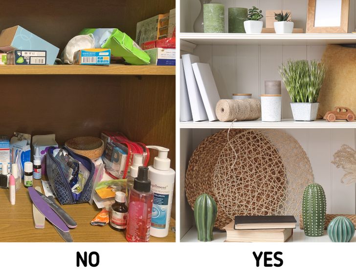
1. Open shelving with clutter
Open shelves are the perfect place for storing books and various small decor items. Though we should keep in mind these shelves shouldn’t become overloaded with too many things. The lightness in the interior appears when the shelves “breathe” and when the items on them are located so that there is some space between them.
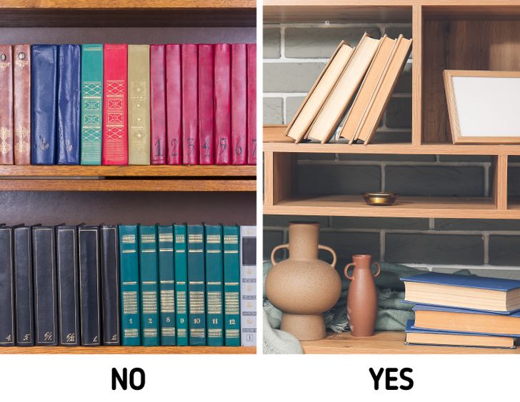
2. Old books
Almost everyone tries to show off each book that they have at home, but this is a big mistake. First of all, softcover books should not be on display. Secondly, you should consider getting rid of worn-out books.
In order to make bookshelves look as elegant as they seem in magazines, make sure you don’t place books too close to each other or take up all of the free space with them. It’s worth placing 2-3 small stacks of books on a shelf and leaving free space for various decorative elements between them. The shelf is considered to be full when you’ve occupied 80% of its space.
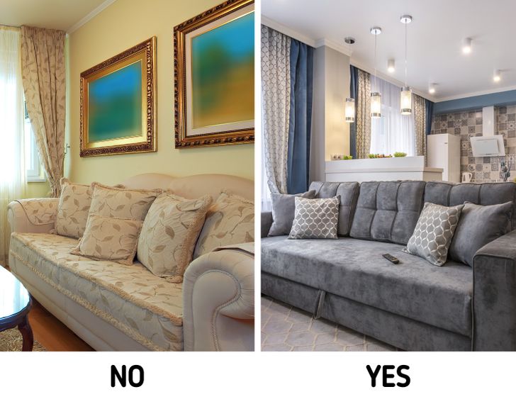
3. Cushions
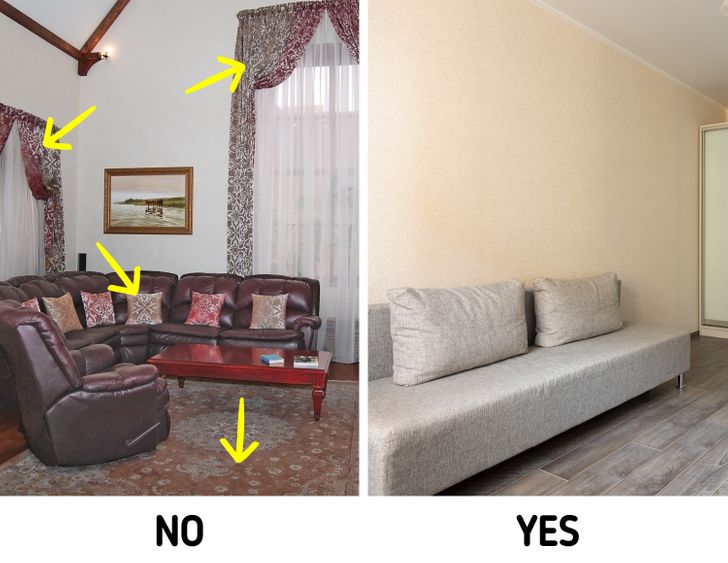
Decorative cushions are an elegant decorative element, but only in cases where there are very few of them. Let’s say the perfect amount is 2-3 cushions for each end of the couch. At the same time, if you place a pile of cushions on your furniture and organize them in a row, the overall look will be weird.
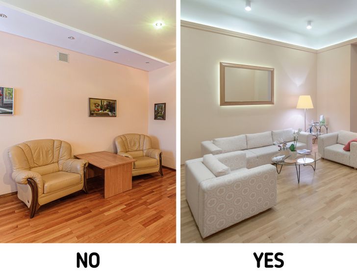
4. Furniture located along walls
When every piece of furniture is placed along the walls, the space in the room visually contracts and a feeling of clutter and mess appears. In order to make your home look neat, it’s better to move away from this classic way of placing furniture. For example, a table in the dining room or in the sitting room looks better when it’s placed in the center of a room, not in a corner.
5. Photos in frames and paintings
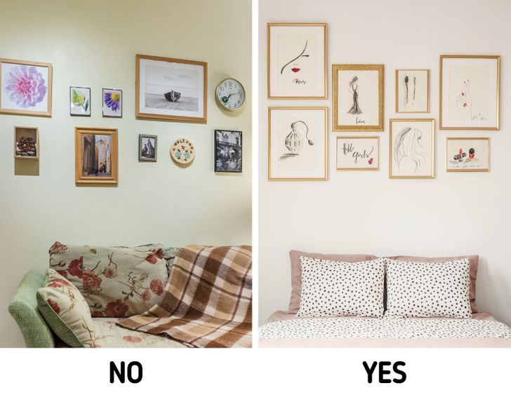
Numerous photos in different frames destroy any feeling of comfort because they make the room seem to be untidy. Displaying several similar frames might be a good idea, but the rest should be hidden in a photo album. Moreover, they should be placed sensibly as well — for example, the composition of photos located on the wall over a piece of furniture looks very nice.
There is one more rule: all paintings and photographs in the room should be located in one place. If you hang 2 pieces at the entrance and place 4 more photos on the table, it will look messy. If you have a bright interior, hanging black and white photos can be a good idea as well — they won’t distract from the main decor of the room.
6. Wires
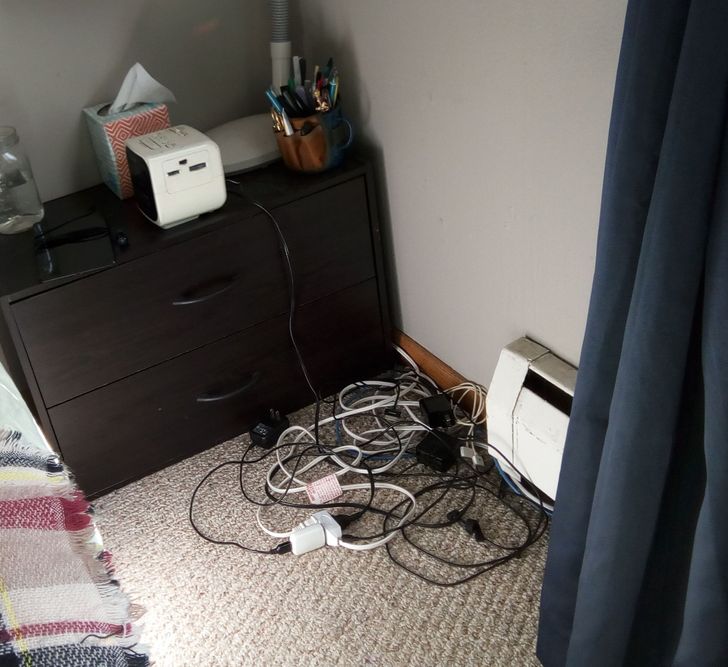
If you hide all of the wires (from the TV set, network cables, extenders, and charging devices), you’ll be surprised at how much neater your apartment will start to look.
At first, you’ll need to move all the furniture and carefully untangle the wires. Afterward, you’ll need to put them in order and secure them with special clamps or Velcro. It’s better to use a different colored securing element for each wire.
7. Massive furniture
When choosing furniture, one needs to proceed from the size of a particular room. Items that are either too big or too small destroy the atmosphere of coziness and will make your apartment look either too cluttered or too empty. The good thing is that, oftentimes, you only need to remove a couple of big armchairs or a couple of miniature tables from the room to create visual neatness.
8. Voluminous drapes on windows
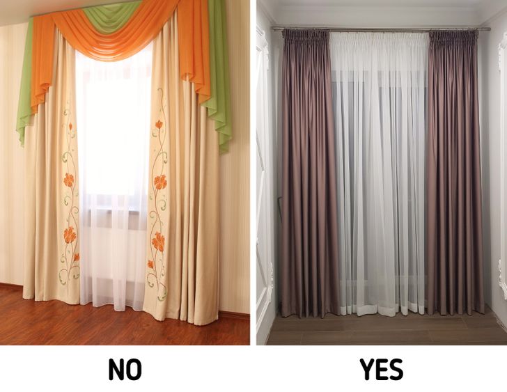
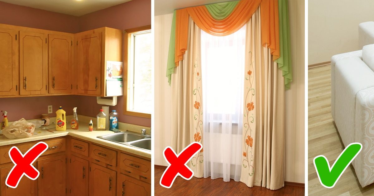
There is a rule saying that there should be no more than 2 curtains on a window. Let’s say, that this could mean a light tulle and 2 more massive curtains on the sides. Having a 3rd element, like heavy drapes hanging from the top, will prevent sunlight from getting into the room and make the window look too massive. Even the most cluttered apartment will look much better if it is flooded with sunlight.
9. Dark decor
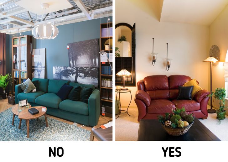
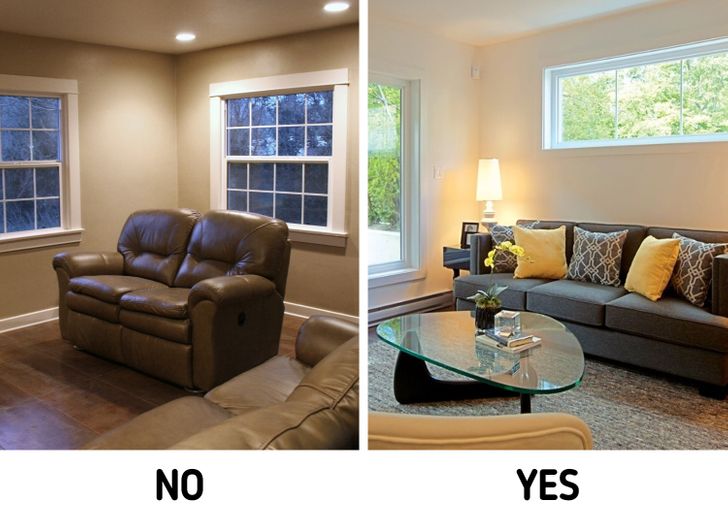
White and pastel colors will always look neater than dark ones. Any room with an abundance of dull and gloomy furniture will seem dirtier than it really is. This perception is due to our subconscious — the whiter a room is the cleaner we perceive it to be, and vice versa.
Of course, this doesn’t mean that we need to rush and paint all the walls in our homes white and buy furniture in pastel colors right away. But adding light accents to a dark room is a good idea.
10. Insufficient lighting
Various shades, unlit corners, and shadows add a feeling of messiness to a room. If the room lacks natural light, you will need artificial lighting.
There are several helpful designer tricks:
-
Paint the ceiling white — the room will look not only cleaner but also visually larger.
-
Use walls and the ceiling as reflectors. To do this, place the lamps close to these surfaces so that the light is directed at them.
-
Hang 1 or 2 big mirrors with a thin frame — they also reflect light and won’t look heavy thanks to the their frame.
11. Patterns
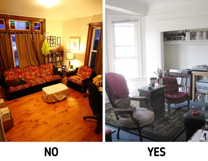
The combination of numerous patterns in design is definitely not a good idea. This trend, which used to be popular in the ’90s, is considered to be outdated now because too many patterns in one place creates a feeling of messiness. Sometimes in order to get rid of this, you just need to replace 2 bright gaudy cushions with a few in a solid color. Try it yourself and you’ll see how much your room will change.
12. Low furniture
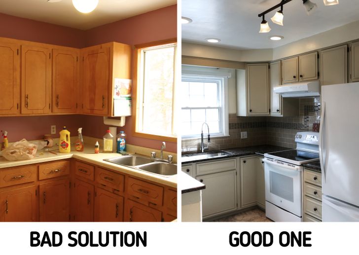
A large room has less clutter by default than a small one. In order to make the room look big, the furniture located along the walls or on the walls (like kitchen cabinets) should go all the way up to the ceiling. Otherwise, the wall will look kinda cropped and visually shortened.
You will also need to pay special attention to the curtains. Designers recommend making them as high, as long, and as wide as possible. That’s why it’s better to not necessarily just place them along the contour of the window opening, but even several inches beyond it. It will create the illusion of a big window, which will eventually make the room look bigger and neater.
Have you ever faced the issue of having an eternally cluttered home despite cleaning your apartment regularly? How do you cope with this?
Comments
I subscribed you in yt also
I'm a big fan of u
I ALWAYS STAY ON THE BRIGHT SIDE OF LIFE
yay
Related Reads
8 Design Mistakes Owners of Small Apartments Often Make
15 Success Moments From Strangers That Deserve All the Golden Buzzers in the World
10 Teachers Who Learned Life Lessons From Their Remarkable Students
10 Times Kids Reminded Adults What Kindness Looks Like
My Boyfriend’s Mom Kept Mocking My Career—My Response Silenced the Whole Table

16 Stories That Prove the Heart Remembers, Even When Life Moves On

15 Heart-Centered Moments of Human Kindness That Only Happen Once in a Blue Moon

14 Friends Who Have a Black Belt in Creating Awkward Situations
15 Career Success Moments That Teach Us the Value of Quiet Kindness in a Harsh World

15 Moments That Prove Kindness Is the Armor That Protects Without a Fight

10 Quiet Acts of Kindness That Prove Heroes Don’t Always Wear Capes

15 Moments That Show Dignity Carries Value Everywhere
