Of course, everyone fails at something sometimes. But for some reason, designers do it more often and their fails are almost impossible to miss. Why would anyone make a waterfall that looks like stairs?
Bright Side can’t just stay calm when we see these “masterpieces.” We decided to show you 26 designer fails that we hope will never be repeated again.
The Braille text is absolutely flat here.
The handle is too heavy for the frying pan itself.
Looks like they are still not sure.
“Bowling alley located in Bangkok. Cracks me up when the balls roll out.”
This font color selection. The result would probably be the same if the bottle itself were white.
The “handle” is part of the container so not only can I not hold it, there is a 100% chance that I will pour tea on my face when I drink."
If there’s one thing the world needs, its more disposable plastic packaging.
Perfect hours! Impossible to miss!
“I only saw the left window at first and got very confused.”
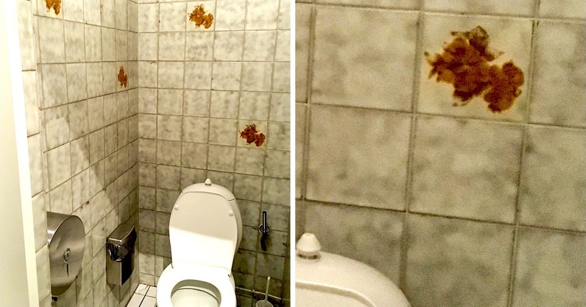
We wonder what these brown spots represent.
“I hope I don’t crash my car while changing the radio station.”
The people who made this, probably wear their watch on their wrists.
This tiny font on a billboard on a 6-lane highway:
The perfect lamp for the depressed hipster.
“This is a slide at a nearby school. Maybe I’m missing something.”
Why not just pull the ring?
Now Timmy can produce the Blue Screen of Death in just 3 easy steps.
These aren’t stairs. They are decorative waterfalls. My friend walked into them and slipped.
Which of these pictures seemed like the worst fail to you?

