Can agree with matte kitchen design. This is what we have and oh my.. fingerprints are everywhere ?
14 Renovation Mistakes People Have Made That You Can Avoid
Before we start a renovation, we can practically see our future home in our minds. Magazines show the design styles and salespeople in stores, ready to sell us anything we’d like. But very often, real life is more complicated and we later realize that some things are not as comfortable as they once seemed and we miss some very important details.
My name is Yulia and a couple of things in my new apartment are really infuriating. This is not my first renovation so I thought that this time I had covered all my bases. But, unfortunately, there’s always something more that needs to be done.
I decided to tell Bright Side readers about all the mistakes that both I and other people have made. Hopefully, it will help you as you plan your next renovation.
A round kitchen sink
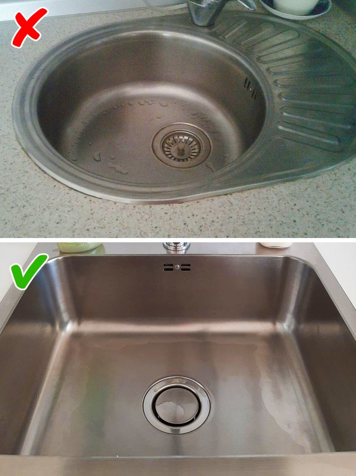
Round kitchen sinks became popular in the ’90s and they seemed very unusual and convenient because they were the same shape as the plates. However, they aren’t the best idea because square sinks can fit more dishes. And if you have a round sink, you’re going to have to place the dishes outside of it if you don’t have time to wash them right away.
A bathtub placed in the middle of the room
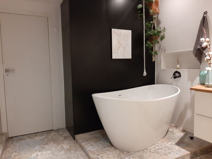
For years, I’d dreamt about having a bathtub like this. It looks so modern and trendy. But let’s face it: you have to have a very big bathroom to position a bathtub this way. Otherwise, it’ll be really hard to wash — it’s almost impossible to fit into the areas between the tub and the wall. You should either have a big bathroom or a cleaning person to clear out all the water that collects around it.
A compartment wardrobe with sliding doors

This is another thing that started in the ’90s. It’s especially popular for people that have smaller apartments. But, in fact, sliding doors are not that convenient since often, they don’t fully close and reveal your stuff to people. Plus, regular wardrobes are typically much cheaper.
A faucet with a flat surface
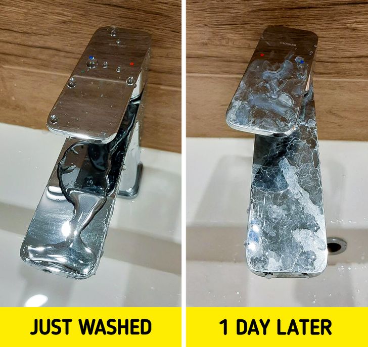
This faucet is something that pains me every day. I can’t even understand why I got it. Most faucets are round: the drops of the water slide down off of it and into the sink. But if the faucet is flat, the drops stay on the surface, leaving water stains. I realized I made a mistake just a few weeks after I started using it. But it was too late.
Dark floors
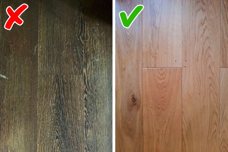
It doesn’t matter what kind of floor cover material you have, the fact still stands: the dirt is easier to see on dark floors than it is on light ones. It seems counterintuitive but it’s true: dark floors and furniture make everything that’s on them really easy to see. Fortunately, I learned this from my friend’s apartment: she had dark floors. I knew I wasn’t ready to wash the floors every day.
A sink with a faucet on the outside
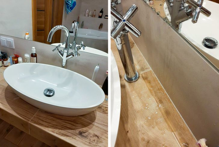
This looks very trendy and modern. There’s enough room around the sink to put everything you want. The only problem is washing the faucet. The foam and the water don’t go into the sink as they should and instead, they fall around the outside. This leaves you with even more cleaning to do.
A dark matte kitchen
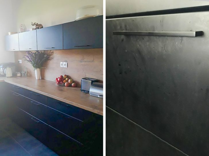
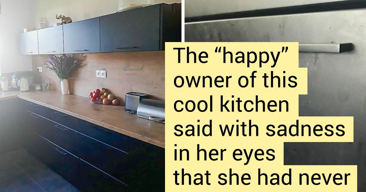
Dark kitchens have been popular for quite some time now. And I can’t disagree — they do look cool in pictures. But in reality, things are way more complicated: fingerprints are easy to leave on something matte and very hard to wash off. The “happy” owner of this cool-looking kitchen explained, with sadness in her eyes, that she had never washed her kitchen as often as she does now.
Patterned linoleum
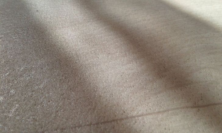
My relatives bought linoleum that the shop-assistant referred to as “very reliable.” But then, it turned out that dirt and dust easily got into the pattern and the surface was very hard to clean. The entire apartment then started to look messy.
A kitchen tabletop made of natural wood
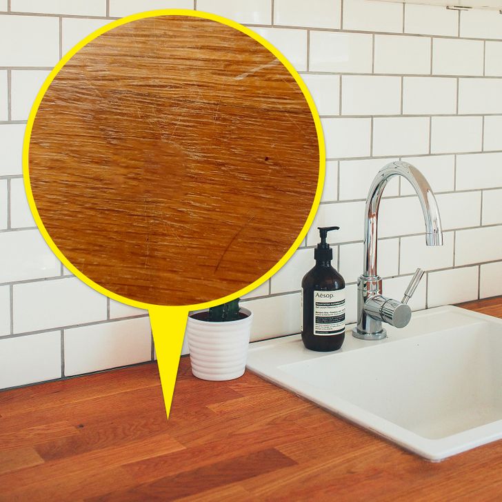
When I first saw a wooden tabletop, I thought it was a great solution. But after I’d used it for some time, I understood that I’d never buy one for myself. It looks great in a magazine but in real life, it’s not as simple. Wood is wood — no matter how careful you are, you will see even the smallest dents and scratches on it. Additionally, such tabletops require special care: at least once a year, you need to cover them with a special solution so that the wood doesn’t dry.
Open shelves in the kitchen
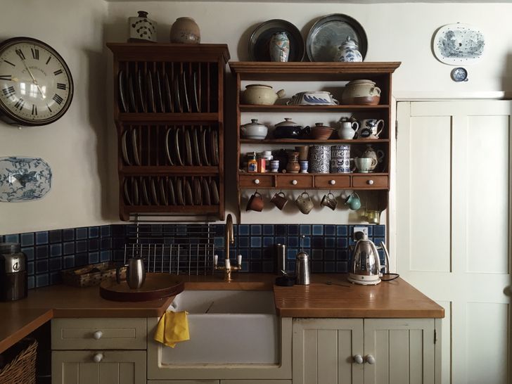
“No more closed shelves on walls means a lot of air and light.” I’ve read claims like this in magazines for years. And while photos of shelves with nice plates really do look nice, after spending a week in an apartment with such a kitchen, you’ll realize it takes a crazy amount of work to place all the plates and cups perfectly. Let’s be real: most people (including me) are not going to do this and their shelves will look really messy.
Doors with glass inserts
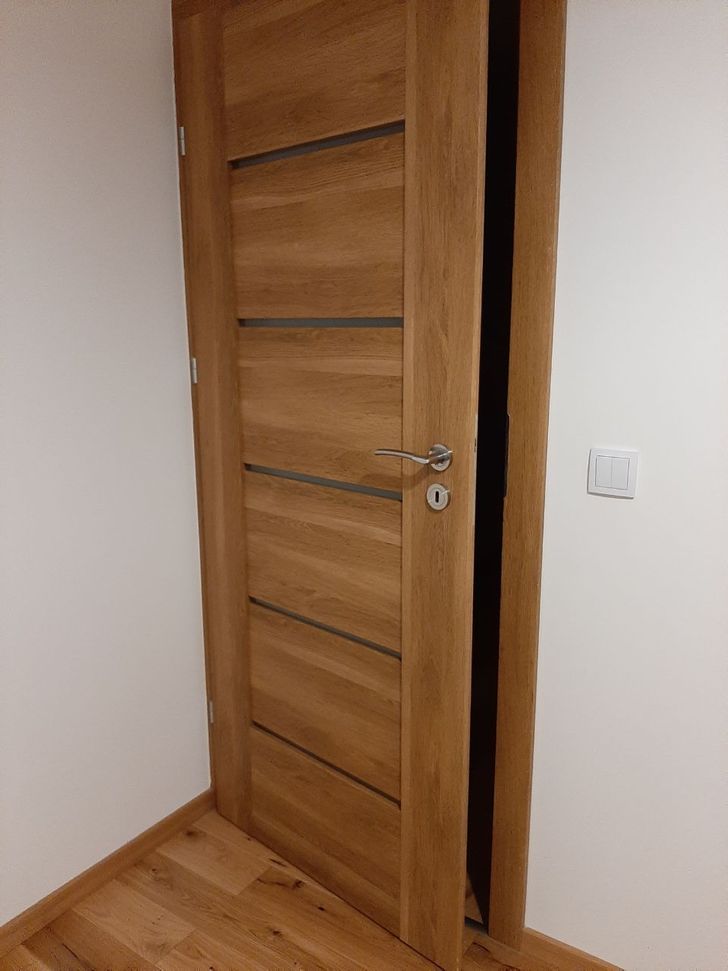
Doors with glass inserts often look more elegant than simple doors. But from my own experience, I can say that such doors are not always the best choice. For example, if someone turns on the light in the evening, it will come into the bedroom, which isn’t good. This is really annoying if you’ve just put your baby to sleep.
Light switches on the wrong side
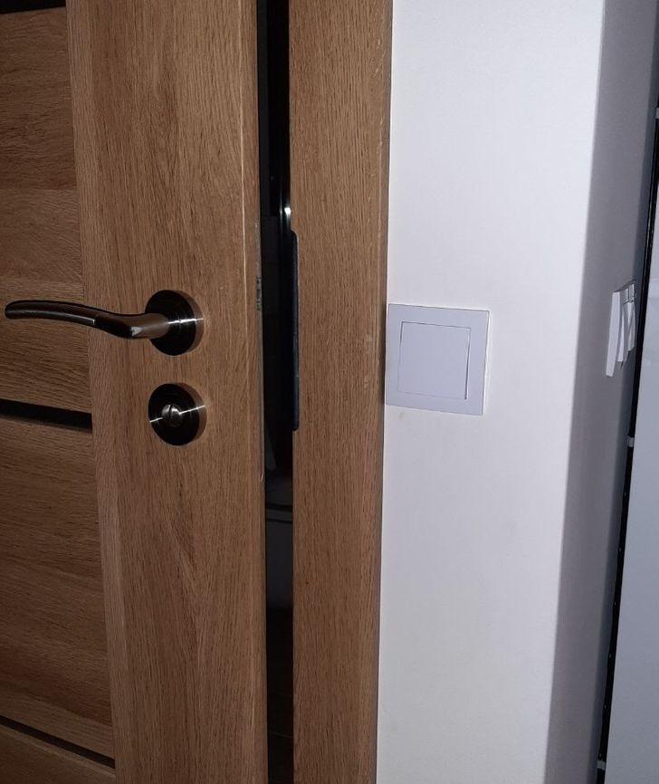
I used to rent an apartment where the light switches were on the side of the door hinges instead of being next to the doorknob. It’s not comfortable because you use one hand to grab the doorknob and the other to turn the light on. And it’s much better if the knob and the switch are next to each other. Someone made this mistake and I noted it and didn’t make the same one in my own apartment.
Deep bevels between tiles
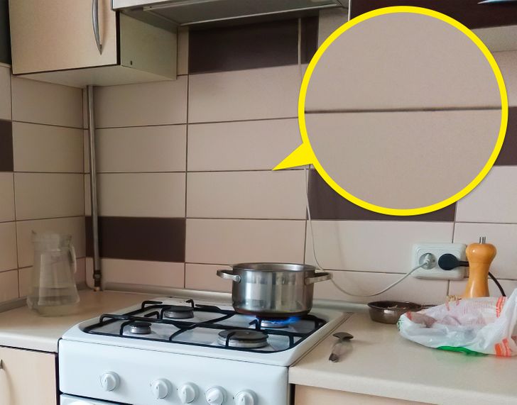
Very often, kitchen walls are covered with tiles. And this is smart: it makes the tiles look nice and they’re easy to clean. But something that I couldn’t predict happened: the bevels on the tiles were too deep. So now I have to clean them long and hard: the grease gets in very fast and then dust settles in. It’s better to choose very flat tiles so that they’ll be easy to clean.
A bathroom fan that’s controlled by a light switch
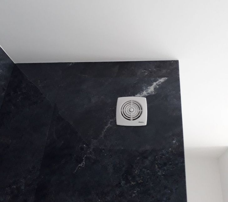
You probably know that every bathroom has ventilation. When we were doing our renovation, I didn’t notice that the ventilation fan was controlled by the same switch as the light. I thought it was a good idea — when you turn the light on, the fan turns on too. You’ll never forget about the ventilation so the bathroom will always be dry.
But now I know that you don’t always need a fan. For example, when taking a bath, you want the air to be warm but the fan instantly sucks it out and it gets cold really fast. Now, I always pay attention to such details.
What renovation mistakes have you made? What will you never do in your home again?
Comments
Related Reads
18 Stories That Remind Us Kindness Is the Greatest Gift

14 Acts of Kindness That Show How Empathy and Compassion Fix What Life Breaks

13 Moments of Kindness That Restored Hope to Those Who Had Lost It All

I Posted a Photo During Mental Health Leave—Then HR Called Me In
15 Stories That Show Quiet Kindness Is the Strength the World Needs Most

11 Stepparents Who Didn’t Try to Replace Anyone—And Won Hearts Anyway

11 Stepparents Whose Quiet Love Proved Kindness Doesn’t Need Permission

My Coworker Stole My Strategies and Got Promoted—Justice Was Served

My Parents Mocked Me for Being Childfree—Now They’re Living the Irony

12 Stories Where Kindness Was the Road to Lifelong Success and a Genuine Happiness

10+ Moments When Quiet Kindness From Strangers Became the Ultimate Success Story

10 Moments That Show Quiet Kindness Is the Love the World Forgot

