No one is absolutely perfect at their job. However, not everyone makes things for us all to use or look at. That’s how high the stakes are for designers everywhere, and sometimes the pressure of it all can be a bit too much. That’s why we end up seeing things like electrical outlets inside shower stalls.
Bright Side rounded up a few design blunders that either gave people a hard time or a good chuckle.
1. “My bathtub fills up with water from the ceiling.”
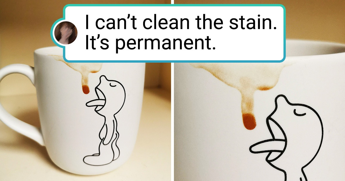
2. “I tried cleaning the stain off this mug until I realized it’s part of the design.”
3. “The new chairs in this café were specifically designed so people won’t hang around for a long time.”
4. “It’s only a matter of time before I pass my washing machine operator exam.”
5. “The strawberry syrup is fake. It’s painted on the cup.”
6. The seat blocks the door.
7. “A bench that doesn’t drain”
8. “Was trying to stack my ice cube trays and realized the cells are different sizes.”
9. “The liquid bleach holder on our washer collects water and rusts.”
10. “Steps that are too long for one step but too short for 2”
11. “At my local movie theater, the urinal is separated but the toilets aren’t. And there’s only one roll of toilet paper.”
12. “This statue of Shrek at my local mini golf course”
13. “My keyboard lights up, but you can’t see any letters at night.”
14. “My feet hurt just looking at this.”
15. “The shower cabin at my grandmother’s house has a power outlet in it.”
Have you ever come across a design that could be improved? What are your own examples?
