Commercial marketing doesn't work on me at all
5 Tricks We Didn’t Know Restaurants Used on Their Menus
Every sphere has its own untold rules and the restaurant business is no exception. Each time we order food, we have to use a menu, so this becomes a powerful tool that influences and directs our choices. And while we really just want to grab a bite, we might end up with our eyes being bigger than our stomachs.
We at Bright Side were curious about some of the secrets that restaurants use to influence our decisions.
1. The weight of the menu influences our perception.
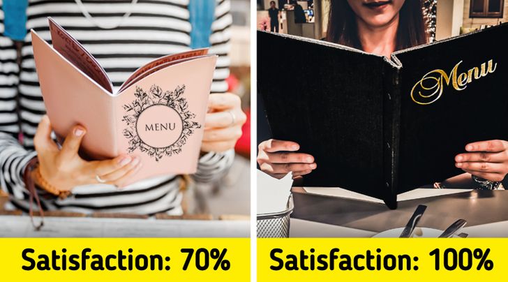
Research says that your impression of the food starts the moment you hold the menu in your hands. Heavier menus leave a better impression, making us believe that the service in the restaurant will be at the highest level. While light ones make people wonder whether this place is casual and “economy.” So the next time you hold a leather menu with good paper, don’t be fooled, it has nothing to do with the quality of the food or the service.
2. Some names of dishes can make you hungry.
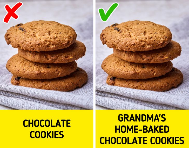
The name can make a certain dish up to 23% more popular. Research showed that indulgent, exciting names increased the number of people who chose certain food. Another way restaurants use names to make you choose certain food is by giving them nostalgic labels like “handmade,” or “Grandma’s home-baked” which gives you positive emotions.
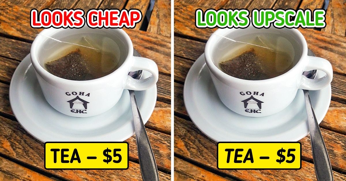
3. Font influences the way we perceive food.
Depending on the font used, the menu can convey different messages. Visitors who were reading an italicized menu perceived the restaurant to be more upscale with top-notch service. While simple, easy-to-read fonts can be associated with “cheapness” and “economy.”
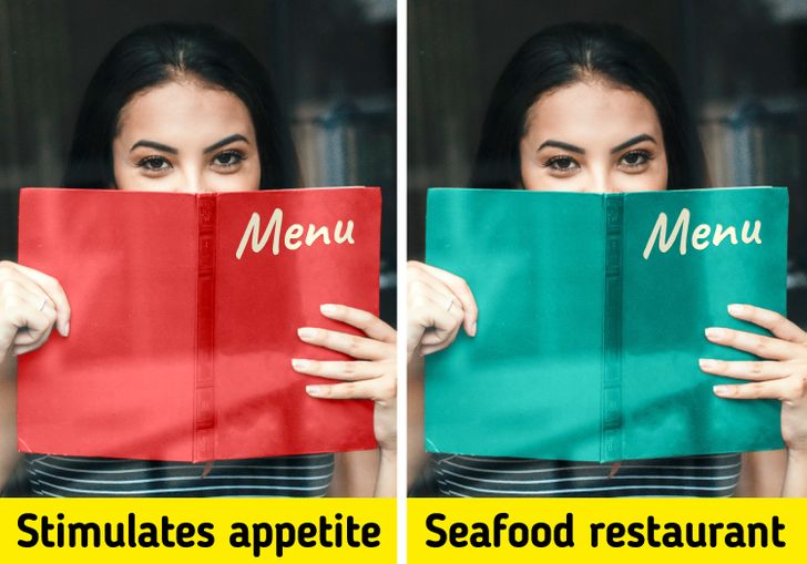
4. Colors inside the menu send signals too.
The colors you see on a menu also have a huge influence, since people respond emotionally to them. Red and blue are the most popular colors that restaurants use when they want to trigger and increase your appetite. What they will do is highlight in color and with bigger letters the main items on their menu. These colors call for your attention. In seafood restaurants, blue is usually the chosen color for the menus since it indicates that the food served comes straight from the sea.
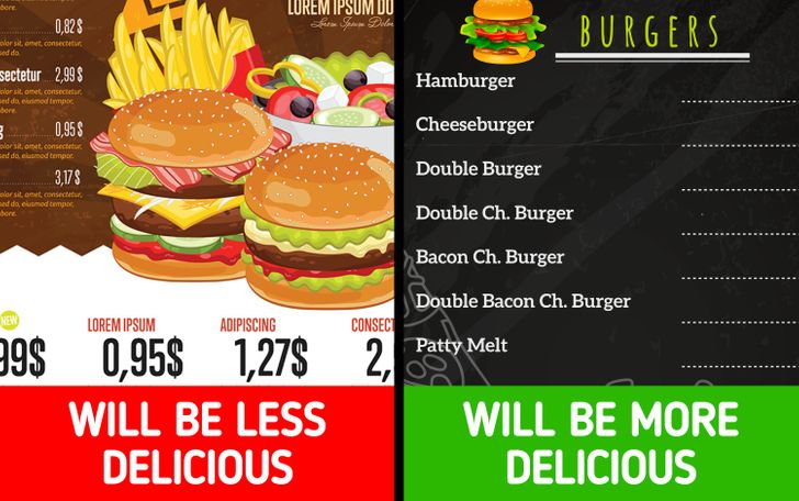
5. A few photos will make you buy more.
The old saying people eat with their eyes isn’t always true. While visuals are important, a menu design specialist says that too many pictures can make us believe that the restaurant is a low-end eatery. Our spending increases by 30% when we see just one picture per page. Often, expensive restaurants prefer to leave the quality of the food to the visitor’s imagination.
Do you enjoy eating out? Are there any other restaurant tricks that you know of? We’d love to hear about your experience!
Comments
same
Related Reads
10 Stories That Show What Happens When You Stop Being the Family ATM
12 Stories of People Who Found a “Glitch” in Their Hardest Day and Met a Real-Life Angel

10 Real Flight Attendant Stories Airlines Don’t Want You to Hear
12 Moments That Reveal How Quiet Kindness Speaks Loudest in a Silent World
15 Friendship Stories That Proved Real Loyalty Doesn’t Care About Time or Distance
11 Moments That Prove Kindness and Compassion Survive Even in the Darkest Times
12 Quiet Acts of Kindness That Break Barriers and Move Hearts
11 MILs Who “Helped” With Home Renovations and Created Hilarious Chaos

16 First Dates That Need to Be Turned Into a Netflix Script
20+ Mother-in-Law Stories That Prove Real Family Is Built on Love, Not Obligation
17 Stories That Prove a Dream Job Is About Happiness, Not a Fancy Title
12 Moments That Prove Real Kindness Means Showing Up for People Nobody Else Showed Up For
