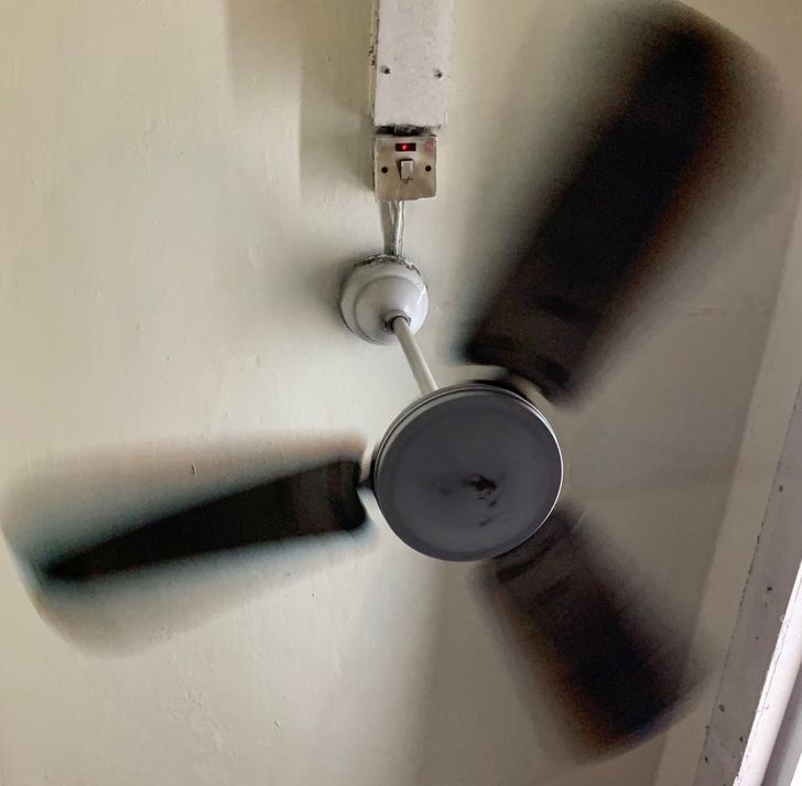
try the Main switch
20 Designs That Didn’t Turn Out as They Were Imagined
A poorly thought-out design has the power to annoy us, make us feel frustrated, or awaken a sudden urge to destroy the object in question. Sometimes it’s the wrong choice of material, shape, or placement that leads to a totally non-functional product. Other times, it’s an utterly bad execution that gives the design a totally different, and sometimes ridiculous, meaning. Either way, we cannot escape having to deal with a bad design every now and then, no matter how hard we try.
Bright Side likes to focus on the funny side of every situation. This is why we’ve decided to share a collection of design flops that we think can be annoying but also extremely hilarious.
1. ’’I have no idea how to turn this off.’’
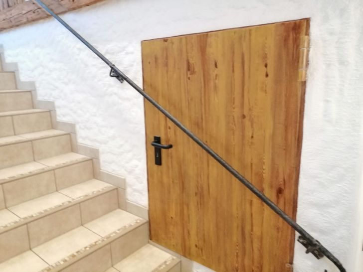
2. ’’This door will never be opened.’’
3. This lion isn’t exactly the picture of courage and strength.
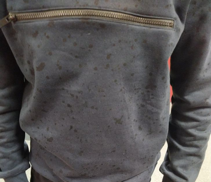
4. ’’I got this new hoodie and everybody has asked me why I am wet.’’
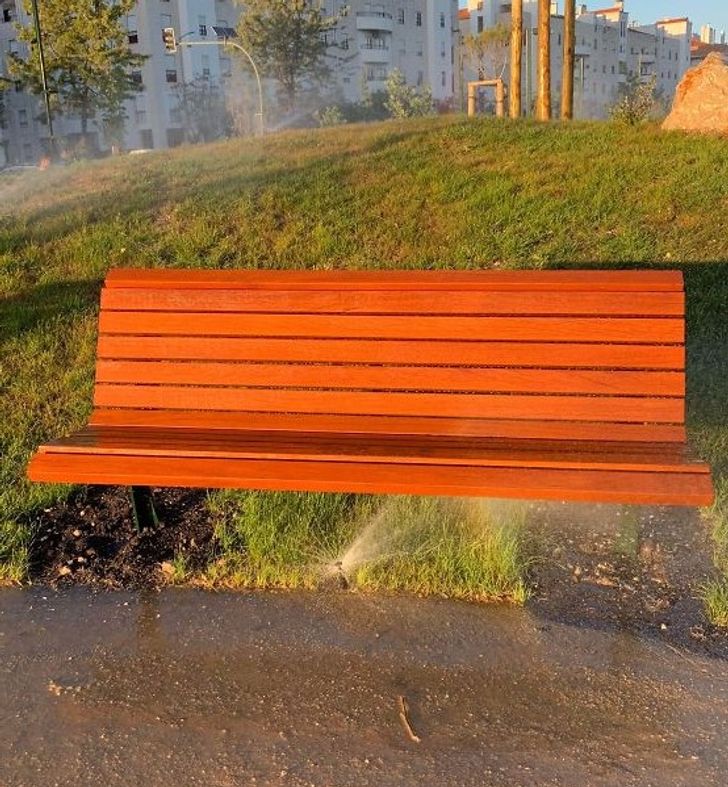
5. ’’A new park opened in my city, pretty lovely except for this one detail.’’
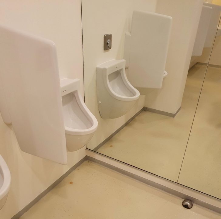
6. ’’My university decided to put a mirrored wall in the men’s bathroom.’’
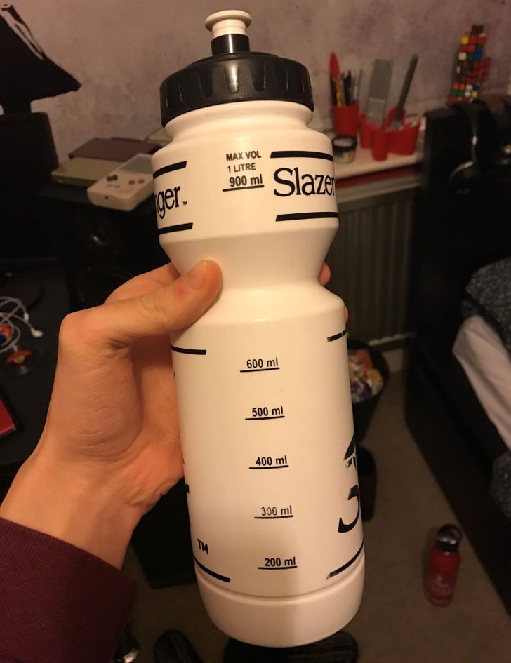
7. ’’Measurement lines on an opaque bottle’’
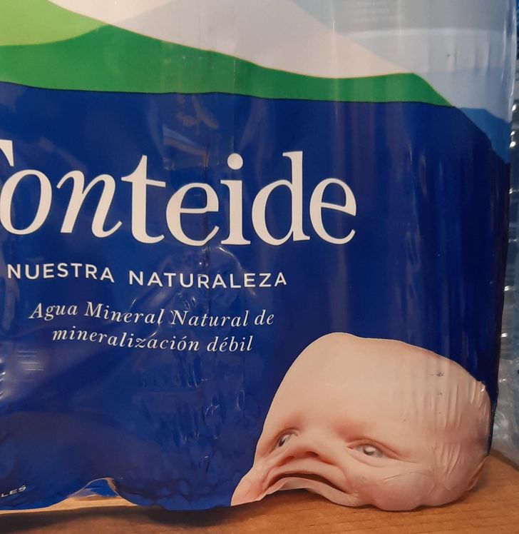
8. ’’The placement of this baby’s head wasn’t quite thought through.’’
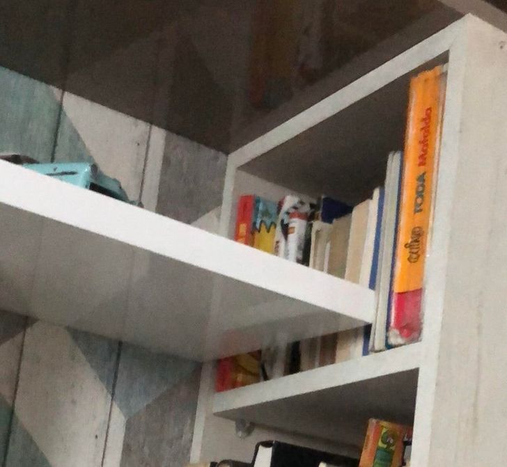
9. ’’My room designer put a shelf next to my bookshelf and now I can’t access my books.’’
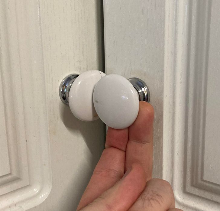
10. ’’I can’t open either of these at my new workplace.’’
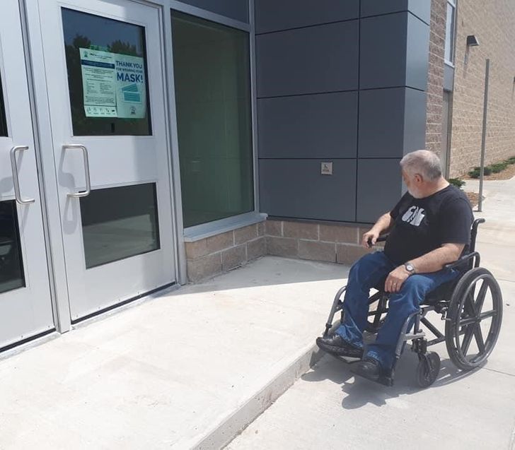
11. ’’This new school has a wheelchair access button for the door, but no way for a person in a wheelchair to reach it.’’
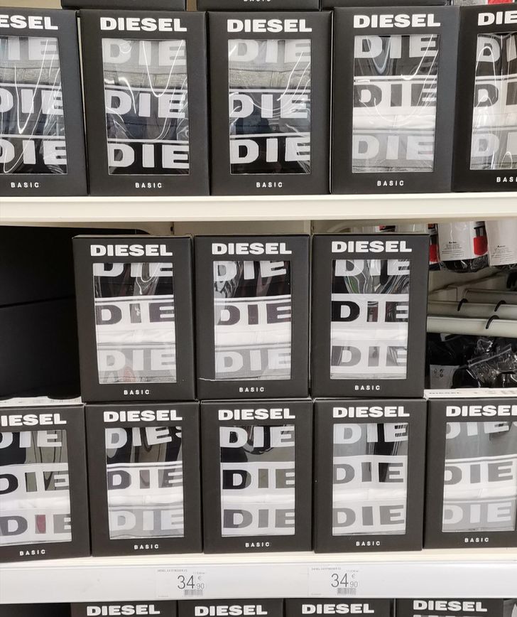
12. ’’I was having a good day until I went to the supermarket.’’
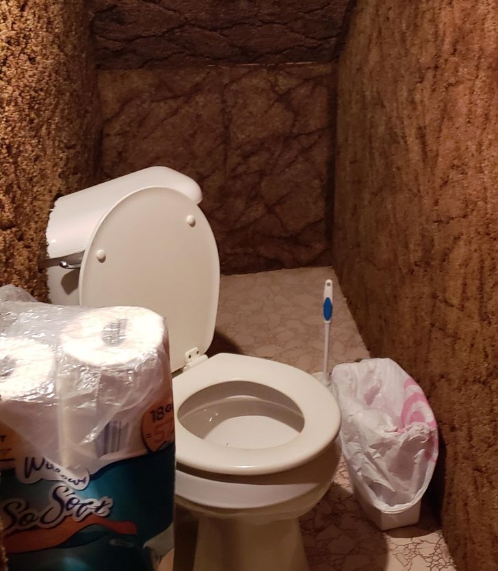
13. ’’My friend’s under-the-stairs ’bathroom’ where the toilet is diagonal and partially installed into the carpeted wall’’
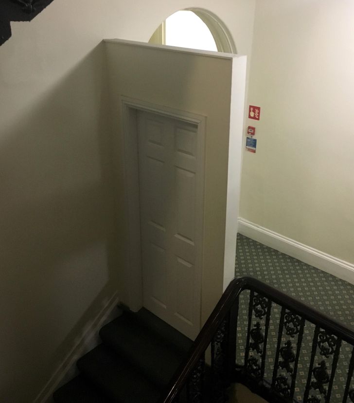
14. ’’This weird door at the top of the stairs in a hotel’’
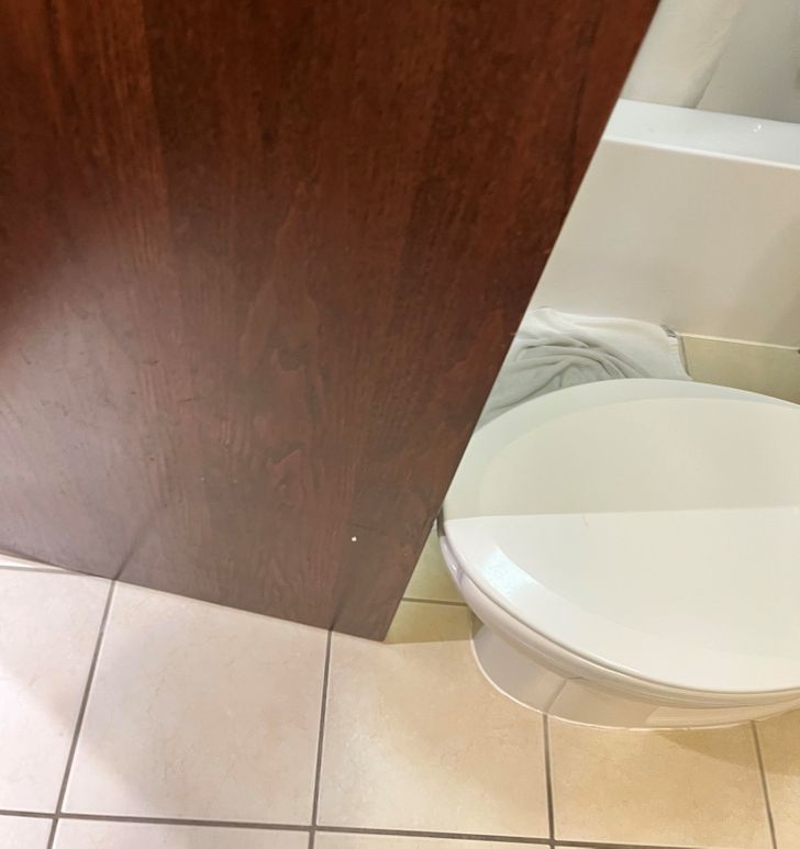
15. ’’Door won’t fully open due to the toilet.’’
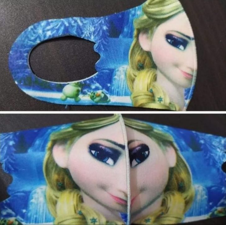
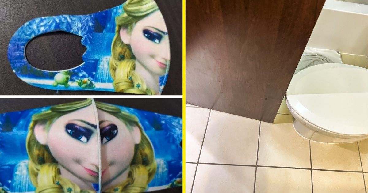
16. ’’Looks good on the package, not so much when worn.’’
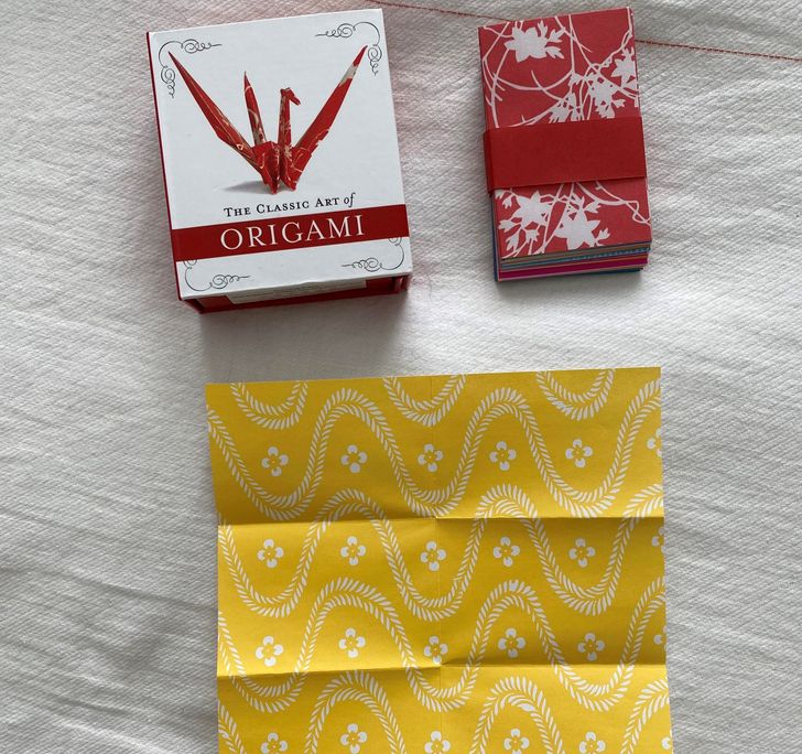
17. ’’An origami kit where the paper has already been folded to fit in the box’’
18. They couldn’t make up their minds on a window design.
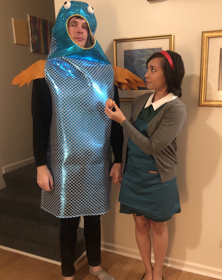
19. ’’This was supposed to be a The Shape of Water costume.’’
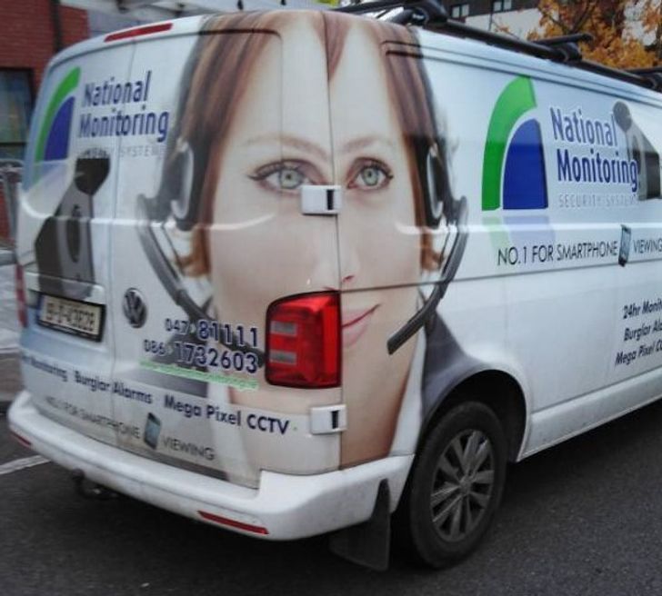
20. ’’I saw an interesting van coming home from school.’’
Do you think the designer is the only one to blame when a product is non-functional? Do you prefer functionality or aesthetics when it comes to choosing objects?
Comments
some ppl are in the wrong jobs
#16 still looks better than how Elsa looked in Ralph Breaks the Internet. :P *Sideshow Bob's annoyed shudder*
16 is a description of 'a symmetrical face'
Related Reads
21 Designers Who Definitely Deserve a Raise for Their Products
20 People Whose Creativity Caught Our Eyes
26 People Amazed Us With Their Preparation for Halloween
15 Pics That’ll Make You Feel Like You Need to Reboot Your Eyes
15 Couples Who Keep Their Love Alive With Their Sense of Humor
18 Useful Inventions Just Made Us Shout “I Need That!”
15 People Who Asked for No Surprises but the Universe Said, “Not Today”
15 Strong People Who Won’t Give Up Even if Armageddon Hits

15 Heartfelt Pics That Are Just What You Need on a Chilly Day
My Son’s Stepmom Went Too Far With Her "Parenting"—I’m Furious
10 Moments That Prove Quiet Kindness Keeps the World Standing
11 Times a Stranger’s Kindness Saved Someone When Society’s Safety Nets Failed
