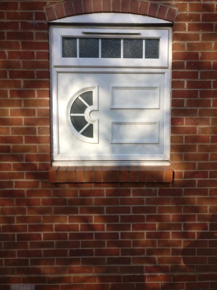
I want to speak to whoever desiged this and why.
20 People Who Made Us Wonder If They Should Go Back to Design School
Some designs are just a little, well, different, and they’re just proof of someone with special talent. Even so, we can say that some of these designs have at least one purpose — to make us laugh.
We at Bright Side wanted to show you a collection of the funniest design fails, so get ready and enjoy the ride.
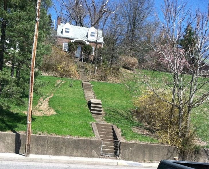
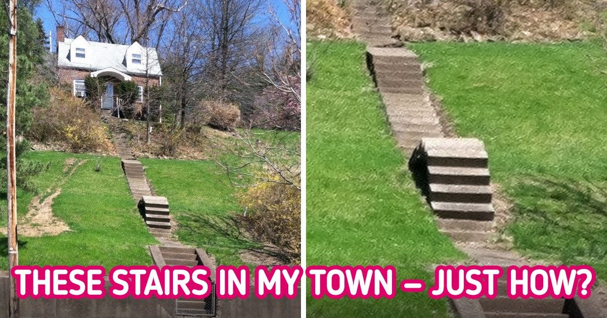
1. “These are stairs in my town. Just...how?”
2. “No broken legs that I know of...”
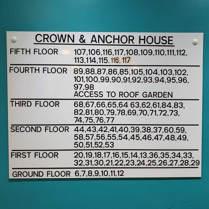
3. “I’m a grocery delivery driver. This is what I’m confronted with in a block of apartment units. ”
4. “The paper in this sliced cheese makes it look like it has mold spots.”
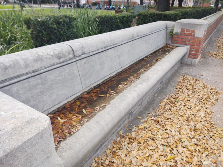
5. “The benches are tilted and have no drainage system, so the water just sits there for days after a rainstorm.”
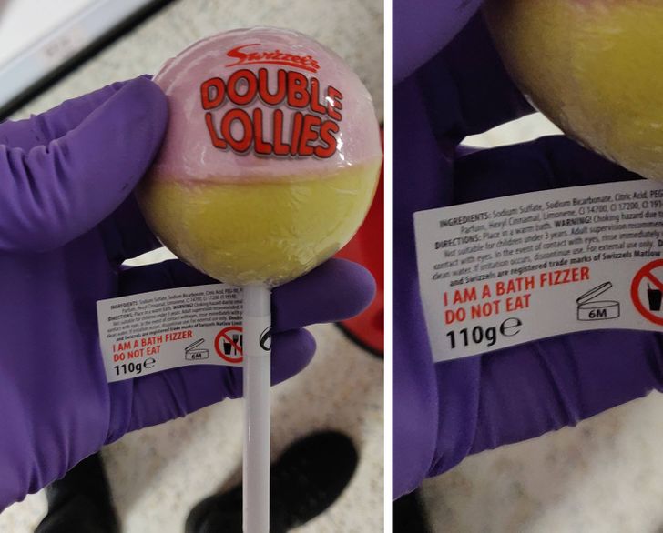
6. “It’ll leave a weird taste in your mouth...”
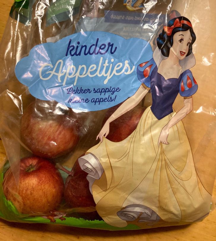
7. “A bag of apples with a character on it that got poisoned by an apple...”
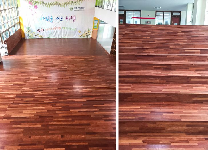
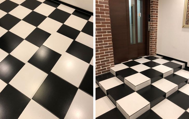
8. “Steps that you can’t see”
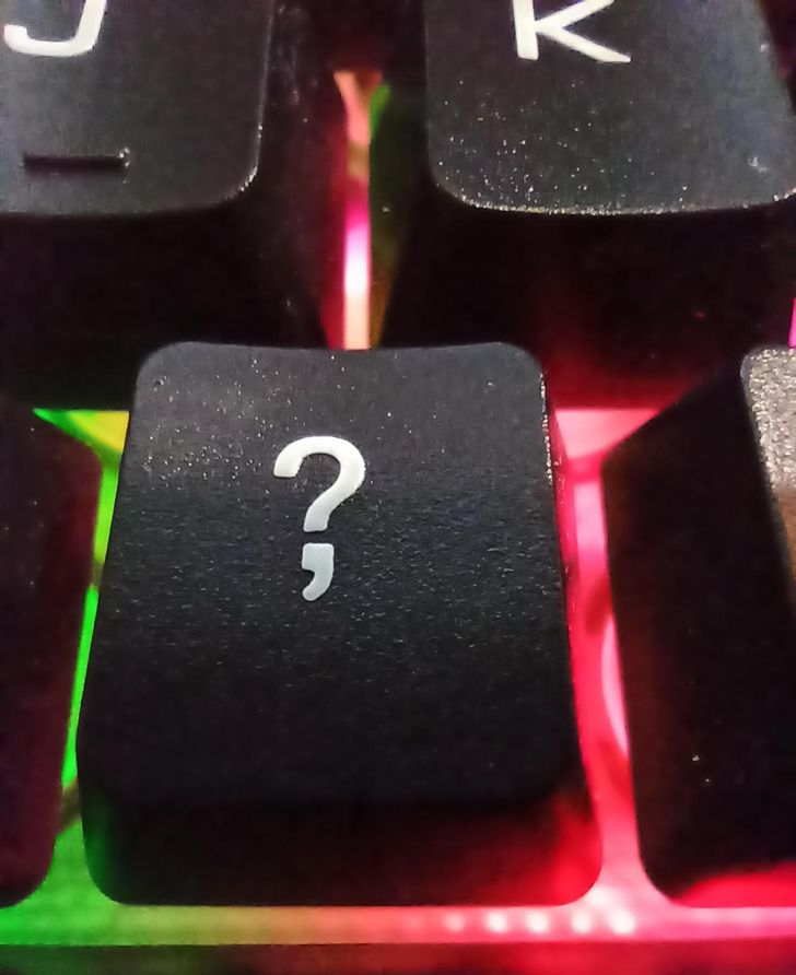
9. “Ladies and gentlemen, let me introduce you to the ’comation’ point...”
10. “Imagine cleaning a fan so well that you uncover 2 new blades!”
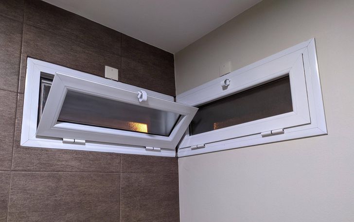
11. “2 windows at my work are always fighting for the honor of being opened.”
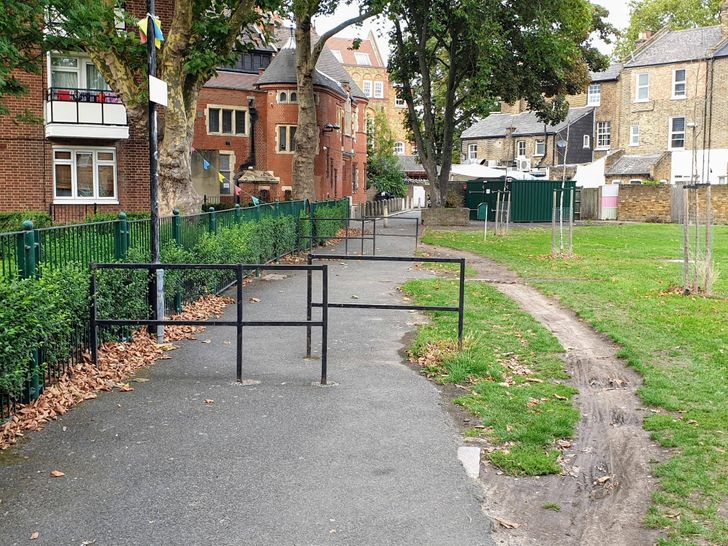
12. “These barriers designed to prevent cyclists from passing through...”
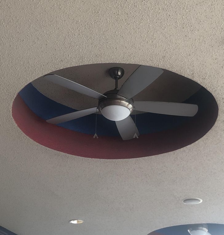
13. “The raised cutout of this ceiling doesn’t allow the fan to suck in any air.”
14. “The pockets on women’s trousers”
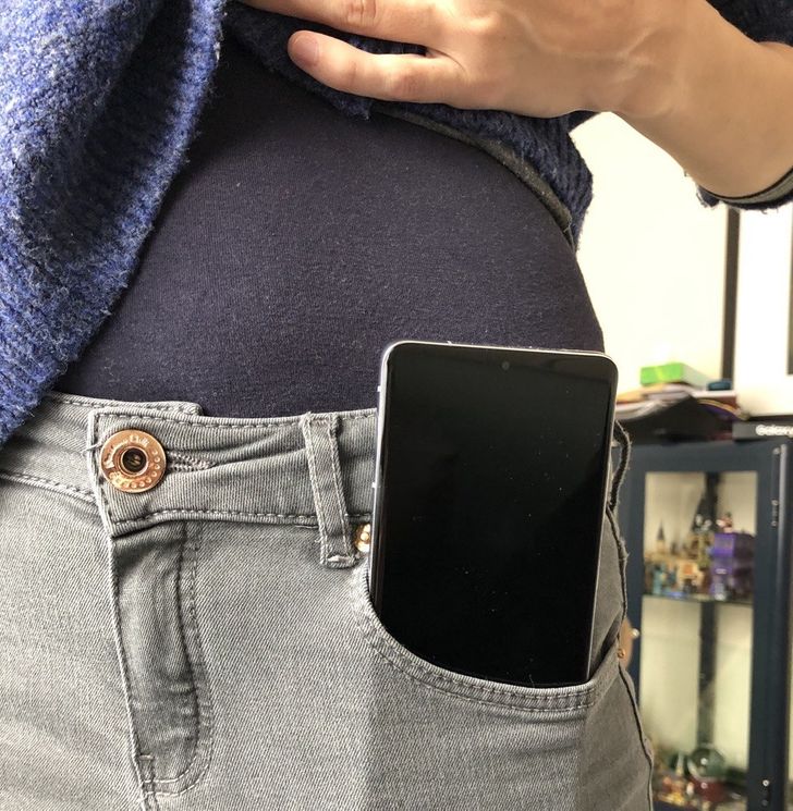
I couldn't understand why people wanted these giant phones while my little Nokia could fit in any pocket. I only switched in 2020.
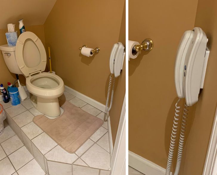
15. “My parent’s bathroom is on a platform next to an angled ceiling so you hit your head every time, and it has a telephone.”
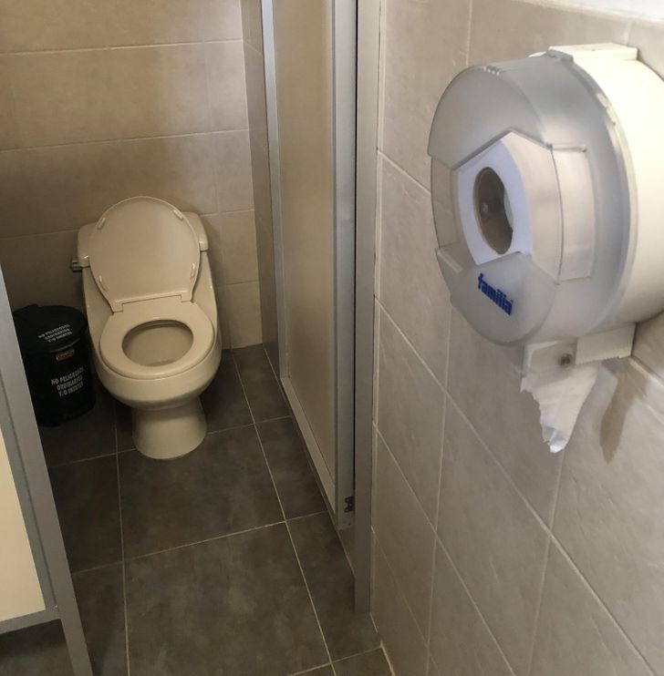
16. “You have to guess how much you need ahead of time.”
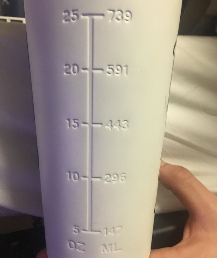
17. “This water bottle has markings to show you how much liquid is in it, but you can’t see through the bottle.”
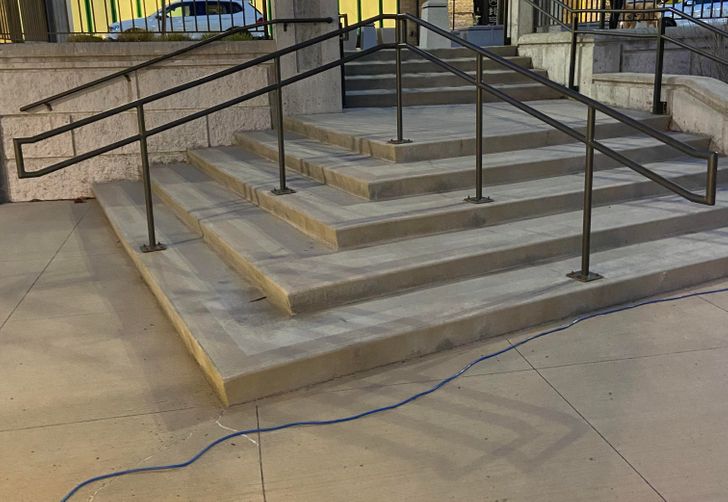
18. “Walked up this, then had to turn around because of these useless railings.”
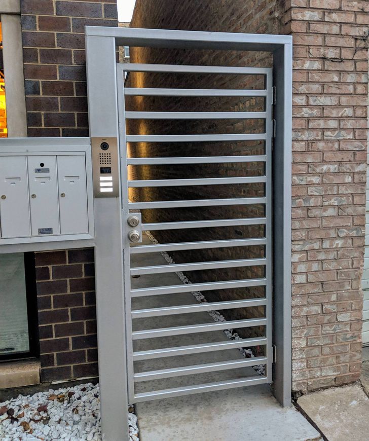
19. “When your security gate is a ladder”
20. “Door? No! Window? Also no!”
Which design fail had you laughing out loud? Do you have a funny one to share?
Comments
#9 - if the phrase "yes, but..." could have it's own sign lol
#12.. Not they are not. They're designed to slow bikes down ahead of the corner.
lol my grandma's bathroom also has a wall phone, but it's pink. It also has no buttons to press. No idea what it's there for.
Related Reads
15+ People Who Know How to Surprise Their Family

20+ Illustrations Proving That There Are Only 2 Kinds of People in the World

20 People Who Discovered Something Unique About Their Bodies
16 Animals That Do Crazy Things and Enjoy It

20 Honest Illustrations That Will Make Every Girl Out There Think, “Is Anyone Watching Me?”

15+ People Whose Savvy Can Outshine the Smartest Minds of the World
13 Real Stories About Coworkers From Hell Who Took Workplace Drama to Extreme Levels

14 Heartfelt Stories That Reveal the Silent Challenges of Blended Families
11 Workplace Moments Where Quiet Kindness Changed Someone’s Life
12 Moments That Prove Quiet Kindness Is the Key to Wisdom That Opens the Heart to Happiness
15 Real Moments Coworkers Became Family Through Quiet Acts of Kindness
15 Acts of Kindness That Prove Quiet Empathy Is the Only Real Superpower
