19 Daily Struggles Only Left-Handed People Would Understand

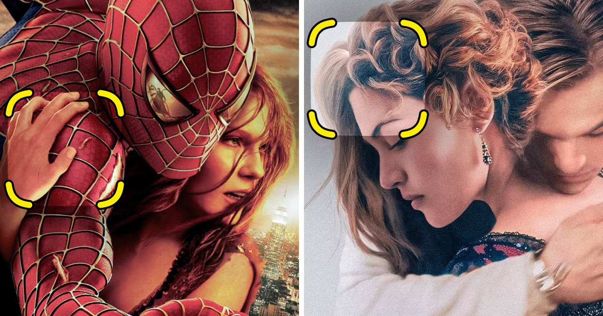
Movie posters often feature characters with exaggerated physical attributes, like people with abnormally long arms and fingers, women with impossibly thin waists, and superheroes defying the laws of physics. These elements can create humorous or uncanny visual effects and can be entertaining for audiences to spot and point out even before movies themselves are released.
One of the best pieces of news yet in 2023, is probably that the legendary Titanic will return to theaters to mark its 25th anniversary. To announce this, the producers have published a super classy looking poster, except for one detail that now is being discussed by thousands of people on the net. Apparently, Kate Winslet seems to have 2 different hairstyles which makes us think that designers couldn’t come to a consensus about her hair.
The poster of Spider-Man 2 features Kirsten Dunst with her hand on Spider-Man’s shoulder. However, it appears that her hand placement may not be anatomically accurate. To have her hand in that position, her shoulder would have to be longer and more slender than it appears, giving the impression that it might have been added as an afterthought, without much consideration given to proportions and anatomy. Plus her thumb doesn’t actually look natural.
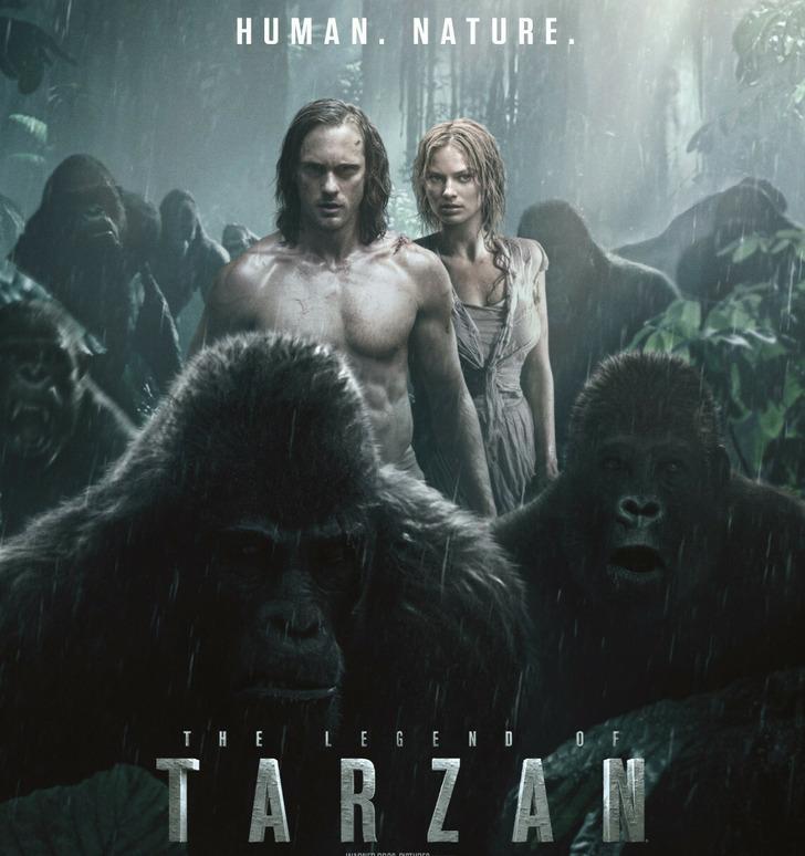
The poster for The Legend of Tarzan is not without its own flaws, however, they are kinda funny. One of the apes on the right appears to be out of place, with an expression that seems different from the other apes in the poster who appear angry and fierce. This poor ape seems to be rather confused or disoriented.
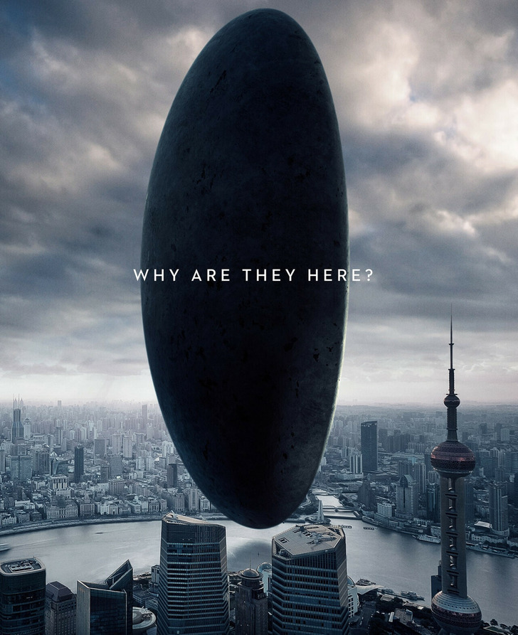
One of the numerous posters for Arrival, featuring a landmark in Hong Kong looks truly impressive. But do you see a unique-looking pointy structure in the bottom right corner? This is the Oriental Pearl Tower, and there is nothing wrong with it except for the fact that it is located in Shanghai, approximately 764 miles away from Hong Kong.
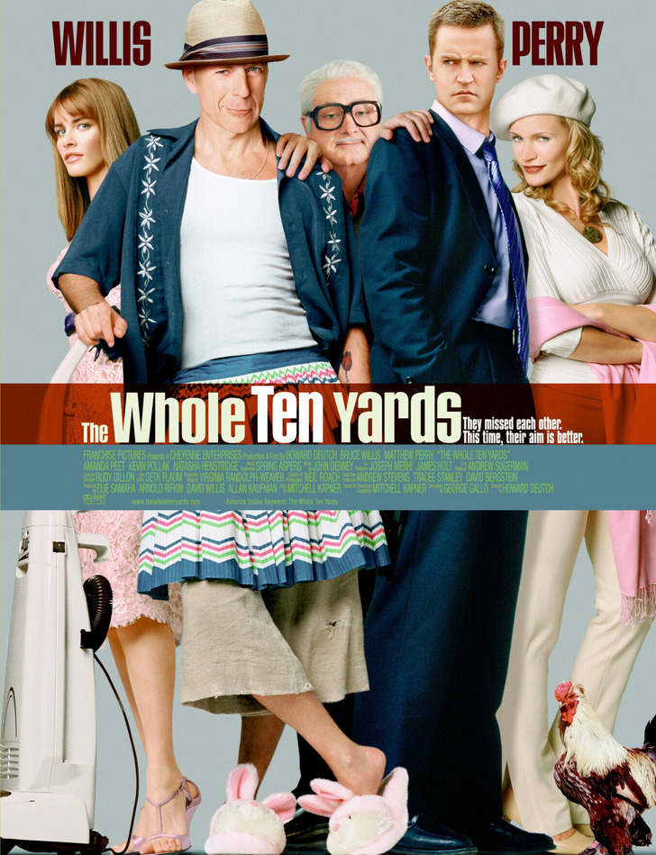
On the poster for The Whole Ten Yards, it is noticeable that the central person’s hands seem out of proportion to their face. Additionally, Bruce Willis’ face appears to match the body in the poster, but upon closer inspection, the legs appear too skinny to belong to Willis.
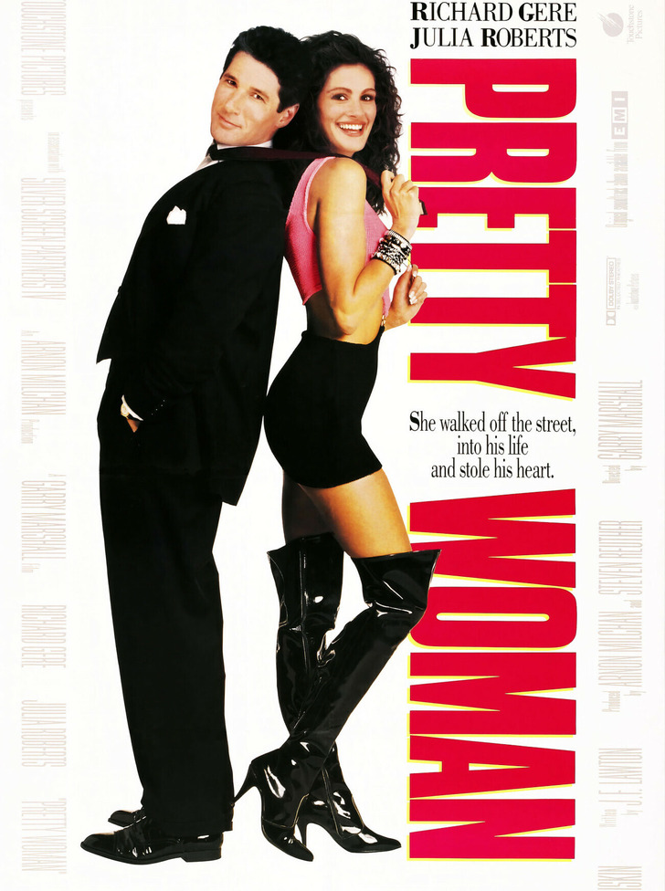
The poster for Pretty Woman actually does not reveal that Richard Gere’s character has dark grey hair throughout the film. Instead, Gere’s hair was significantly darkened in the poster, making it appear more like a wig and it actually merges with Julia Robert’s hair.
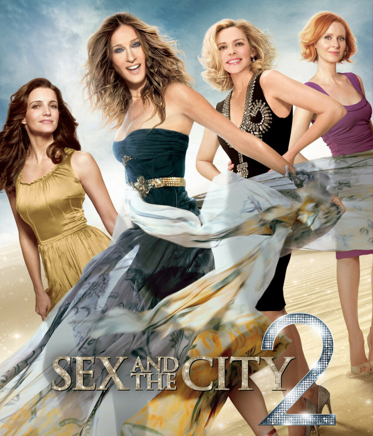
The poster for Sex and the City 2 also has some questions that were even addressed in the media. It’s not clear whether it is a result of a photoshoot or just photoshop but look at the strangely elongated elbow of Kim Cattrall. She doesn’t even look like herself but rather like Sharon Stone. Additionally, Sarah Jessica Parker’s upper arms are thinner than her forearms.

The poster for The Bounty Hunter raises some concerns. Firstly, Jennifer Aniston’s head appears to be disproportionate in size compared to Gerard Butler’s head, which is not accurate (unless Jennifer’s body is a lot longer than we think). Second, Gerard Butler’s position on the poster, sitting on Jennifer Aniston’s left buttock, also seems to be inaccurate and unlikely.
The poster for Heavy Petting appears to show Brendan Hines giving Malin Akerman a kiss on the cheek. However, it is clear that the dog in the image is not original and just photoshopped. The question is also about how the dog is actually standing.
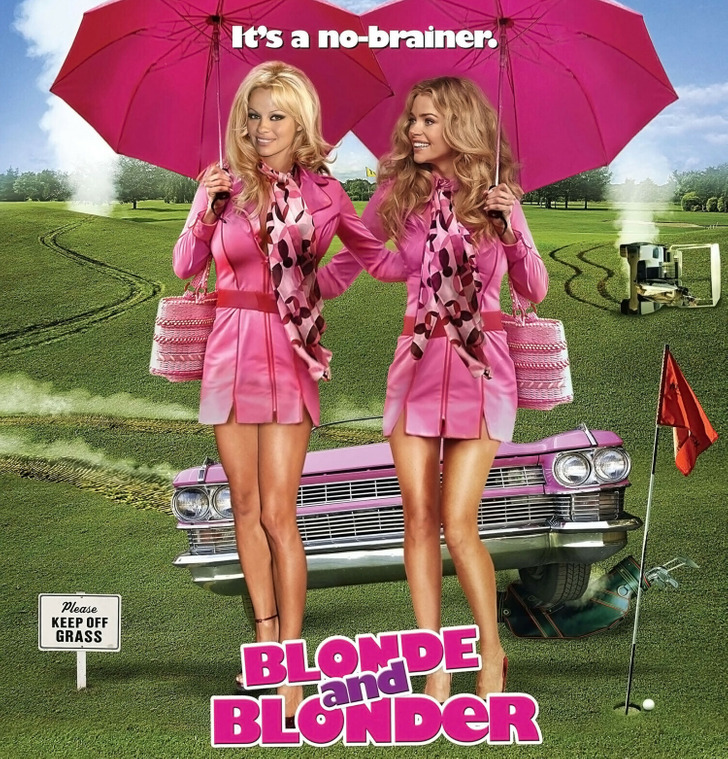
While opinions on the movie Blonde and Blonder may vary, it is clear that the photoshop work on the poster is not well done. The heads of Pamela Anderson and Denise Richards were clearly added to other bodies in an unskilled manner, resulting in an unflattering and unrealistic image of the women.
Do you know of more photoshop fails related to movies? Share your examples with us!
