We all know what it’s like to wake up on the wrong side of the bed. Only it’s even worse when it happens to people who are responsible for designing things for the masses — then we all end up in the same poorly-constructed boat.
We at Bright Side gathered some design school rejects that are almost the emotional equivalent of stubbing your toe.
1. “Yellow as a container color for gallons of drinking water.”
2. “These playing cards with reflective backs. Everyone at the table can see the cards you draw.”
3. “My friend found some fine jean-a on the FB Marketplace.”
4. “I don’t think they understand the gravity of the situation.”
5. “The strawberry syrup is painted on the cup.”
6. “Couldn’t figure out why I kept grabbing the wrong size out of the multipack box. Then realized all 3 sizes come in all 3 colors!”
7. “There used to be a normal bench here.”
8. “Why do I kinda like it tho?”
9. “Taco pizza, but only if you have all of the ingredients at home.”
“The picture on the box is just a ‘visual serving proposal’ it says on the back”
10. “Who thought it was a good idea to put an image of 7 churros above the sign for 3 churros.”
11. “When you have a bowling tournament at 5 and a hot date at 7.”
12. “Misleading >0 fats and sugars in this protein shake.”
14. “Terrible sign color choices.”
15. “Unbalanced pan. Only stands correctly when there is weight in it — pretty annoying and even dangerous with hot oil.”
16. “A bench that doesn’t drain.”
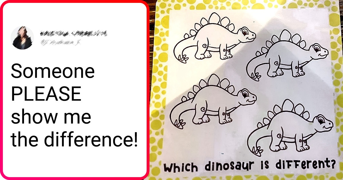
17. “Someone PLEASE show me the difference.”
Which one of these designs sent chills down your spine? Is there anything in your life that bothers you like this? Share pics with us in the comments!
