Packaging is the first impression we get of the products we see on store shelves every day, and even its design and appearance can have an influence on whether or not we finally buy a product. The real question is what happens when designers decide to push the boundaries of creativity and manage to create packaging that is more appealing than the product itself.
Bright Side made a compilation of packaging whose design has left us in awe of its originality.
1. Nutritional supplements inspired by the planets of the solar system
2. “Simple and well executed”
3. Cookies right out of the oven
4. Marmalade, to paint your breakfast with a little color
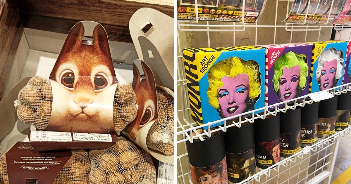
5. A loofah with an artistic touch, if you ask us...
7. Tennis balls turned into peas
8. Face sponges in a very peculiar box
9. A different presentation and a different character for each egg variety
10. Summer inflatables that have made their way to the pool (and the backyard)
11. Why just buy the honey when you can have the whole comb?
12. All the makeup in a single bird
13. A luxurious bottle of canola oil
14. Bath time for the little ones can be more fun with these.
15. Packaging inspired by a river stone
16. Just a bottle of water. Literally.
17. A perfume bottle can also be beautiful to look at
18. A spring makeover for every soda flavor
19. A very unusual package for milk
20. Does anyone know what these cans have inside?
When it comes to buying a product, do you prefer nice packaging or do you not care at all?
