10 Moments Where Kindness Didn’t Argue—It Acted

A logo is the face of a brand. When we see a symbol we know, we subconsciously trust popular brands. This is why designers work really long and hard at creating a simple and easy to remember logo. A good logo should also convey a hidden subtext.
Bright Side found out what secrets are hidden in logos that are known worldwide.
The internet service Airbnb, that people use to find places to stay all around the world, chose a really strange logo that looks like a paper clip. But in fact, the logo has a much deeper meaning than it might seem at first glance. It contains 4 elements: the head of a person that represents a user of their site; the sign for a location on a map — for the place where the house or apartment is; a heart — the sign of love; and all these symbols are combined to make the letter A for Airbnb.
The American website TripAdvisor allows travelers from all around the world to choose the best hotel to stay at, the best restaurant to go to, the best airline to use, and even the most interesting place to visit. On the website, there are a lot of reviews from other users which you can use to help you make your decision. The logo of TripAdvisor looks like an owl which symbolizes wisdom and knowledge, and its eyes symbolize the choice that a traveler will make: green light — they should go, red light — definitely not.
MasterCard, the international payment system, decided to use color psychology in its logo. The red color stands for bravery, passion, and for actions that make you feel joy. The bright yellow color symbolizes prosperity. MasterCard thinks that these qualities are necessary for people who want to become rich, so the colors in the logo meet in the middle.
Dell, the American company that produces computers, highlighted the letter E in its logo for a reason. The founder of the company Michael Dell wanted to convey the meaning of the popular idiom “turn the world on its ear” which means to change something in an unusual way. And separately “to turn (something) on its ear” means turning something upside down. So the company decided to use this wordplay and turned the letter E upside down.
National Geographic, the popular magazine and channel that broadcasts documentaries in 171 countries, made its logo a yellow rectangle. It symbolizes a door that is open to the world of knowledge about nature, science, and culture. The color was chosen for a reason, too: it is a metaphor for the sun that shines over the entire world and is the source of energy and power.
British mobile operator Vodafone chose a couple of mysterious things for its logo that remind many people of an earpiece, but it’s actually just a quotation mark. So, in this case, an open quote stands for the beginning of a conversation. The designers wanted to show that, with Vodafone, users can talk to each other anytime.
Haribo is famous for its gummy bears that are loved by both children and adults. The founder of the company came up with the name all by himself. He combined the first 2 letters of his first and last name Hans Riegel and added the first 2 letters of his hometown Bonn. Hans used to sell sweets at fun fairs where there were dancing bears and he used this memory as an inspiration for the shape of his candy.
The arrows on the first and last letters of the Subway logo are there for a reason: they stand for the entrance and the exit to the subway. This way, the company demonstrates that with Subway you can eat... on the subway. The colors play a huge role, too: the green color symbolizes the fact that the company is an advocate for healthy food and supplies only good quality products, and the yellow stands for joy, optimism, and fun.
The famous company DC Comics decided to change their logo in 2016. Their fans were furious and asked the company to return to the logo they had become accustomed to. But nobody even knew how much of a hidden meaning there was behind the new design. The co-founder of the company Jim Lee revealed on his Instagram account what the new logo actually means: The nooks and angles are meant to evoke the Superman “S” symbol, the Wonder Woman “WW” emblem, and the Bat logo."
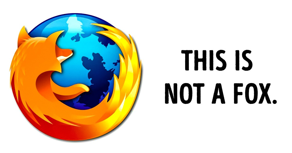
The famous web browser Mozilla Firefox put a fox on its logo that circles the entire planet. But what if we told you that this is not a fox but a red panda. The thing is, “firefox” is the English translation of the Chinese name for a red panda. This way, the company wanted to demonstrate how unique they are because this is a very rare kind of panda that is endangered. And in 2010, Mozilla Firefox even adopted 2 red pandas and took responsibility for their lives.
If you look closely at the logo on an Orbit pack, you will notice that the capital “O” is split into 2 parts: one dark and one light, and in the background you can see the image of an orbit. So, it’s clear that the “O” symbolizes day and night and a planet revolving around the Sun.
Which logo amazed you the most? Tell us in the comment section below.
