I don't know about you guys, but I love a good old rustic kitchen ?
11 Home Design Trends That Used to Be Popular, but Are Completely Out of Style Now
According to statistics, about 30% of people who decide to redecorate their houses prefer contemporary interior design. But it might be pretty difficult to bring these ideas to life because we often receive plenty of controversial advice, and fashion trends are constantly changing.
Bright Side follows the trends, so we decided to figure out which design ideas we should ditch and which modern approaches can replace old-fashioned trends.
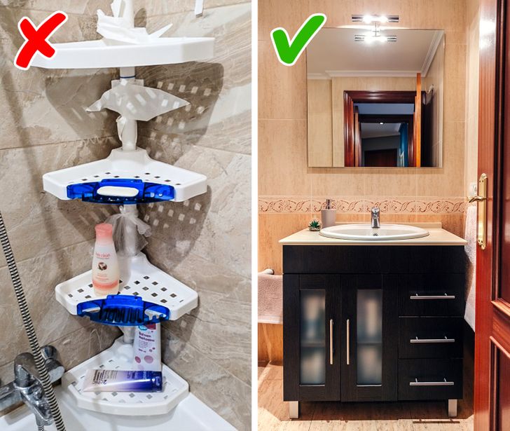
1. Plastic bath corner shelves
Plastic objects, especially when they’re placed near ceramic tile, make the interior look cheaper. Plastic corner shelves also visually make the space narrower, so a small bathroom will look even smaller with this detail. Instead, it’s better to just keep the products you use every day in the bathtub and hide the rest of them in the under-sink cabinet.
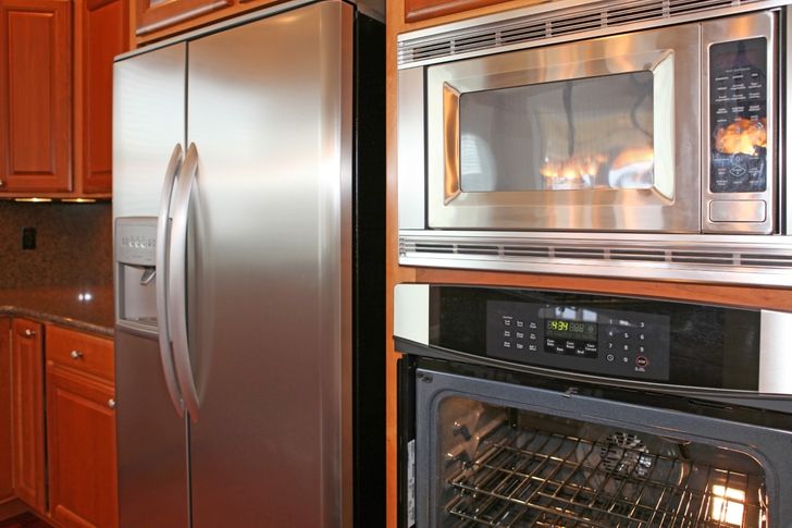
2. Metal surfaces
Industrial kitchens became popular in the 1990s. Many people wanted their kitchens to look professional, just like the ones in big restaurants. So they used different metal textures and surfaces to achieve this effect.
Today, this style isn’t popular anymore. The overuse of metal makes the design look bulky, while cold shades turn the room into an uncomfortable and alienated space. Now, designers recommend choosing lighter materials and colors.
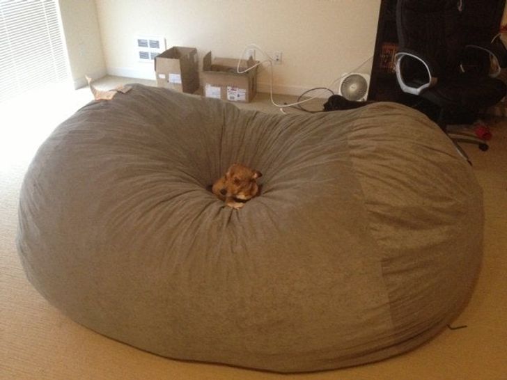
3. Beanbag chairs
At first, beanbag chairs were placed in offices where employers wanted to create a comfortable environment for their employees. But office workers probably enjoyed them so much that they decided to have this piece of furniture in their homes as well. But beanbag chairs have been considered old-fashioned for a couple of years, and designers suggest replacing them with armchairs or more modern-looking chairs.
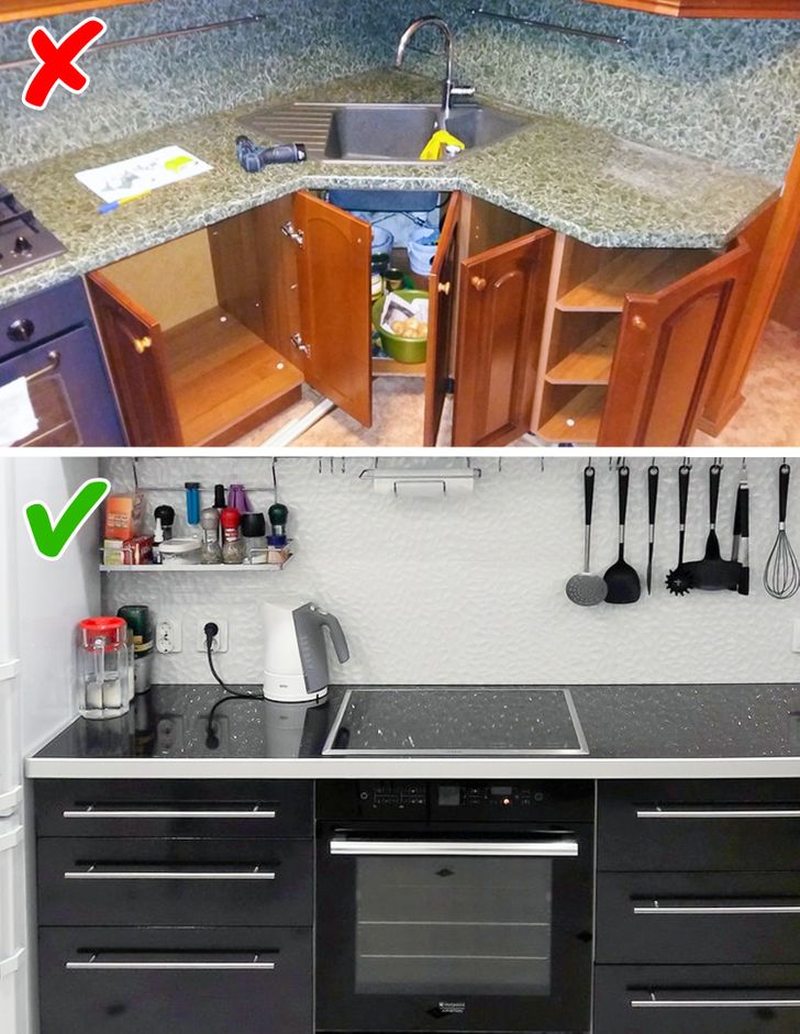
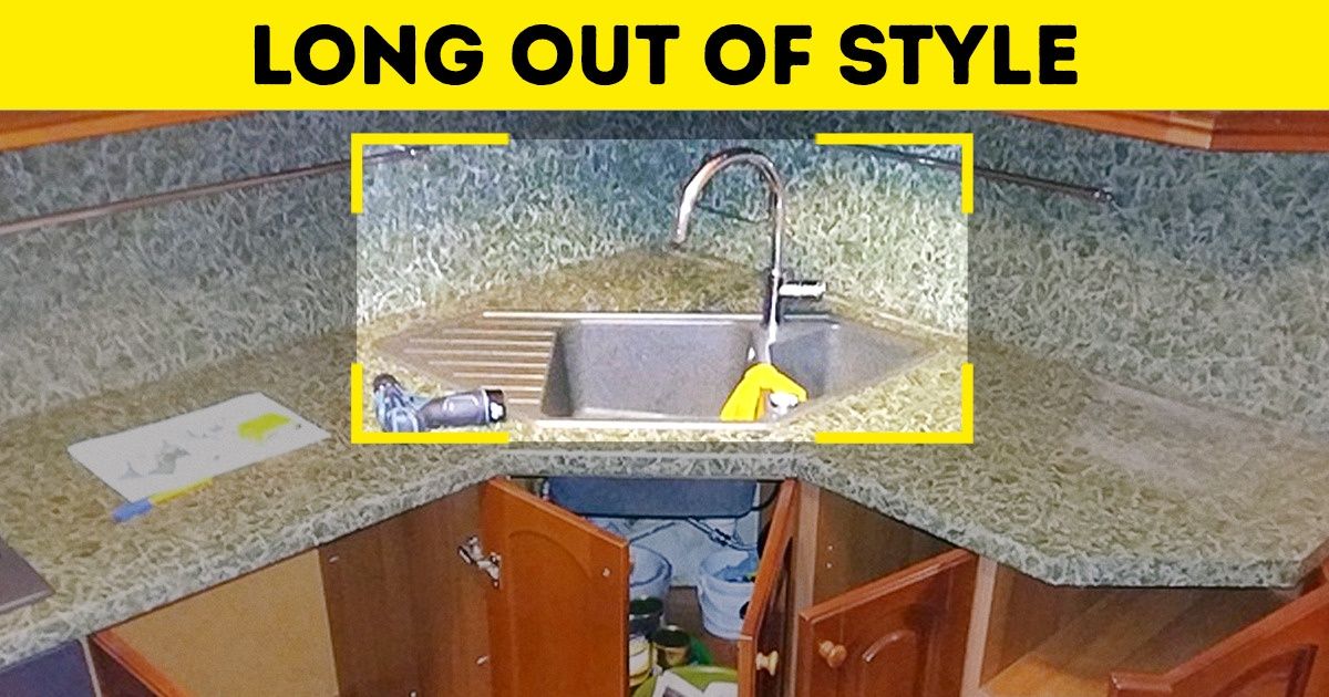
4. Countertops made of gray or brown granite
Granite countertops that were once popular are experiencing a new low right now. It seems like we can find them in every other apartment and they automatically make even the new interior seem obsolete and unfashionable. So when choosing kitchen surfaces, it’s better to choose either plain matte or glossy shades.
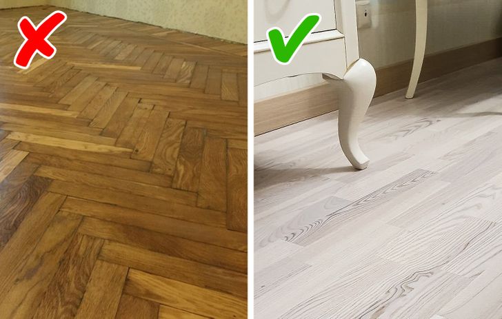
5. Herringbone parquet
Wood parquet is considered a high-quality flooring material. So people often choose it when redecorating their houses. And thanks to the variety of layout options, it’s pretty easy to get confused. That’s why many people choose the Herringbone parquet out of the habit. But this option instantly makes the atmosphere in the house feel old-fashioned. If you still don’t want to go through too much trouble when choosing a layout, the Herringbone parquet can be replaced with a classic rectilinear pattern, which also visually makes the space appear bigger.
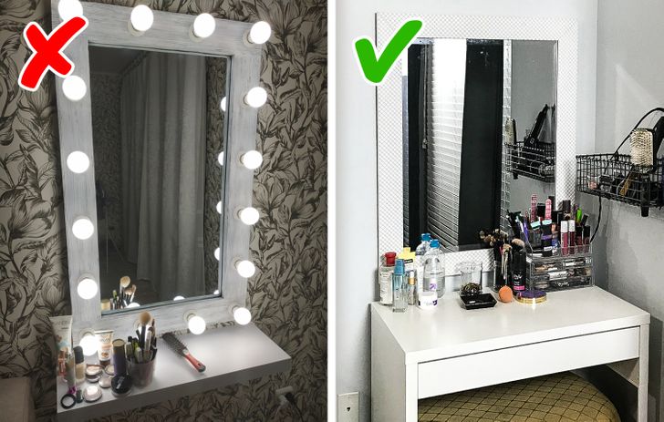
6. Hollywood mirror lights
A mirror surrounded with small light bulbs has become a dream for many Instagram fashionistas. Every woman wants to feel like a star, but unfortunately this interior element is likely to leave us out of fashion. It’s possible to replace the Hollywood mirror lights and dressing table with a neutral design and softer lighting.
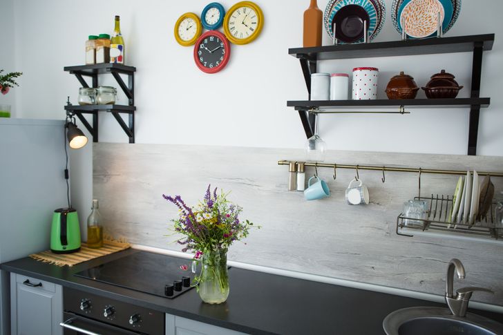
7. Rustic kitchens
Rustic kitchens became popular at the same time that industrial kitchens took off. But soon, interior designers realized that they look very inappropriate in an urban environment. Plants on the windowsills and cozy shelves look nice with a garden view and not when your windows are facing the neighboring high-rise buildings. That’s why designers recommend opting for an eco-friendly style instead of rustic kitchens. Green colors and natural materials also show how close the owners of the house are to nature, but at the same time, will look more suitable in an apartment.
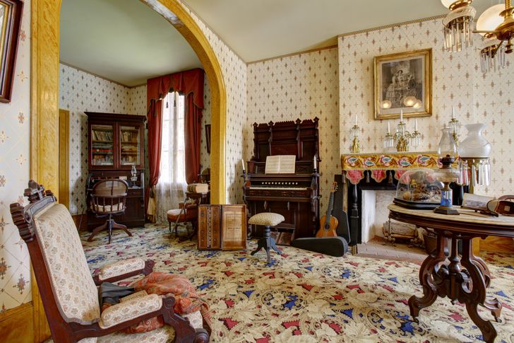
8. “Heavy” classic style
Baldachins, dark velvet, natural wood, and gilding have been overused for a long time. Now, this pretentious and excessive aesthetic have replaced by more subtle design ideas and minimalism. Designers choose light flowy curtains, instead of heavy curtains, velvet gets replaced with linen and cotton, and wood or silver are more on trend than gilded details.
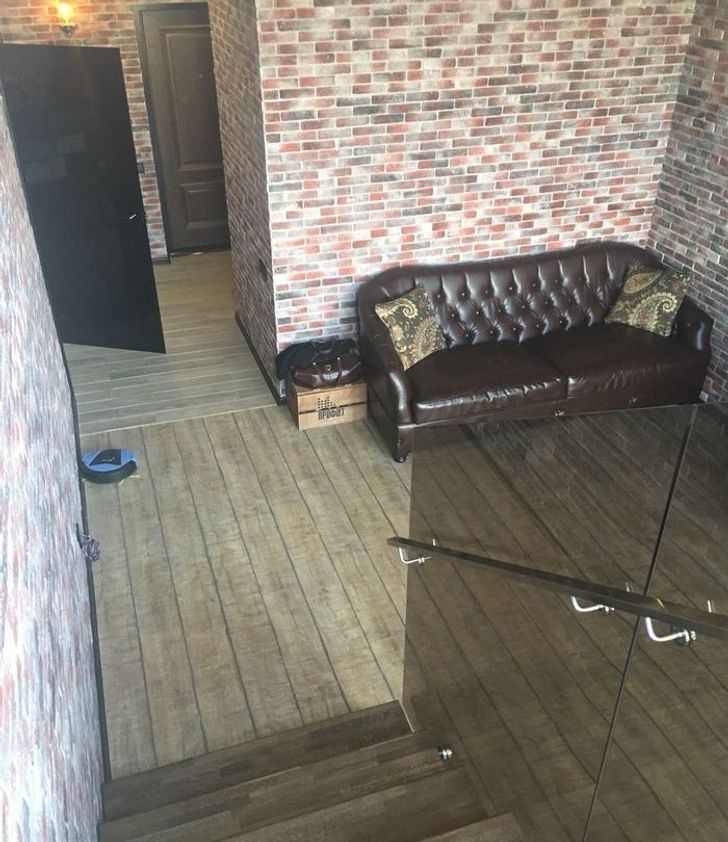
9. Loft-style brick walls
When interior designers were creating the loft-style, they were inspired by factory spaces with brick walls. At first, cafes and restaurants liked this idea. And then their visitors started to used brick walls in their apartments and buy Edison bulbs as well. But like all industrial design, this loft-style became too wide-spread and, as a result, went out of style. Now, it’s been replaced with an eco-friendly style that is full of natural colors and wooden structures.
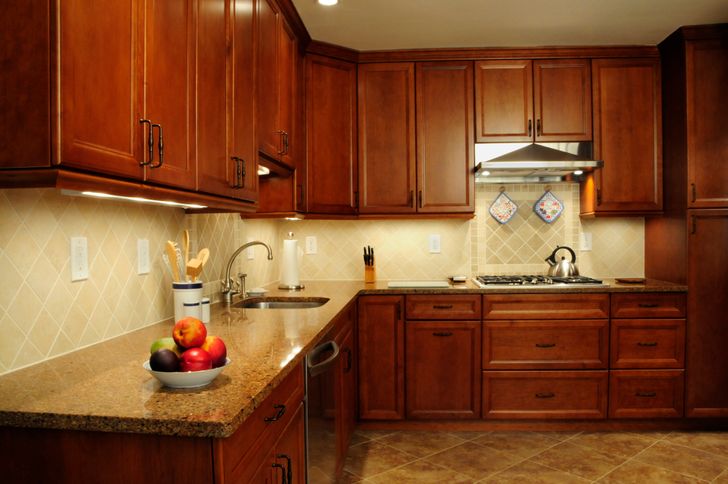
10. Cherry wood cabinetry
Dark-red cherry colors are especially popular in kitchen designs. But they make the furniture look heavy and make the room look old-fashioned. Interior designers advise choosing wood in lighter colors that will make the kitchen look more fresh and modern.
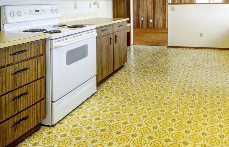
11. Linoleum in old-fashioned prints
Linoleum is considered a cheap and practical material, but it makes the interior look totally unsophisticated. This is especially true if a person chooses the typical prints that you can also find in hospitals, schools, museums, and libraries. So it’s better to choose wood or tile instead. Of course, these materials cost more, but they’re longer-lasting and will look much better in your interior.
What interior ideas do you think are completely out of fashion now?
Comments
Thank God those Hollywood mirror are over now ???
I don't care about beanbag chairs, the little dog on it is a cutie
3. Reading this while sitting on my beanbag ? fave
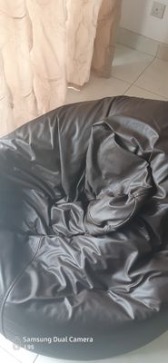
everything look okay though
Related Reads
17 People Who Are the True Minions of Lady Luck

15 Moments of Compassion That Showed the World the Strength of Kindness
I Refused to Pay for My Son’s Wedding Even Though I Paid for His Siblings

13 Beautiful Stories That Prove a Mother’s Love Heals All Wounds

I Refused to Meet My Dad’s New Girlfriend—He Destroyed Our Family Happiness for Her

I Refuse to Name My Baby After My Mother-in-Law, She Crossed a Line

My Neighbor Refused to Help My Autistic Son, She Wasn’t Ready for My Revenge
I Refuse to Repay My Dad for My College Tuition—Now I Know Why He Really Needs It
14 People Who Accidentally Discovered Their Stepparents’ Hidden Secrets
13 Teachers Who Didn’t Just Teach a Subject, They Rescued a Soul
12 Moments That Remind Us Kindness and Compassion Quietly Build What the World Breaks
11 MILs Who Stepped Up When Families Needed Them Most

