16 Designers Who Threw Their Common Sense Out the Window and Made Us Suffer
Curiosities
4 years ago
Even the most famous places can take more than one sight to fall in love with them. For example, the Flatiron Building in New York was initially called “awkward” and received a lot of criticism. However, it later became one of the most well-known signature buildings in the city. With that said, some designers’ creative ideas are less fortunate and never get appreciation.
We at Bright Side want to share 16 examples of designs that are not likely to grow on us anytime soon.
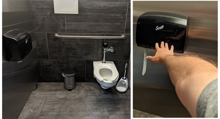
1. “I’m 6’2” and couldn’t reach the toilet paper."
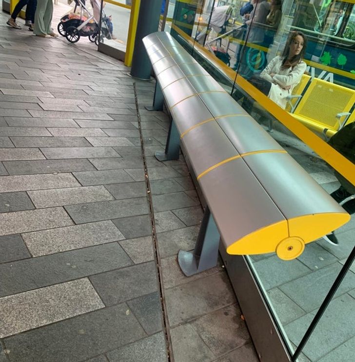
2. “You just slide off this bench every second.”
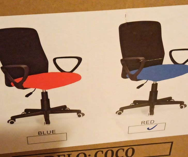
3. “Colored the chairs, boss.”
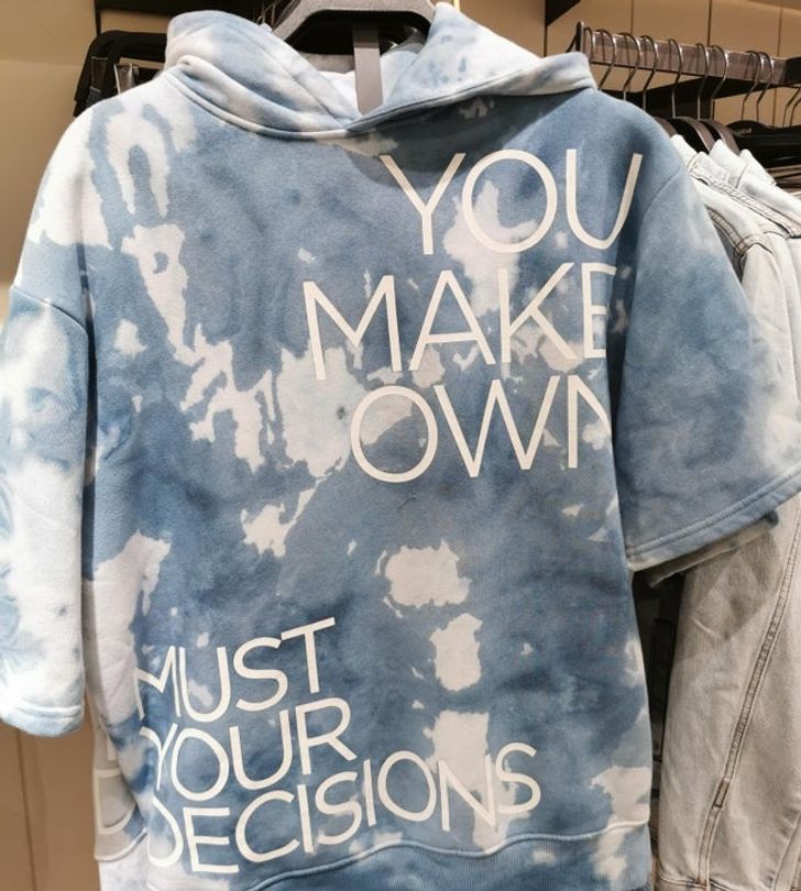
4. “This shirt I saw in the store today.”
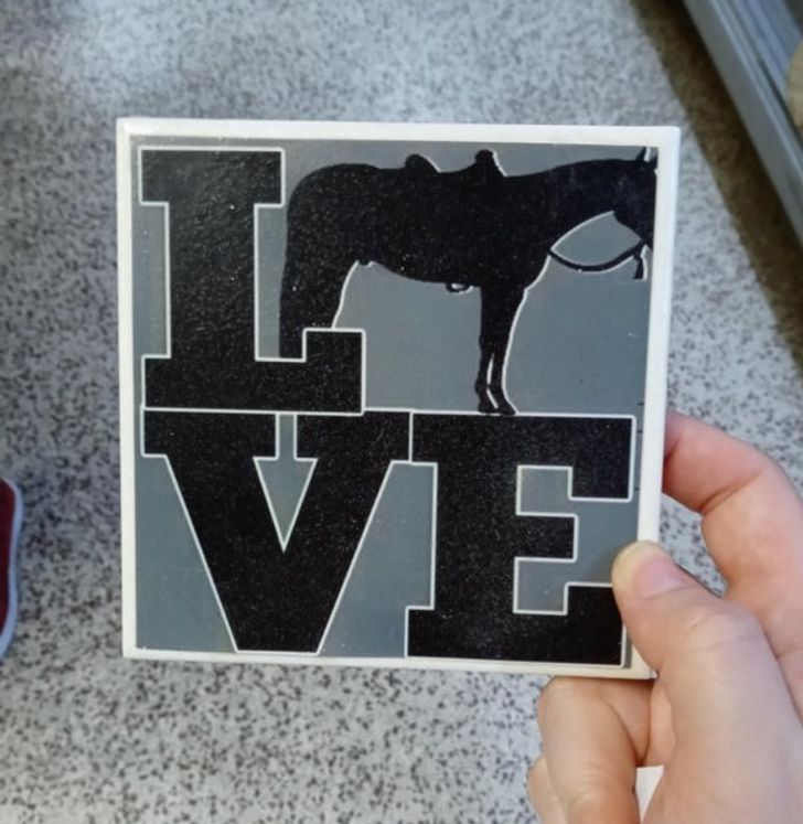
5. “What letter is the horse with half a face supposed to be?”
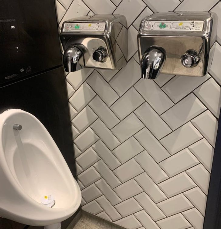
6. “An inconveniently placed hand dryer.”
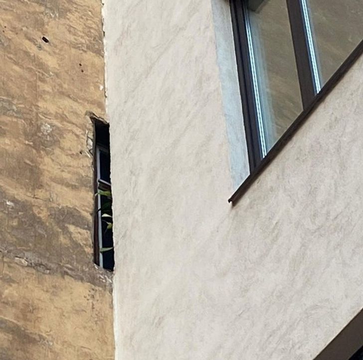
7. “This apartment’s window”
8. “Is the low actually low, or is it medium? I still haven’t figured it out.”
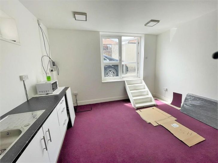
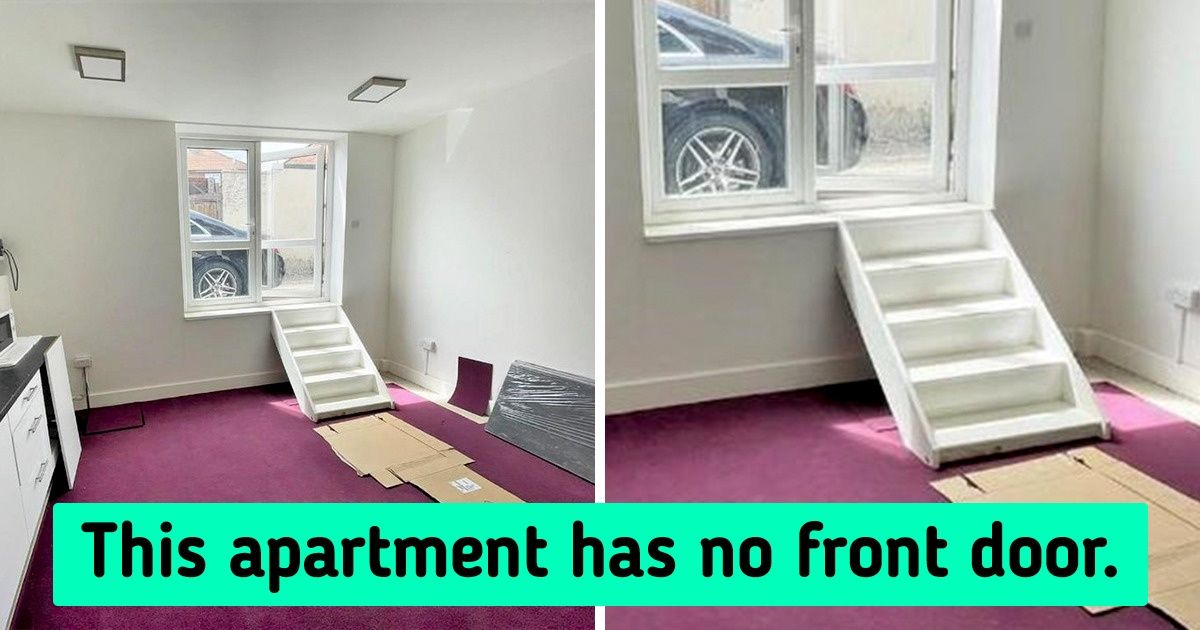
9. “An apartment in London that has no front door, just a set of stairs leading up to a window”
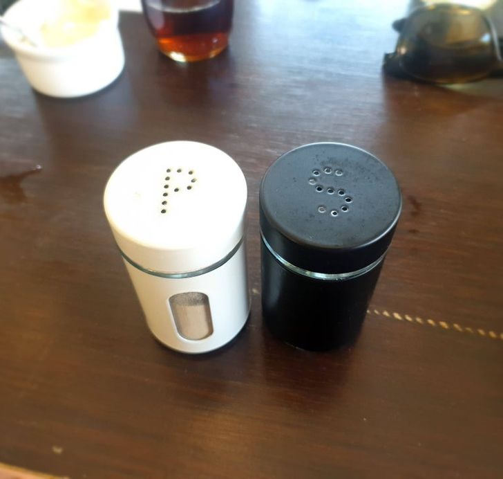
10. “Did you want salt or pepper? Wrong!”
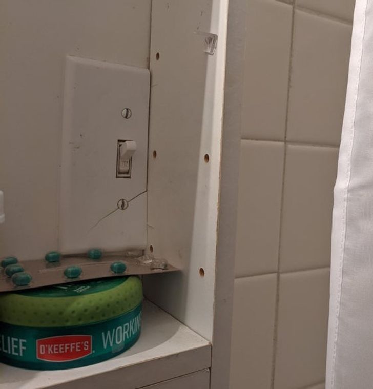
11. “I spent 5 minutes searching for the light switch until I opened the MEDICINE CABINET.”
12. “Found this ad for lemonade while shopping.”
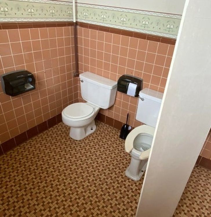
13. “This bathroom at my college.”
14. “This tea will change your image size ratio!”
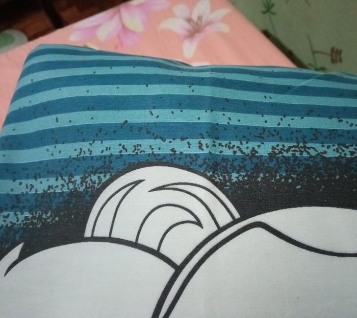
15. “The design of this pillowcase makes it look like there are bugs crawling on it.”
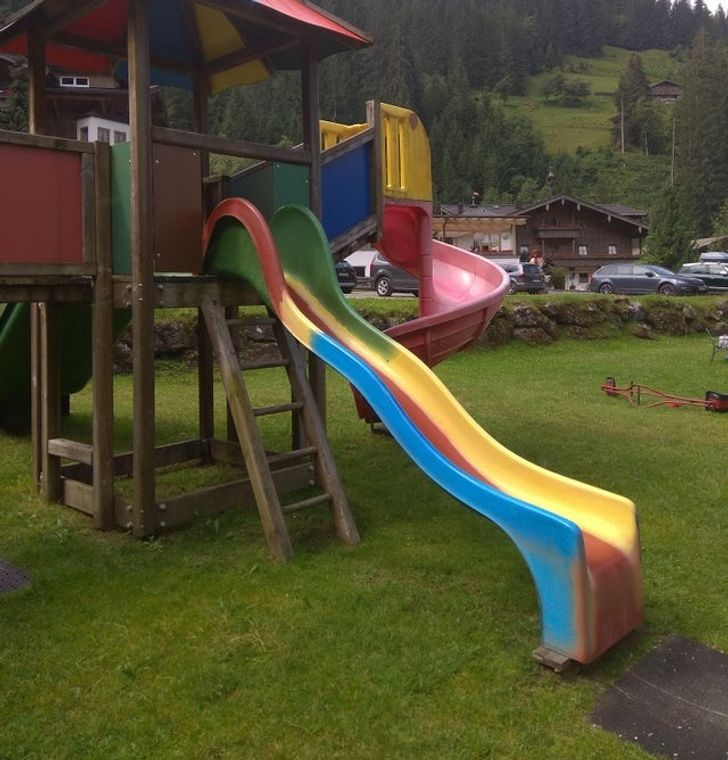
16. “My kid had some issues using this slide.”
Which of these would get “The Best Worst Design” award, in your opinion?
Preview photo credit Lord-Crimble / Reddit
Comments
Get notifications
Lucky you! This thread is empty,
which means you've got dibs on the first comment.
Go for it!
Related Reads
16 Ingenious and Funny Designs That Are Surprisingly Neat
Design
4 years ago
20 Designers That Tried Really Hard to Make Our Lives Difficult

Design
5 years ago
Residents of 10 Countries Share the Things Tourists Do That Annoy Them

Places
6 years ago
21 Coincidences That Will Make You Go, “No Flipping Way!”
Curiosities
4 years ago
15 People Who Proved That Deception Is Waiting for Us Around Every Corner

Curiosities
5 years ago
15+ Rare Examples of When People Got Lucky With Both Their Expectations and Reality
Curiosities
4 years ago
15 Stories That Prove Kindness Is Worth Fighting For

People
2 months ago
I Refused to Lie for My Manager About Missing Funds—Now HR Wants a Meeting With Me
People
month ago
20+ Moments That Prove Grandma’s Kindness Is the Thread That Holds the Family Together
Family & kids
month ago
I Absolutely Refuse to Let a Newbie Steal My Promotion and Make $45K More Than Me
People
2 months ago
I Refuse to Fund My Stepgrandson’s Education, I’m Not a Charity Foundation
Family & kids
2 months ago
My Boss Treated My Child’s Surgery Like a Joke — I Went to HR

People
month ago
