how is that inpossibe theres cant between the k and i
11 Logos That Aren’t as Simple as We Thought
The origins of many familiar logos that we encounter on a daily basis are shrouded in mystery. Some logos feature hidden messages and symbols that designers intentionally created to increase the appeal of well-known brands.
1. A smile
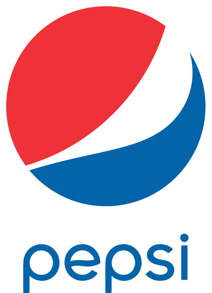
The Pepsi logo is circular, with a red upper half and a dark blue lower half, separated by a white swirl. The combination of these colors resembles a smile, a widely recognized symbol of happiness and friendliness.
By incorporating a smiley face, Pepsi aims to create a less formal and more approachable image, conveying a sense of friendliness and trustworthiness to its customers. This logo design suggests that Pepsi’s main goal is to bring joy and satisfaction to its consumers through its products.
2. A word hiding in the logo
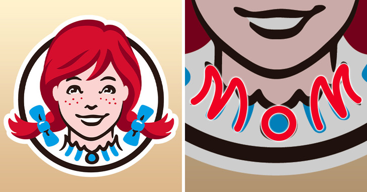
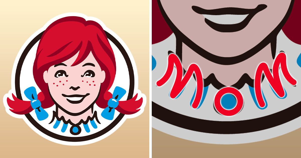
In 2013, the fast-food chain Wendy’s revealed a new logo for the first time since 1983. The previous logo featured boxy Western lettering, but the new design features a more modern and streamlined Wendy’s icon, along with casual handwritten lettering. Interestingly, if you observe the logo closely, you’ll notice that the word ’mom’ is hidden in Wendy’s collar.
3. A fairy, not a falling star
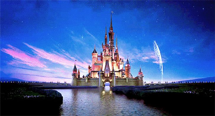
The Walt Disney Pictures logo is a common sight at the beginning of most movies produced by the studio. The logo features the fairytale castle from the stories of Sleeping Beauty and Cinderella, modeled after the Neuschwanstein castle near the German town of Füssen, which belonged to Ludwig II of Bavaria.
What many people do not realize is that the flying object above the castle is not a falling star, but Tinker Bell, the fairy from Peter Pan.
4. Candy in the logo
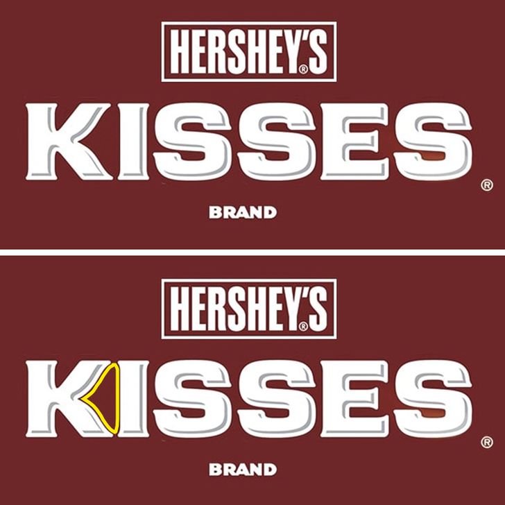
The logo of the famous American chocolate brand, Hershey’s Kisses, cleverly incorporates the shape of the candy itself, which resembles a small droplet.
5. The logo of an electric car company and ovaries
Tesla Motors was established by Martin Eberhard and Marc Tarpenning, two engineers, in July 2004. The company was named after the Serbian inventor Nikola Tesla.
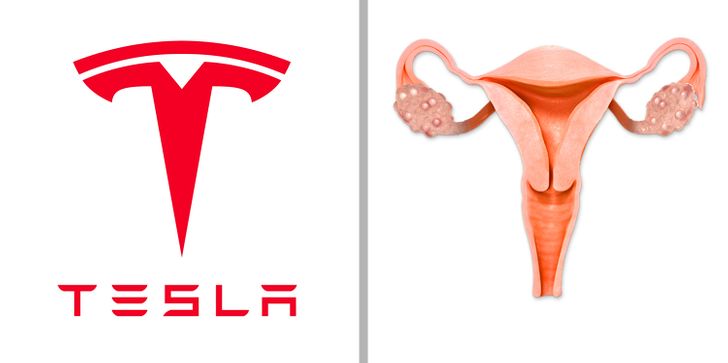
There are various opinions on the origin of Tesla’s logo on social media. Some users believe the female reproductive system inspired the logo, while others believe it resembles a cat’s nose.
However, the logo depicts a segment of an electric engine that Nikola Tesla invented in 1883.
6. This man is actually Frank Brown.
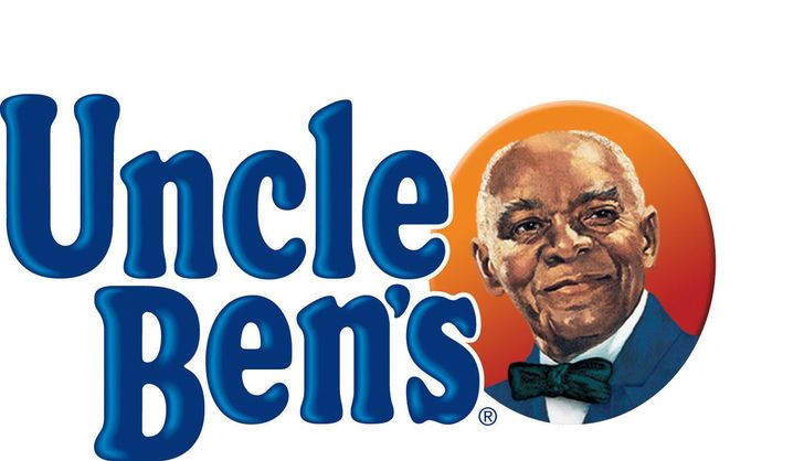
The well-known brand of parboiled rice and other food products debuted in the American market in 1943. Since 1946, the company’s logo has featured an image of an elderly black man wearing a bow tie. The man is believed to be based on a Chicago maître d’hôtel named Frank Brown.
The company’s owners spotted him during their dinner at a Chicago hotel and offered him payment for the rights to use his likeness as their trademark. The man’s friendly and welcoming demeanor was a good fit for the brand’s image.
7. Space meatball
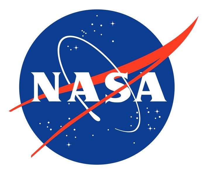
The iconic NASA logo, humorously referred to as the “meatball,” was created by James Modarelli, a NASA employee, in 1959. The design incorporates various elements related to aeronautics and space exploration.
The circular blue shape represents Earth, while the stars symbolize space. The red wing evokes the image of flying, and the spacecraft orbiting the agency’s name represents space travel.
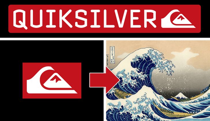
8. The famous painting in the logo of a fashion brand
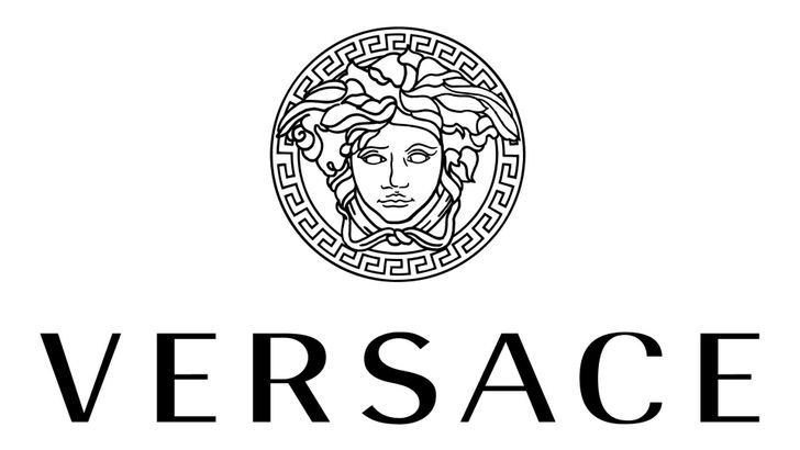
9. The logo that is supposed to hypnotize you
The renowned fashion brand Versace was founded by Gianni Versace, who created the brand’s iconic logo in 1987. The inspiration for the logo came from the sculpture of Medusa Rondanini, which portrays the transformation of Medusa from a repulsive creature to a stunning woman.
The designer chose Medusa as the symbol for the brand because of her power to captivate and enchant those who looked at her, leaving them with no escape. He intended for the logo to have a similar effect on those who wore Versace’s clothing and shoes.
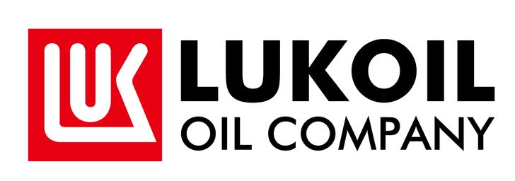
10. The cities encrypted in the name of the company
The name of the company is derived from the combination of the first letters of three oil-producing cities in Russia: Langepas, Uray, and Kogalym, known as LUK, and the word “oil.”
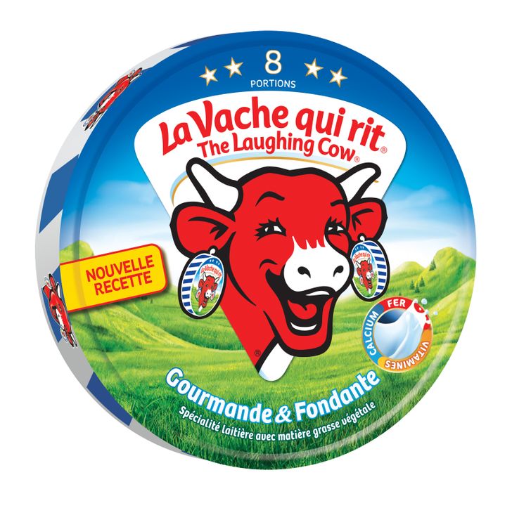
11. Droste-effect
The logo of The Laughing Cow, a French processed cheese brand, features a cheerful cow wearing earrings. The earrings depict the same cow with the same earrings, and this pattern repeats infinitely. This design technique is known as the Droste-effect, which adds an element of mystery and memorability to the logo.
These are not the only secrets that our favorite logos keep. For example, the TripAdvisor logo features an owl, often associated with wisdom and knowledge. The owl’s eyes are designed to represent travelers’ choices when using the platform: green for “go” and red for “stop”.
Comments
Related Reads
Curious Features of the Female Body Even Women Themselves May Not Know About

15 Riddles That Will Leave You Scratching Your Head
16 Examples of Cosplay That Are Even Better Than the Original
15+ Tattoos That Show Not Every Ink on the Body Is Art
15 People Who Changed Their Gender and Proved It’s Never Late to Do What Your Heart Says

20 Furry Accidents That Made People Run and Grab a Camera

People Shared 20 Text Messages That Can Make You Laugh and Cry

12 Stories With Plot Twists That Even Hollywood Writers Couldn’t Invent

12 Moments That Show Quiet Kindness Brings the World Together

13 Real Kindness Stories That Prove Compassion Can Change a Life

10 Stories That Show Online Shopping Could Turn Into Pure Chaos
10 Moments Where Kindness Didn’t Argue—It Acted
