10+ Illustrations That Can Make You Want to Use Every Second of Your Life to the Fullest

Everyone wants to have a cozy place to come home to after a long working day. But when we attempt to decorate our homes, we sometimes try a little too hard, making big mistakes that are really hard to fix.
We at Bright Side keep track of trends, not only in fashion but in interior design as well. Today, we’re presenting a compilation of things that can make even the best apartment look like an eyesore.
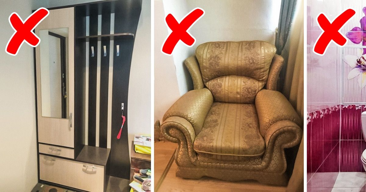
Hallways are often the first place in a home or apartment that a person sees when they walk in. This means that they serve as the first impression of your home. Cheap and massive pieces of furniture look outdated and can ruin the overall impression of your place. A great alternative would be hooks drilled right into the walls or a decorative panel. Additionally, regular hangers that can be moved around are great for almost any interior design scheme.
Shiny stretch ceilings are considered to be a thing of the past. Designers don’t recommend using bright colors or multi-level construction. Simple, white, matte ceilings are the best solution. Besides, the simplicity will make your renovation much cheaper.
According to designers, gold or crystal moldings are signs of bad taste. Nowadays, the simpler, the better. So, it’s better to replace the really bright door knobs with neutral-looking metal ones. If you want to make the interior a bit more creative, you can add antique knobs if they look good with other elements in your home.
People install plastic protectors because they want to make the edges look neater. However, this only makes the overall impression more artificial.
Some designers believe that compartment wardrobes, in general, are outdated. Especially those with different patterns and photos on them. If you can, it’s better to buy a classic wardrobe closet with normal doors. If you have a small apartment, don’t buy massive wardrobes.
In the past, massive heavy couches were a symbol of financial stability and luxury. But now, everything is different. Massive armrests are being replaced with simple shapes and smaller designs. Designers say that modern couches and armchairs have to be both comfortable and ergonomic. And such furniture shouldn’t take up half of the room! Remember: the smaller the room, the smaller the furniture.
These monumental sets of furniture don’t look modern anymore. It’s hard to make such furniture look natural and it’s practically impossible to move them, even when you want to. There’s absolutely no need to buy entire sets today. Open shelves and elegant bookcases will make your living room lighter and more aesthetically pleasing. And when you want to change something, it will be very easy to do so.
Designers strongly recommend ditching photo prints on kitchen walls. Giant flowers, fruit, coffee beans, underwater creatures, and the night cityscapes make kitchens look cheap. It’s better to choose matte glass that will add a nice touch to the overall look of the area.
There was a time when having bar counters with metal legs was really trendy. But today, it’s more of a look straight out of the ’90s. It looks awkward and makes the kitchen appear messy. There are a lot of minimalist-looking bar counters that appear way more modern.
Shower stalls with high thresholds are another anti-trend. Not everyone can step this high up and it’s not very comfortable. Additionally, if the cabin is made of plastic, it has to be cleaned more often. Finally, such stalls take up a lot of space and don’t look very modern. Simple stalls made of glass are more popular now.
Nowadays, designers recommend choosing tiles boasting more natural-looking colors, like those of stone, wood, or concrete, rather than hues found in flowers and other patterns.
Visible pipes can ruin even the sleekest of designs. For some reason, pipes connected to towel warmers are often left in plain sight. They should be concealed to make the room neater.
Just around 10 years ago, jacuzzis were a symbol of wealth. But today, they’re a signal of bad taste. Such a massive piece takes up a lot of space and requires special care. Again, more minimalistic-looking bathtubs of simple shapes (like oval, round, and rectangular) are more popular now.
It used to be trendy to make lamps built into the ceiling. But now, this is an anti-trend. This can make a room appear more like an office rather than a place to live. To make a room cozier, it’s better to use table or floor lamps or single chandeliers on the ceiling.
In your opinion, what interior design trends look tasteless, and what parts of this article did you disagree with?

