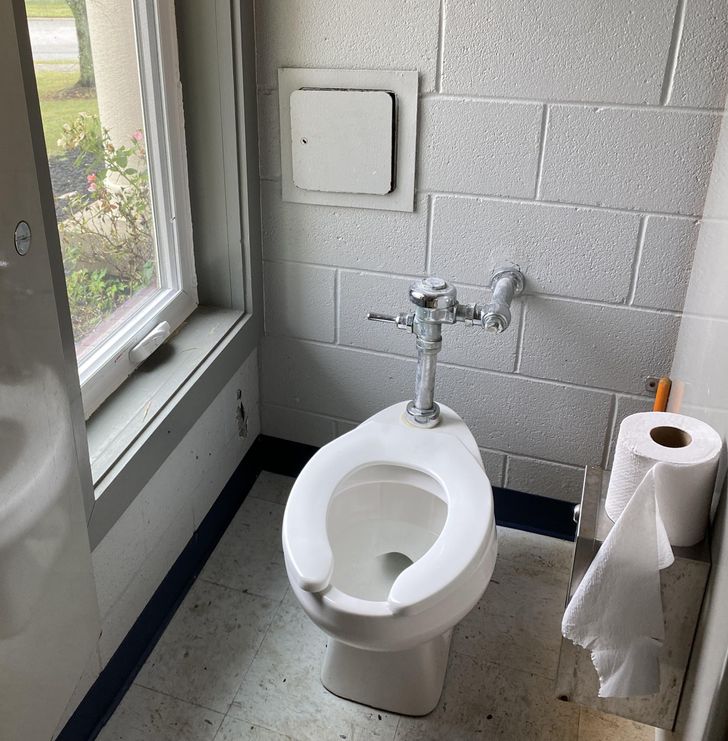
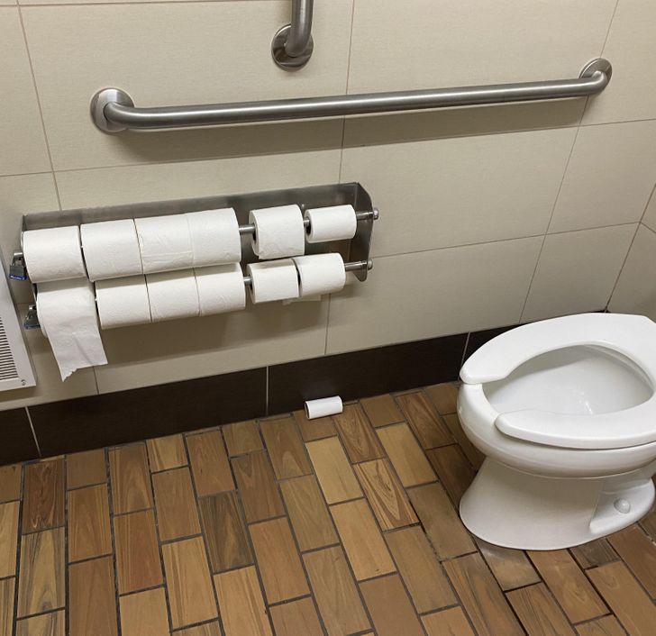
#13 is perfectly normal in situations where there's nobody on-site to tend to the toilet. Typically pit toilets in high use areas of national parks, but I have seen it with flush toilets at a trailhead.
17 Designers Who Value Creativity Over Functionality
Have you ever come across a situation where you got really confused, asking yourself, “How is this supposed to work properly?” It can happen because of a designer’s lack of attention to detail, or because of an excess of creativity. But if you have been through this before, you know the feeling of being let down by something that is supposed to make your life easier, or at least not to make it harder (or even impossible).
Thanks to the designers that were out of their minds during their creation process, we are here at Bright Side to show you that these mistakes don’t have to be just unnerving and frustrating, they can also make you laugh — especially if it’s not happening to you.
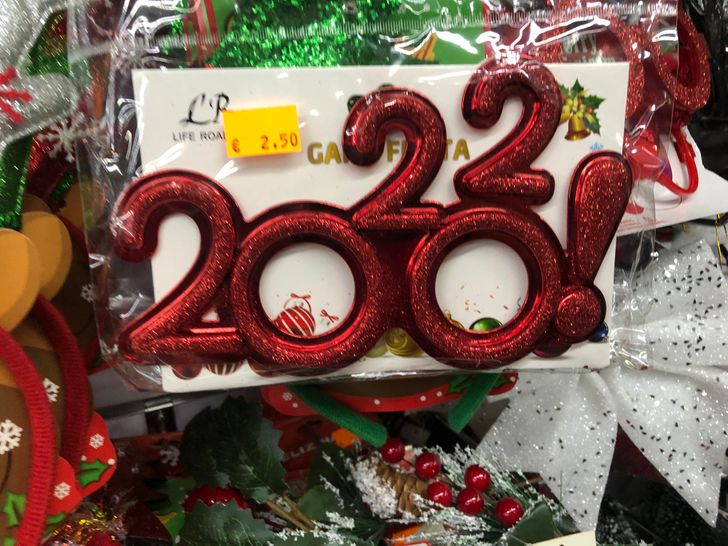
1. These 2022 glasses
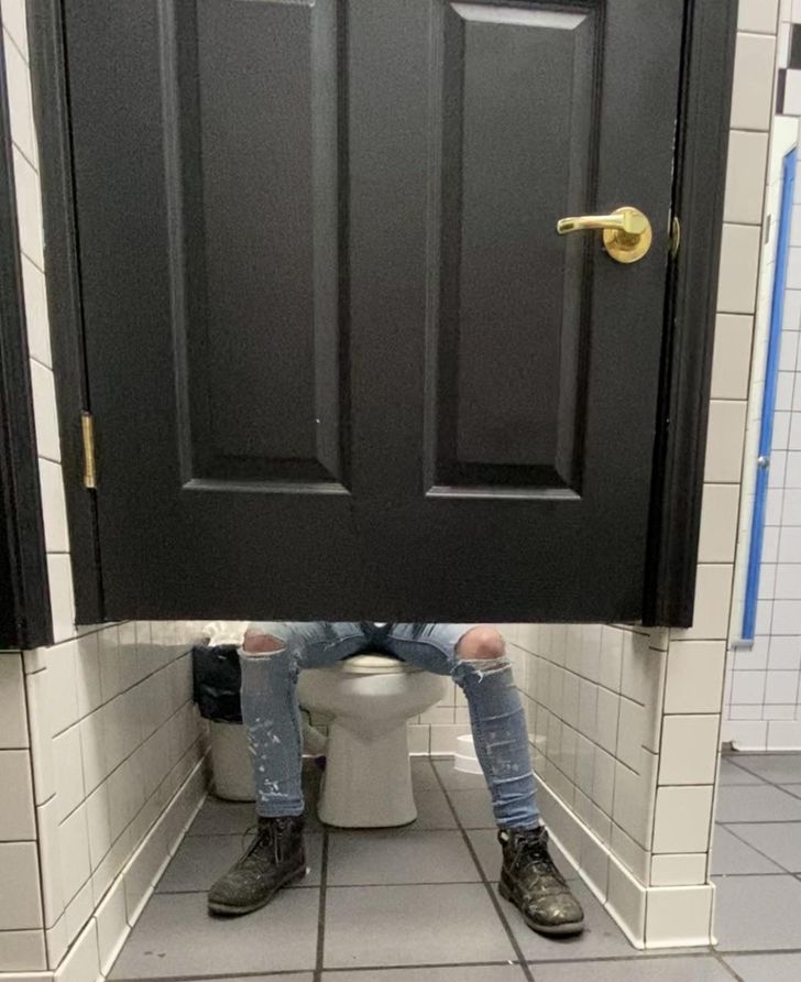
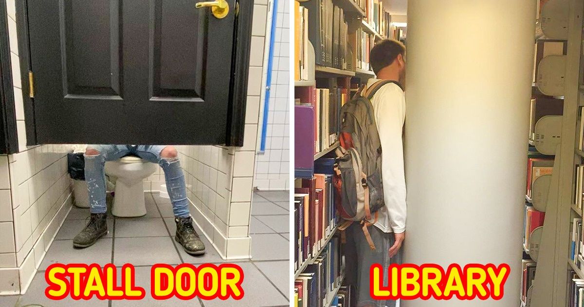
2. “Who needs privacy, right?”
3. “Such a private place.”
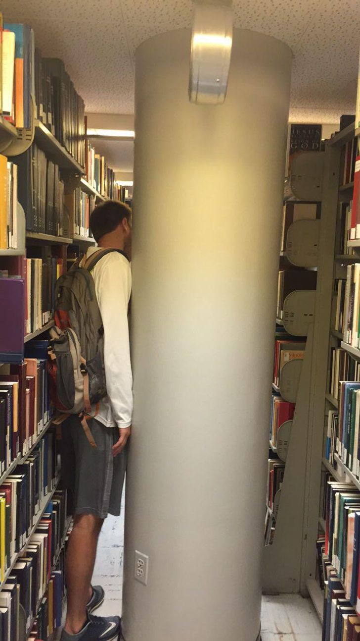
4. It’s impossible to get to some of these books!
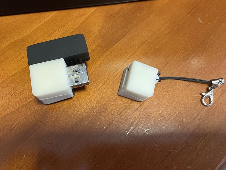
5. “It’s not like I wanted to plug in the USB?”
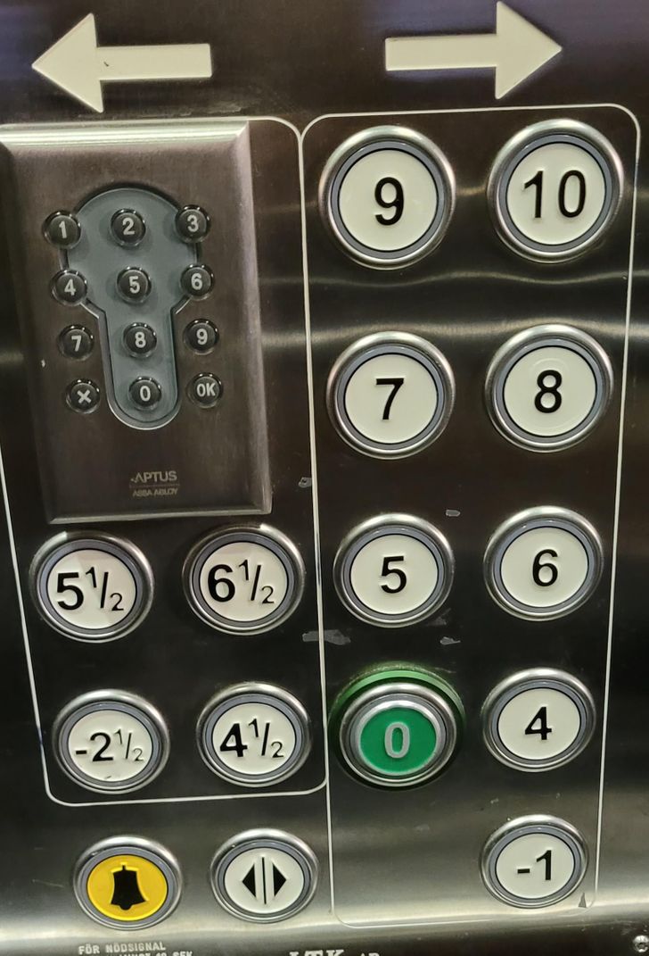
6. “How am I supposed to get to my floor?”
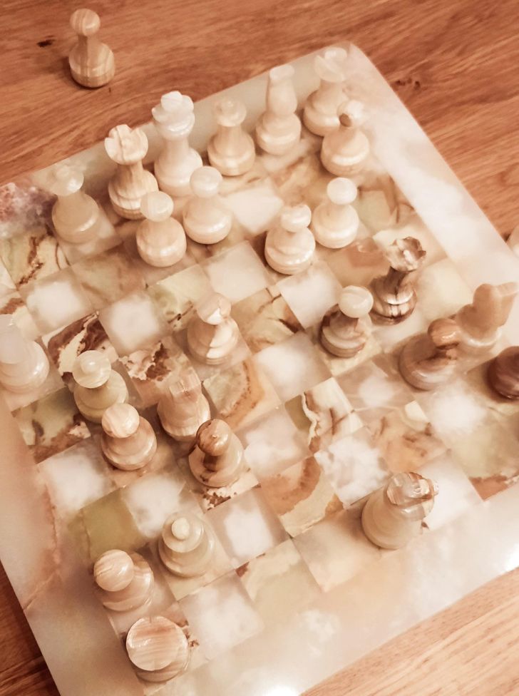
7. “We had to stop... We kept mixing up our pieces.”
8. I don’t know if this house is very secure or very dangerous.
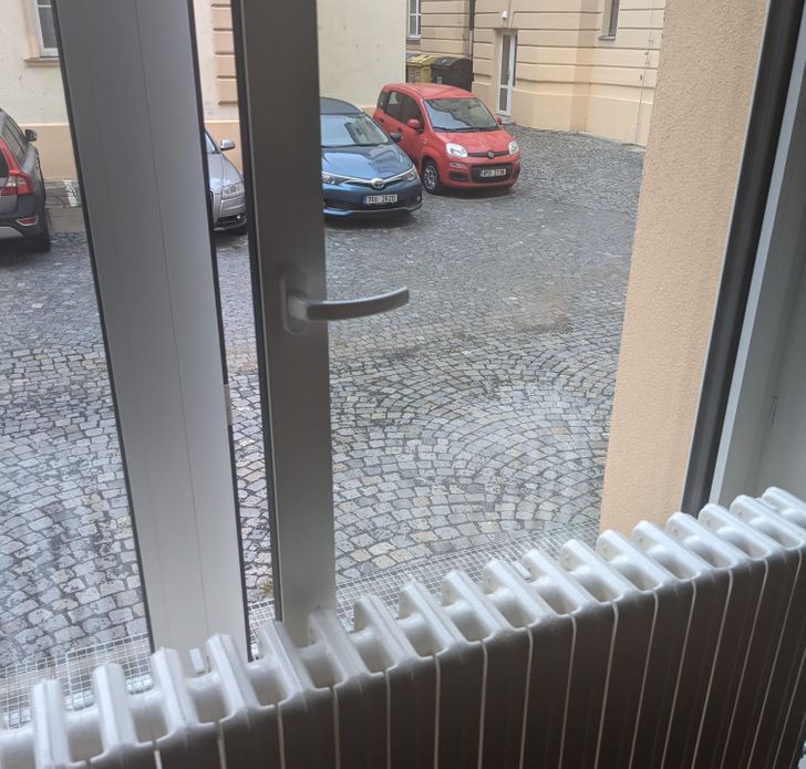
9. “Please, I just need some fresh air!”
10. Logo for “Old Town North”
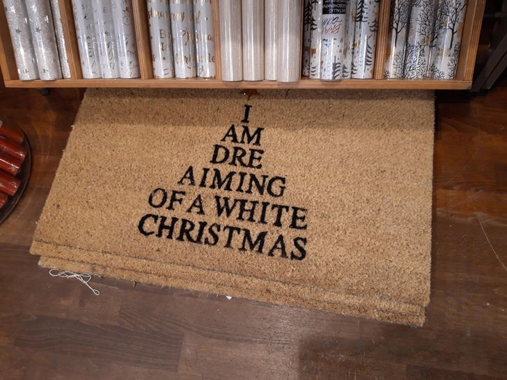
11. “I am dre, aiming of a white Christmas.”
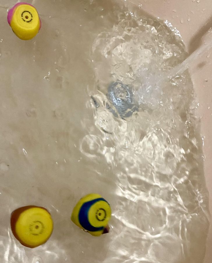
12. Rubber duckies that float upside down
13. Toilet paper dispenser
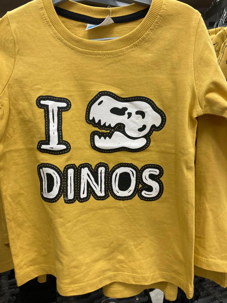
14. “I dino dinos.”
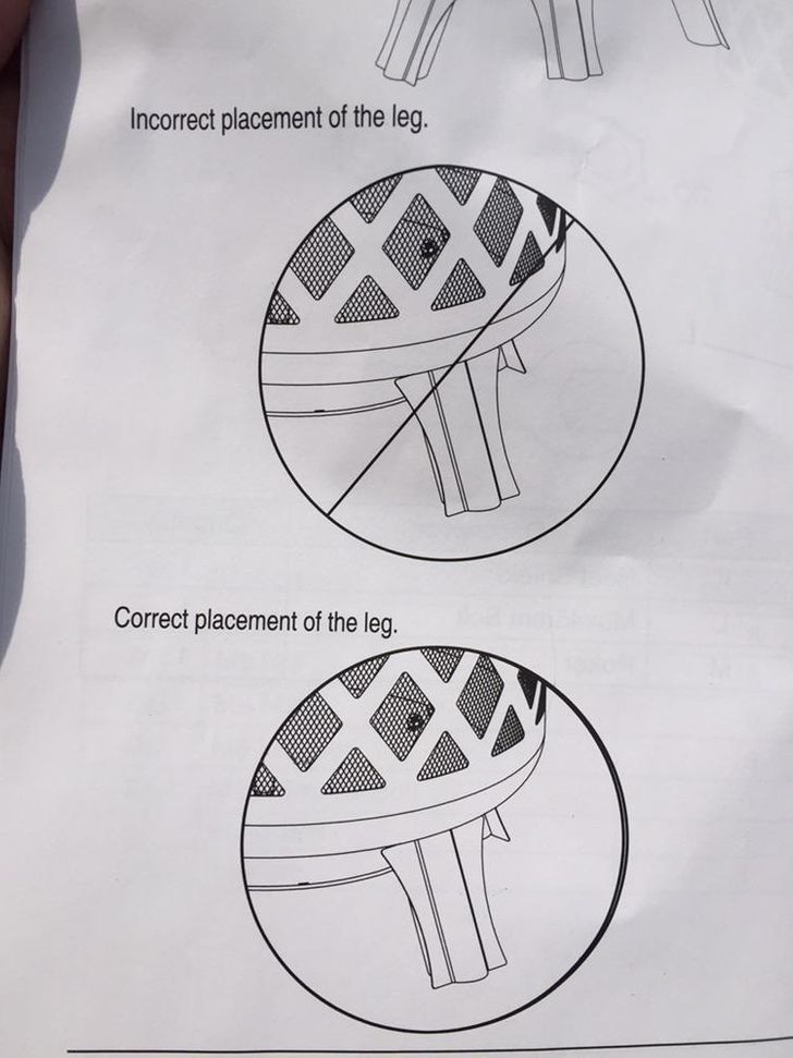
15. “I’ve stared at this for an hour trying to figure out what I’m missing.”
16. “I love PaAis”
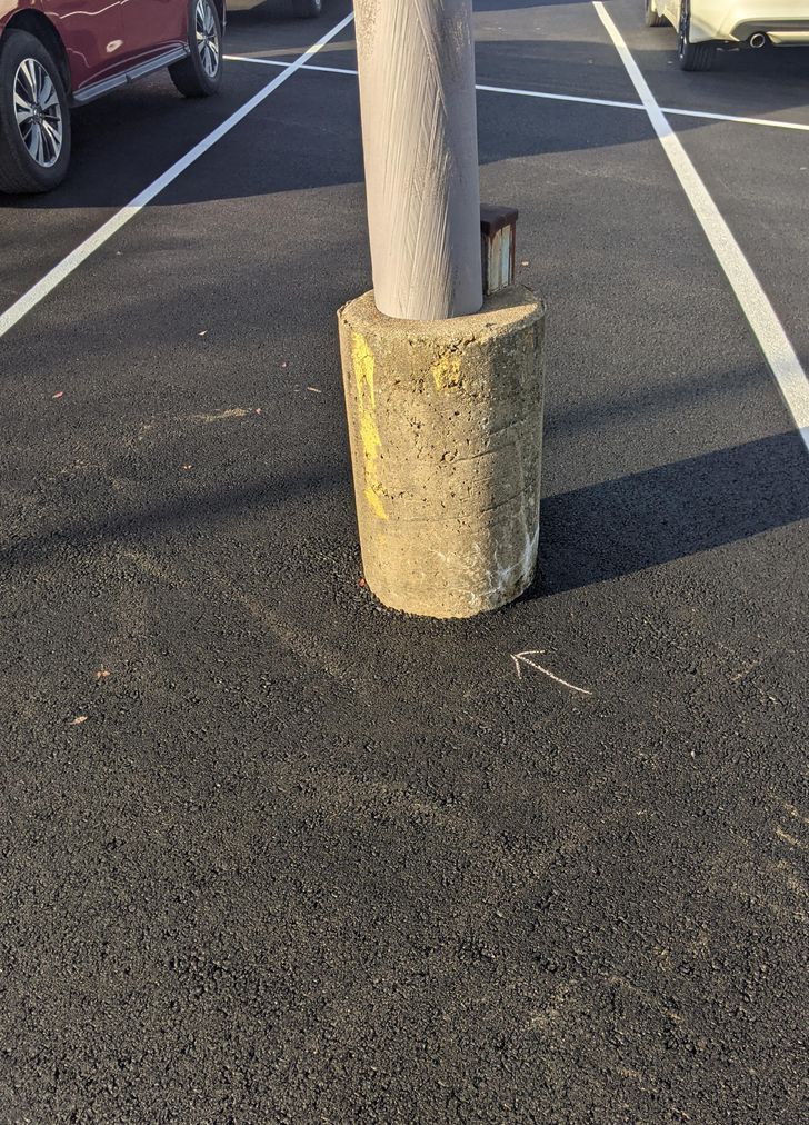
17. “New parking spots!”
What would you do to overcome these design flaws? Would you start over from scratch or make some minor adjustments? Tell us about it, we would love to hear your solutions!
Got some cool photos or stories and want to be featured on Bright Side? Send them all right HERE and right now. Meanwhile, we’re waiting!
Comments
Related Reads
18 Restaurants That Tried Way Too Hard to Be Creative When Serving Their Dishes
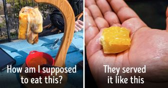
31 Design Fails That Must Have Got Someone Fired

7 Signs You’re a Good Parent, Even If You Are Not So Sure

Joe Jonas Files for Divorce From Sophie Turner and the Reason Is Heartbreaking

16 Pics Showing That Life With Family Is Always Unpredictable
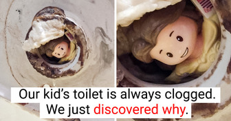
12 Weird Photos That Need Explaining Right Now
30 Common Things in China That Will Leave You Burning With Curiosity After the First Shock

14 Dressing Rules That Everyone Should Learn Once and for All

17 Stories That Prove a Dream Job Is About Happiness, Not a Fancy Title
12 Stories That Prove Kindness Still Wins in a Cruel World
My Parents Refused to Support Me Through Med School—Then I Discovered Their Sad Secret

15 People Who Went Home for a Quiet Visit but Got a Plot Twist Instead
