Being creative and artistic often means having a unique point of view that can be misunderstood by a wider audience. This is the case with some design solutions that can be amusing and confusing at the same time but are certainly attention-grabbing. Although most of these items were made with good intentions, they turned out to be better at making people laugh rather than fulfilling their original purpose.
Bright Side collected some of the most unfortunate examples of designers’ work that can make you giggle and wonder, ’’What were they thinking?’’
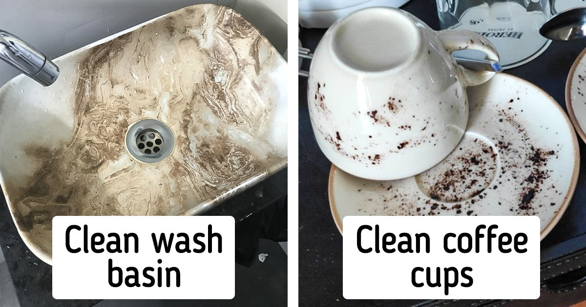
1. ’’My 5-star hotel has these “clean” looking coffee cups.’’
Are the designers and the hotel people blind?
2. When you think cheap Pop Its will make great read-a-thon prizes.
3. ’’The paper in between this sliced cheese makes it look like it has mold spots.’’
4. ’’Trying to pedal the hard way’’
6. ’’This shopping bag looks like greasy fast food takeout.’’
7. ’’Red design on a red shirt’’
8. ’’This restaurant’s floor choice makes it look moldy.’’
9. ’’Her phone is number’’
10. ’’What are these earrings supposed to be?? Croissants? Larva? Poop??’’
11. ’’Get your hands dirty to get a clean paper towel.’’
12. “This disposable meal container looks like it’s covered in hairs.”
14. ’’Artificial — No Ingredients’’
16. ’’Fins share memories’’
17. ’’I feel a little sorry for this horse patch...’’
18. ’’This shoe comes with a pre-dirty look to it.’’
19. ’’Why are there ears on its butt?’’
20. ’’The letters...What do they mean?’’
21. ’’This is apparently a clean wash basin.’’
What’s the most memorable unfortunate design that you have encountered? Share the details with us in the comments.
