6 Gestures That Show a Man Is in Love With You and 6 Signs That Show He’s Using You

The foyer is a space that not only serves as the entrance to the house but also functions as a fluid connection to the common areas. Although, generally, its structure can be narrow and long, with creativity and the right details, you can take advantage of it to make it become a wider space with greater visual proportions, which will give life and light back to the home.
At Bright Side, we are interested in your comfort and good taste for those spaces that, at first glance, seem to need a design to look good. That’s why we want to share 10 tips that can inspire you to make the most of the entryways.
The secret to making your entrance hall feel more spacious is to use light colors on walls and ceilings. They help light to be distributed better and give the sensation of a much larger space. You can go for a very traditional white or, if you feel braver, choose flower-strewn panels that are very much in fashion right now.
The visual power that rugs give in narrow spaces ultimately provides just enough color and gives the feeling that that area of the house delineates the space from wall to wall. With a well-centered rug, both unique and comfortable, functional styles can be achieved.
Decorating one of the walls with details, from a piece of furniture that delimits a seating area to pictures that brighten the room, can also be of great help in taking advantage of and stylizing that elongated space.
The presence of a carpet on your floor can be as varied as the geometric shapes you can find. But opting for small models in the form of circles will give a unique touch to the hallway.
2 allies that will make your entrance hall an eye-catching and spacious place are paint and wallpaper. Neutral colors will be the best option, as long as you choose to paint both the ceiling and walls in the same color. On the contrary, using dark tones will turn your entryway into a cave.
Make your entryway an attractive place with functional decorations. Let this area become an appealing place that leads you to comfort and space utilization. Furniture with a decorative and supportive purpose will be your friend.
Trays to leave the keys on and a table to rest the mail on are both functional and aesthetic options. However, keep in mind that the entrance hall needs to be walked through, so loading it with useless things won’t help, neither aesthetically nor functionally, it will only make it uncomfortable for you to walk around.
Light is an element that can give other dimensions to your entryway without overloading it with decoration or color. Strategically positioned lamps achieve an effect of closeness or height. Directing the lights in a certain position helps us to perceive new dimensions, both on walls and floors as well as the ceiling. Placing some on the wall toward the ceiling and floor will give the sensation of vertical elongation.
Seeing an empty space can tempt you to upholster it with ornaments and decorations that do not always favor places as small as the foyer. But expressing your personality on one of the walls can be very visually appealing.
You can try painting the front door to highlight your tasteful sensibility and style. Don’t clutter your walls. Small, unique details are your allies.
Besides serving as a great touch of design and life, putting a few plants in your entrance hall will add a sense of freshness, personality, and space-saving. The green color will contrast with everything and bring the entryway to life.
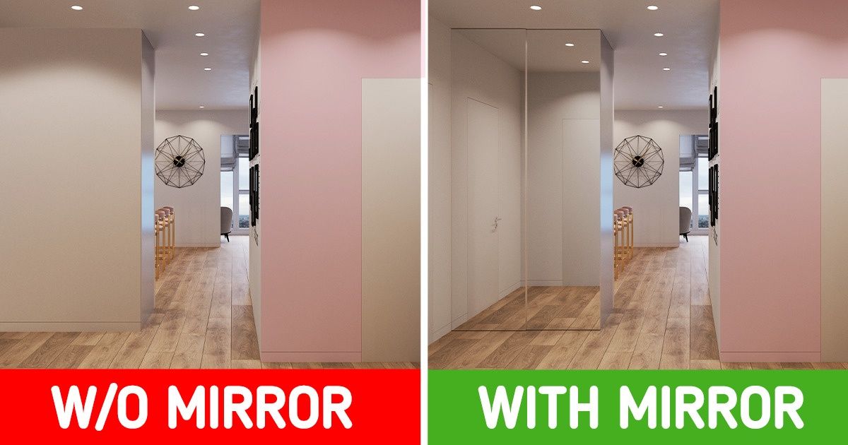
Placing a mirror on a wall facing the door will keep the light in and brighten your space. Therefore, this can be an excellent option.
Applying 2 colors helps with the visual perspective of the walls. Playing with half a tone and half another tone will provide new dimensions, and if you do it with horizontal stripes, you will achieve the effect of a shorter entryway without sacrificing decor or side space.
What other tricks have you used to generate effects of spaciousness in your home?
Got some cool photos or stories and want to be featured on Bright Side? Send them all right HERE and right now. Meanwhile, we’re waiting!


