15 Stories That Prove Kindness Wins Even When Your Heart Is Breaking


When doing renovations, we focus on our own feelings without knowing design basics. This is why the result doesn’t always meet our expectations.
Bright Side collected the most common mistakes that slip through in living room design. Make sure to read up to the end because there’s one crucial thing you should never do.
Lighting creates an atmosphere. It should take into account your mood, so the living room cannot do with only a chandelier in the center of the room. Create your own lighting system (reading, wall, and floor lamps, ceiling lights, and so on).
The best place for a TV is a blank wall. Don’t install the TV in front of or close to a window, as it’s harmful to your eyesight and prevents you from clearly seeing the image. The distance between the TV and the sofa depends on the screen size: the distance must be equal to 3-5 diagonals. Take this into account when buying a new TV.
Sofa cushions create a cozy and relaxed atmosphere. When choosing them, consider whether their material and texture suit the fabric your sofa and armchairs are covered with. If the furniture in the living room is made of velvet or velour, say no to cotton or linen textiles. For smaller furniture, choose small items. A massive sofa allows for several voluminous pillows.
This rule works for large rooms. If you have the opportunity to place the sofa away from the wall, do it. You’ll visually enlarge the space and create comfort. A sofa standing by the wall when there’s extra space feels more like a dance studio than a living room.
If you buy dark furniture for a room with a low ceiling, you’ll make it look more squat and cramped. Choose compact sofas and chairs and neat tables on raised legs. Make choices that favor neutral light shades.
Just because the furniture looks nice doesn’t mean it will suit your house. Make sure it’s comfortable for you — try it. Take a seat in an armchair or sit at a table you liked. Otherwise, you’ll rarely use these things and will have to part with them.
Furniture fashion exists. Bulky furniture with voluminous backs and armrests went out of fashion long ago. Pay attention to items with straight lines and sharp silhouettes. You can choose a traditional sofa, but opt for an unexpected and modern color.
Perfect height = 153 cm from floor level to the center of the image. If you have too many photos, a hanging gallery instead of photo frames placed in every corner will be a great solution.
The most common mistake is when people stuff a room with furniture that doesn’t fit its size, especially when it comes to sofas — it makes the room look much smaller. If you have a large living room, then you can afford a roomy sofa. For smaller living rooms, a two-seater sofa and a pair of armchairs are preferable.
If you have a rectangular room, you can correct its shape using a cabinet or a rack — a square is more advantageous, and it’s easier to keep balance there.
Here are some zoning ideas:
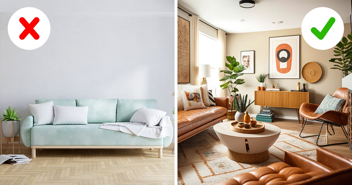
A living room demands a bright accent. It can be a fireplace, artwork, a mirror, wallpaper — anything that attracts attention. You can also make the rest area a focal point, emphasizing it with contrasting colors, prints, or mixing complex tones.
It’s better to put a large plant in a pot than lots of small ones on the window sill. Thus, your room will seem bigger and cozier.
When changed, furniture covers can transform an entire room and make your design stylish and modern. You can also change the image of your living room according to mood and seasons.
If you give preference to a certain style of interior and let no deviations appear, your room loses warmth and becomes very trite. Mix your favorite style with others: eclectic, retro, loft, grunge, and many other design options will make your living room original. You’ll never want to leave it!
Such an insignificant trifle as incorrectly hung curtains can make your room visually smaller. It’s important to hang curtains as high and as wide as possible to make your ceilings seem higher and your living room larger. Choose a brighter and more saturated curtain color than the rest of the textiles in the room.


