“Too Bad She Couldn’t Accept Aging Gracefully,” Shania Twain, 58, Looks Shockingly Youthful in New Pic

Ah-hem. The earliest logos can be traced back to ancient family crests. In the Middle Ages, people with pubs and shops started using various symbols to present what they did and to distinguish themselves from others in their line of business. But why is it so important for a brand to have an impactful logo?
Well, because first impressions count, even for businesses. A well-crafted logo can send the right message to potential customers and help people learn more about your business at first glance. With so many logos to look at nowadays, especially since the beginning of e-commerce, it’s easy to overlook the hidden meanings and symbols in everyday products.
The Domino’s Pizza logo also says a lot about the company’s past. As its name suggests, there’s a domino piece in the graphic design of the logo. The initial plan was to add another dot to the domino for each new location. But the company grew so big that adding dots for all the locations wasn’t possible. So those three dots we see today are there to remind customers of the three initial locations of the pizza chain.
When you look at the Beats logo, the first thing that comes to mind is the letter B —and rightly so. But there’s a hidden meaning here, as well. The red circle actually depicts a person’s head, while the white letter B also stands for a pair of headphones.
Another very customer-oriented logo is that of the brand LG. The company designed its logo to include both the company’s initial name, “Lucky Goldstar,” and the company’s current slogan — “Life’s Good.” A careful look at their logo shows not only the letters L and G but also a smiley face.
They may be one of the most famous jeans manufacturers in the world, but their brand identity also has some hidden meaning in it. The Levi’s logo is designed in the shape of a pocket that can be found on each and every pair of jeans they produce.
The FedEx logo is also very cool. At first glance, it looks like the words FED and EX written together in two contrasting colors, purple and orange. But if you look closely between the letters E and X, you’ll notice that the negative space is in the shape of an arrow pointing to the right. It symbolizes movement and agility.
The Unilever group has a staggering number of brands all over the world — more than 400. It’s no surprise that their U-shaped logo is composed of many different symbols, like a flower, a spoon, or a bird. It’s done to showcase how many things they produce, from food and refreshments to personal care and beauty products.
NBC — or the National Broadcasting Company — is a broadcast and radio network with a logo that’s very nice to look at. It’s bright, colorful, and flashy. Why is that? Well, because the network was created at about the same time color television started to gain momentum. The bird-shaped NBC logo symbolizes the initial 6 divisions of the network. And the colors are also a nice reminder to customers that NBC is “as proud as a peacock” of their programs.
The Evernote logo is another of those designs that clearly show the brand’s overall purpose. While the font used is relatively simple, on the left of the word “Evernote,” there’s a depiction of an elephant. The animal is a well-known symbol of good memory. And the shape of its ear is curled like a post-it note. A cool touch for an app designed for organization and note-taking, wouldn’t you say so?
The Cisco logo comes with its own little secret as well. The font is quite minimalistic, but the lines above are there to depict the Golden Gate Bridge in San Francisco. The first CEO of the company, a man named John Morgridge, thought this would be a great idea to emphasize moving toward the future and connecting two worlds.
The Amazon logo is everywhere these days. But there’s a small detail in there that most people probably miss. The arrow connecting the letters A and Z, the one in the shape of a smile, is there to point out that they have a complete inventory of products — from A to Z.
Audi is one of those brands that like to showcase their history. Those 4 simple intertwining circles on the company’s logo are a reminder of the four companies which were initially part of the conglomerate: DKW, Horch, Wanderer, and Audi.
There’s a nice story behind the Baskin-Robbins logo as well. Between the letters B and R, in the middle of the logo, you can notice the number 31. Why is that? Because the company has 31 original flavors of ice cream. I think I’ve darn near tried them all.
A lot of companies out there like to give their logos a bit of a vintage touch — and Picasa is one of them. Before we had digital cameras and the perfect portrait was just a click away, analog cameras had a little thing called a shutter. That’s a device that opens to let light pass through, exposing the film and creating a photograph. The Picasa logo is just that — a shutter nicely colored in red, blue, green, purple, and orange.
The 7-Eleven logo has a nice twist that might not have caught your eye by now. The “n” at the end of the word is in lower case, unlike the rest of the letters, which are in all caps. It’s said that the company president’s wife back in the 60s wanted to make the company’s logo look a bit less harsh. She believed that the uppercase font would be a bit too rigid.
And she wanted to make the overall appearance of the logo more fluid. A graphic designer found a solution by switching to a lowercase “n” at the end of the word. So I’m guessing that when you pronounce it, you just throw away the lowercase “n”, like “7-Elevennn.” Or not.
Chocolate fans must know the Toblerone brand. If you’re one of them, have you ever noticed all the intricate detailing in its logo? The city of Bern, in Switzerland, where the company was founded, is also named the City of Bears. When you visit this place, you’ll see that there are bears everywhere, from the city’s coat of arms to public trash cans. The Toblerone chocolate is shaped like a mountain — hence the mountain in the logo. But there’s also a bear depicted there, hidden in the negative space.
The Chick-fil-A logo is one of those that go straight to the point with their imagery. The C stands for chicken, of course. But it’s also shaped like a chicken if you look closely.
Another great example of negative space used creatively is the Formula One logo. Between the F — which stands for the word Formula — and the horizontal lines depicting red flames, the number 1 is intelligently hidden. Bet you didn’t see that one.
One of the greatest sportswear brands, Adidas, has a mystery of its own. At first glance, its logo is merely comprised of three vertical lines. Don’t they look like a mountain to you? This mountain is there to symbolize the effort athletes have to make to reach the top — which is like, you know, climbing a mountain.
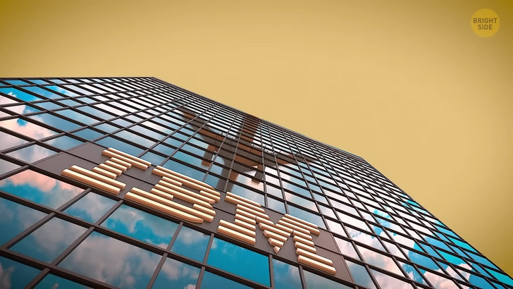
The IBM logo has its own statement to make. The three letters of the company’s name, I, B, and uh, M, are designed to be horizontal lines meant to symbolize speed and dynamism. This is one of the company’s main values, which has always been important to the founders.
With a cool logo to present to the world, Ray-Ban has become a household name for sunglasses. Just to make sure you don’t miss what they actually do, the B in the logo is designed like a pair of shades.
The worldwide Internet source of information, Wikipedia, has a logo to match its brand identity. The globe is made of many puzzle pieces, each with a different symbol on it, and some missing pieces as well. It tells the story of the company’s mission without a single word. That’s a nice lesson in storytelling, don’t you think?
Subway is one of those brands that have a nice combination of the logo and name. Meant to symbolize that you can have a delicious meal anytime, the pointing arrows on the letters S and Y look like the directions found at subway stations.
There’s no way you can miss the two pieces of chocolate in the Hershey Kisses logo. But there’s a third one hidden in there if you look closely. Have you seen it yet? It’s hidden between the letters K and I. If you’ve ever redecorated a house or planned a wedding, you most likely used Pinterest to store and share ideas.
The Pinterest logo looks like the letter P in a red circle. But look again: this P is shaped like a drawing pin.
To the untrained eye, the logo of the London Symphony Orchestra looks like an eccentric red curved line. But in reality, it has a purpose of its own as it symbolizes a musical conductor.
Another brand with hidden imagery in its logo is Magic Coffee. The cup of coffee on top of the name is shaped like a top hat if you take a closer look. Okay, I’m ready for some food now....


