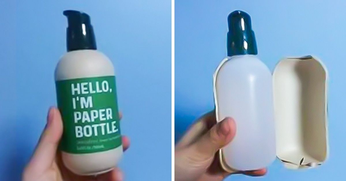
An eco-friendly paper bottle may not be as green as you thought. A hair conditioner can be used as a body shower cream due to a misleading package design. Such things can happen to anyone, so it’s best not to take these blunders so seriously and have a laugh.
We at Bright Side are at a loss when it comes to some of these design ideas that we’re sharing with you.
1. This eco-friendly bottle made of paper
2. “They made an Internet competition and were forced to actually sell the winning design.”
3. “The broken doorbell at my neighbor’s place in Munich”
4. “That would explain why my ankle hurts.”
5. “The recycling and trash go into the same bin.”
6. “Shrinkflation was used by Cadbury to literally cut corners. The bottom chocolate bar is more than 8% smaller.”
7. “My workplace’s ‘low plastic, recyclable eco-pens’ have a secret at their core.”
8. " I conditioned my body 3 times this week."
10. “I work for a company with a division that designs and installs kitchens, and this is our break room.”
11. “Literally, it’s just uncomfortable for everyone.”
12. “Perfectly fine lighters with no way to refuel them”
13. “Packaging that tricks you”
14. “My disappointment is immeasurable, and my day is ruined. I didn’t even get a cotton candy one.”
15. “I would like to thank Suave for increasing the size of their bottle by −17%.”
16. “No more waiting for the bus!”
17. “I went to get my mail and this was the first thing I saw.”
18. “New chairs in Starbucks, specifically designed so people won’t hang around for a long time.”
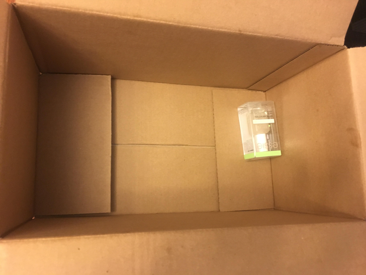
19. “Amazon sent me nail polish in a box so big that I had to go to the post office to pick it up when I wasn’t home to receive it.”
The only reason I can imagine they use a box this big is so that your nail polish doesn't get lost.
Which design surprised you the most? Do you have pictures of your own experience with poor design ideas? Please share them with us!
