I think a lot of these are down to preference
8 Furniture Placement Mistakes Almost Every Home Owner Makes
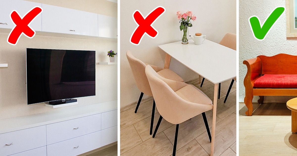
Each of us has had the need to buy new furniture and then attempted to arrange it nicely when designing and renovating a space. But few of us manage to turn our home into a cozy nest, and instead, we end up with a cold, awkward living area.
Bright Side learned about what mistakes we make when arranging furniture and how to correct them. In the bonus section, we revealed a couple of inaccuracies that almost everyone makes when installing sanitary engineering.
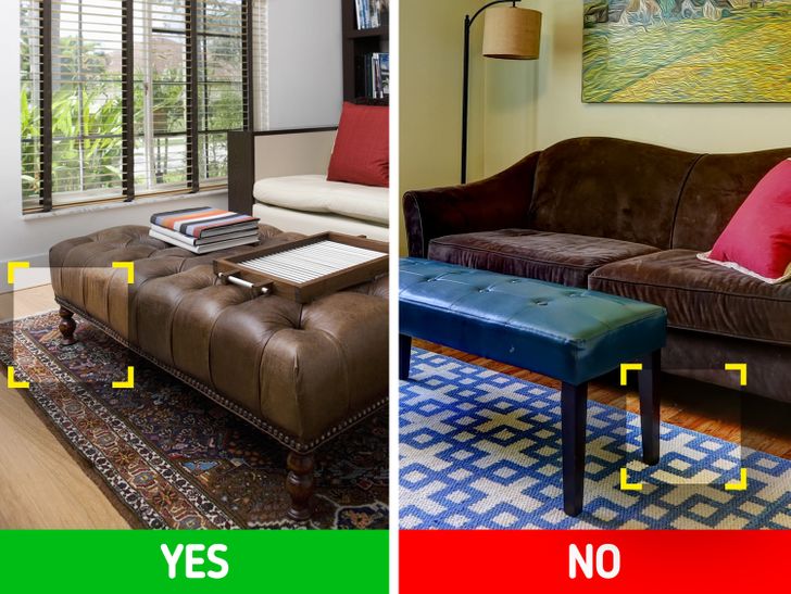
1. You arrange furniture on the carpet without regarding the rules.
Designers outline 3 methods for how to properly place furniture on a rug:
- Put the furniture right on the carpet so that there are about 12-18 inches left between the edge of the furniture and the edge of the carpet.
- Arrange things so that there’s no furniture standing on the carpet at all. In this case, it’s important that the carpet is not too small because it will create a feeling of messiness in the room.
- Position the furniture so that only its front legs are standing on the carpet. With the help of this trick, you can visually combine several things in one group, such as a couple of armchairs and a table, for example.
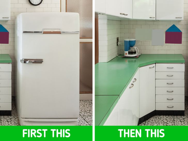
2. You choose kitchen furniture before buying household appliances.
When designing a kitchen, it’s better to first choose kitchen appliances (like a fridge, stove, dishwasher, microwave oven, and other necessary items), place them in the right places, and then choose kitchen units, like a dining table, etc. Otherwise, you may end up having no place for putting kitchen appliances, and the space will look cluttered and tight.
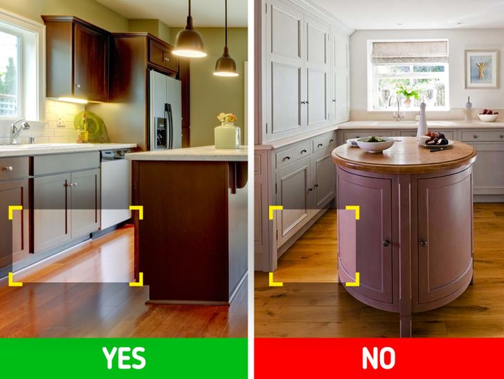
3. The distance between the kitchen island and the main unit is less than 40 inches.
A kitchen island is a perfect solution for increasing storage space and workspace. However, it works only in cases when the kitchen is really big. If the room is small, the island will only take up space, and it won’t help you in any way. It’s believed that there should be about 40 inches of empty space around the island. If you don’t follow this rule, it will be difficult to move around the kitchen.
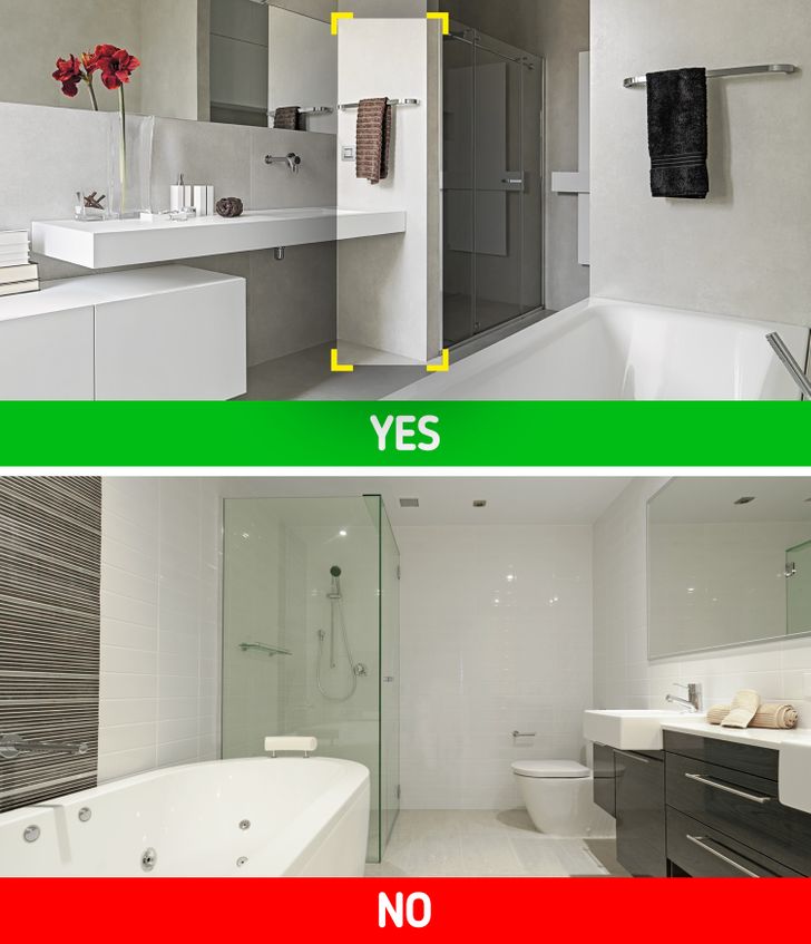
4. Your big bathroom isn’t divided into zones.
When the area of a bathroom is really big, owners often place all the furniture and plumbing along the walls and end up having a lot of empty space in the middle. This simply doesn’t look nice. In this case, designers recommend splitting the room into zones. It can be done with the help of a glass wall, partitions, or even folding screens. The best option is to split the room into 2 or 3 parts: a washing zone, a toilet, and a showering zone.
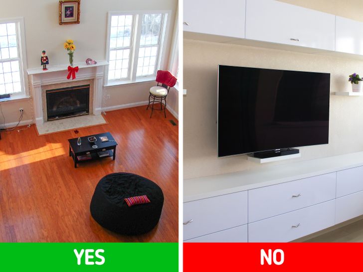
5. The room lacks a focal point.
It’s impossible to furnish a room nicely if it doesn’t have a center that will serve as a starting point for the designer. Things like a view from a window, a fireplace, an accent wall (if it’s hand-painted), a piece of art, or even a coffee table can all serve as focal points. If necessary — and if the size of the room permits — there can be 2 (but no more than that) focal points. A bigger number of focal points will make the room look cluttered.
Oftentimes, a TV set becomes the center of the room. Designers don’t recommend doing this though. If friends or family come to see you, you’ll be sitting near the screen, and this doesn’t contribute to good conversation at all. But if you still want to make a TV set the central object of a room, place the couch and armchairs, not in a straight line opposite to the screen, but in a semi-circle, so that it is more comfortable to communicate and look at each other and not watch what’s happening on the display.
After you’ve determined what object will be central in your room, you need to start placing big furniture around it. As a rule, all this furniture will be overlooking the focal point. Only after doing this can you shift your focus onto smaller details.
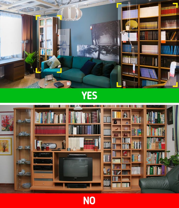
6. There are objects of approximately the same height standing right next to each other.
There’s a rule that says when you look around a room, your eye should “jump,” not move along one line. This can be acquired by placing furniture of different heights throughout the room. If you, for example, have 2 high closets, place one of them in the left corner of the room and the second one in the opposite corner — it will help them “balance” each other. Don’t put these closets right next to each other, as it will make the room look cluttered and cramped.
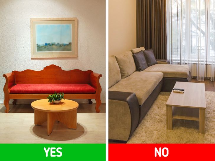
Here’s one more useful piece of advice: to combine various shapes. A round-shaped piece should go with a square-shaped item, and straight lines should go with wavy ones. For example, it’s better to place a round or oval table near a rectangular couch. It will make the room look nice and original.
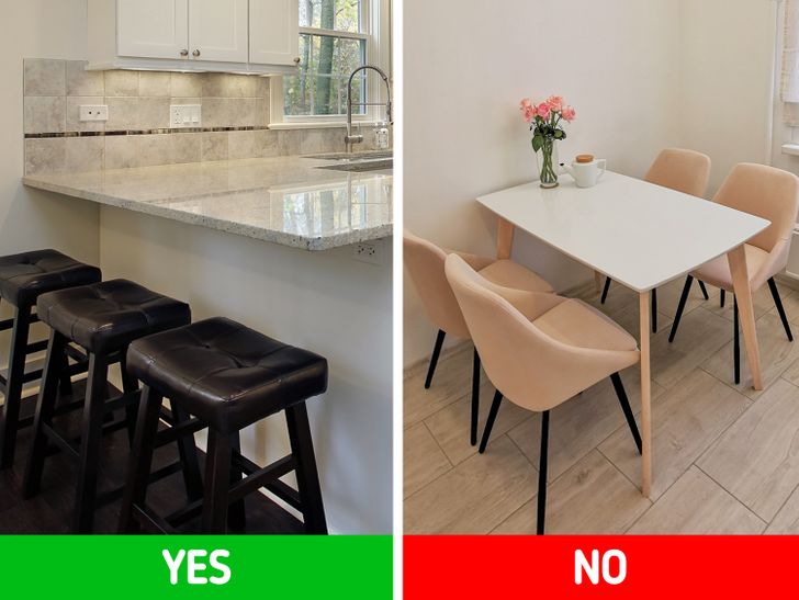
7. The table in the kitchen takes up too much space.
A big dining table is one of the worst solutions for a small kitchen. But sometimes, we want to have a get-together with friends but don’t have enough space. In this case, it’s better to use the following trick: opt for benches or backless chairs instead of typical couches and standard chairs. The former can be hidden under the table, which will help you win more space.
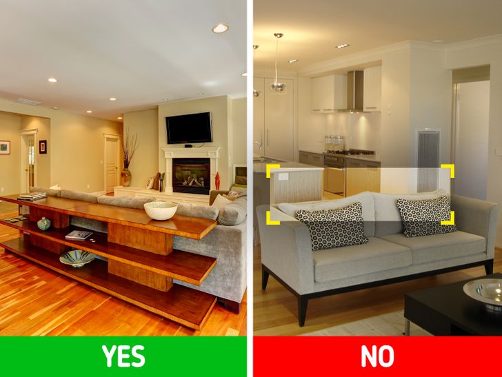
8. The couch is located with its back facing the door.
Designers don’t recommend placing a couch with its back facing the door because such a layout creates big discomfort for a person. You won’t be able to relax if you’re sitting with your back to the door, and you’ll likely feel nervous (consciously or subconsciously) that someone will sneak up on you.
If you don’t have a chance to relocate the couch, or you simply don’t want to do it, create an artificial barrier. Place some small table right behind the back of the couch and put flowers or lamps on it — just be sure it’s something tall that will fence in the person sitting on the couch from whoever enters the room.
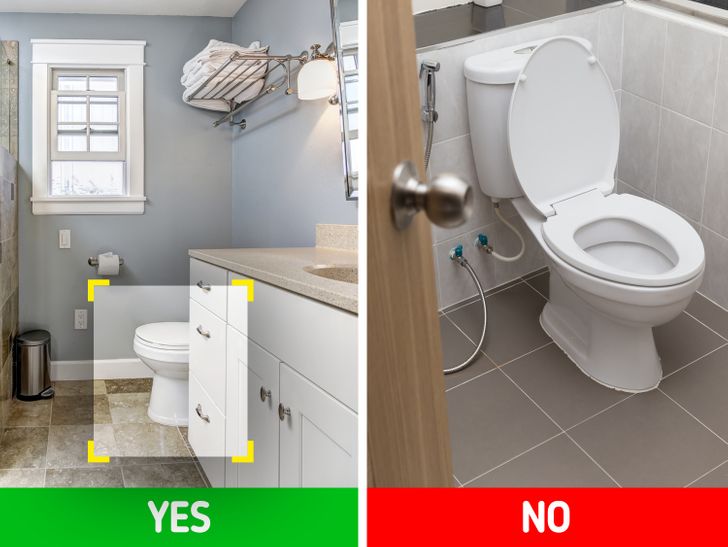
Bonus #1: The toilet is located opposite the door.
A toilet located opposite the door is quite a bad solution in terms of design. It’s better to be placed so that it’s not fully seen when the door is opened. When locating the toilet, keep in mind that there should be empty space on both sides of it (otherwise, it will be uncomfortable for you to use it because you’ll keep hitting your elbows on nearby furniture or walls). A space of about 8 inches from each side is sufficient.
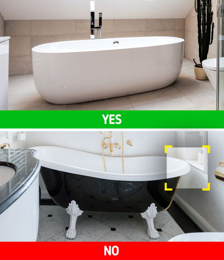
Bonus #2: A freestanding bathtub takes up the entire width of the room.
Recently, many people have been opting for freestanding bathtubs, but they don’t actually look nice in every bathroom. If the length of the room is 7 feet and the bathtub itself is taking up 6.5 feet, then there is no sense in putting it there because it will look unkempt. The thing is, one of the main advantages of a freestanding bathtub is being able to clean the floor around it. It will be hard to do this if the distance between the tub and the walls is less than 4 inches. The optimal distance from the furthest wall should be 8 inches, and it should be about 1 foot from its surrounding walls.
Do you follow any rules when you refurbish or relocate the furniture in your home? Please show us what the most beautiful corner of your place looks like!
Comments
I can understand why we need to keep a certain amount of space between furniture but 7 for example really just depends on the family. I don't see why you can't have a nice table if you use it often
Related Reads
15 Real Stories That Prove Even the Smallest Acts of Kindness Can Mean the World to People

I Chose to Help My Sister Even After She Hurt Me—Then I Found Her Real Secret

I Refuse to Be Treated as Less Reliable Because I’m a Single Mom

I Refuse to Watch My Promotion Get Stolen From Me, Now HR Is Involved

I Refuse to Let My Boss Monitor My Personal Phone — I Won’t Trade My Privacy for Job Security

15 Stories That Show Quiet Kindness Is the Strength the World Needs Most

14 Parents Who Proved Love Shows Up in the Smallest Moments

I Refuse to Cash Out My Retirement to Pay for My Daughter’s Fertility Treatments

I Refused to Be Underpaid at Work — Then My Boss Revealed His Secret Plan

I Refuse to Accept Being “Grandfathered In” at $15K Less Than New Hires

I Refused to Let My Boyfriend Discipline My Child—He’s Not His Real Dad

15 Moments of Compassion That Showed the World the Strength of Kindness

