17 Designers Whose Work Will Attract the Wrong Kind of Attention

Curiosities
2 years ago

Bad construction is nothing new in our world since we see examples of it every single day, the moment we walk out our door. But sometimes we see nicely made things that are very hard to use and that seems to be their intention. We can’t have any idea about what the people who designed and made them were thinking, but they definitely weren’t thinking about practicality and beauty.

Bright Side is in disbelief of these designs that were either poorly constructed or were deliberately made in a way that makes our lives hard.

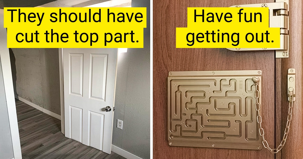
1. “Shouldn’t they have cut the top of the door so the knob wasn’t so low?”

2. Have fun getting out.

3. “The disabled parking at my school”

4. “Outlet is less than a foot away from the faucet and is inside the curtain.”

5. Crosswalk to where?

6. It must be a joy to ride down this bike lane.

7. “I have an idea, what if we didn’t line up the top 2 floors with the rest of the building.”

8. “Does this have a deeper meaning? I don’t understand?”

9. “Bad tile choice for this bathroom.”

10. “Finally we got an essential bike lane.”

11. “If that isn’t accessible to wheelchairs, I don’t know what is.”

12. “Locked the gate boss.”

13. “Doorstopper installed boss.”

14. “Good thing I don’t need to read the sign.”

15. “Built-in kitchen cupboard covers half of the outlet.”

16. “The more I look at this house, the worse it gets.”

17. “Some poor attempt at a quirky clock”

What is the single worst design you’ve ever witnessed? Was it something utterly bad or something that looked nicely made but ended up being tough to use?

Comments

Get notifications

Related Reads