There are almost 8 billion people in the world, and it’s hardly possible that all of them have the same idea of logic and aesthetics. That’s why some designs look somewhat exotic and puzzling to us.
At Bright Side, we believe that things should be beautiful, functional, and cost effective — but these 18 designs miss either one of these elements or all of them.
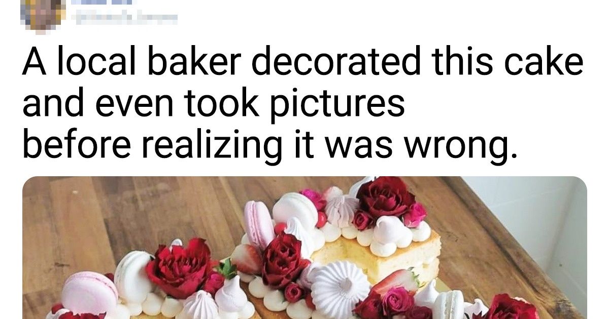
1. A local baker decorated this cake and even took pictures before realizing it was the wrong side up.
2. Has anyone figured out where we’re supposed to go?
3. This hotel has 6 elevators but only 2 lead to the garage. So there’s a 2 out of 6 chance that the elevator that shows up will be able to take you to the garage.
4. “The dividers in this stall are way too high up. They could see my thighs.”
5. They have the same size written on them.
6. “The power button is next to the backspace button — guess what I use when writing important documents...”
7. You need a really small car to fit there!
8. Water droplets printed on this umbrella make it hard to tell whether you’ve shaken the water off or not.
10. This soap holder can’t hold soap.
11. The shower was made for people who are literally 3 feet tall.
12. This slide curves up at the end with no drain. It’s completely unusable after the lightest rainfall.
14. “This poster is hanging in my school. It took me 4 days to realize that it was a tongue and not a weird upper lip.”
15. The toilet paper dispenser becomes see-through to the next stall as the rolls are used up. Peek-a-boo!
16. Is this toy smiling or not?
17. These black playing cards with a black font make it nearly impossible to see what card you have.
18. “I almost fell down and rolled my ankle on this.”
Have you ever come across examples of absurd designs? Tell us in the comments below.
