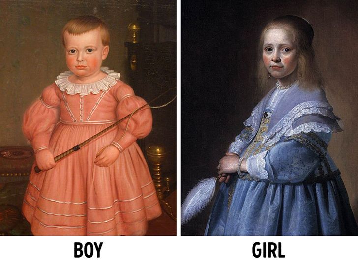
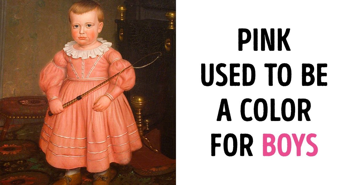
Wow who would have thought Pink was for boys and blue for girls...
Why Yellow Is Almost Never Used On An Airplane, and 14 Other Ways We’re Affected by Color
We make up our minds about people and products we first see within 90 seconds, and about 62% to 90% of our opinion is based on color alone. That is why some companies use colors in their packaging, logos, and stores to influence our daily decisions. But colors can sometimes play on our psychology even more, like how the colors pink and blue have been shown to calm us down enough to reduce aggression and suicide.
We at Bright Side hope that you will be tickled pink to learn about how colors play such a great role in our lives.
1. Pink was for boys, and blue was for girls.
Gender reveal videos often show pink to signify a baby girl and blue to indicate a baby boy. But a long time ago, babies wore white clothes and no colors were actually linked to gender until some magazines claimed that pink should be a boy’s color and blue should be a girl’s color. The trend somehow switched in the 1940s and 1950s to become what we’re used to today.
2. Pink may be able to calm us down and reduce our aggression.
Believe it or not, some prisons are painted pink to reduce aggression and some locker rooms, meant for the away teams, are also painted pink to make them feel weak. This is because some studies have found Baker-Miller pink to be effective in reducing aggression and strength. However, later research studies done on the same topic found limitations and different outcomes.
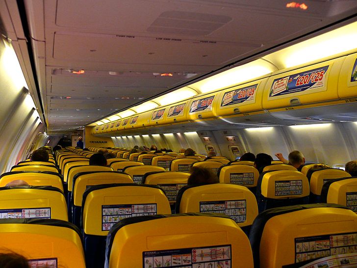
3. Yellow inside an airplane can make our eyes tired.
While yellow is a color that evokes happiness, it is such a bright color that it reflects more light and hence could stimulate the eyes too much. This might explain why most vehicles, especially airplanes, hardly ever use yellow in their interior. Ryanair, a budget airline used to have a lot of yellow, but chose to redo the color of their cabins to the delight of their customers.
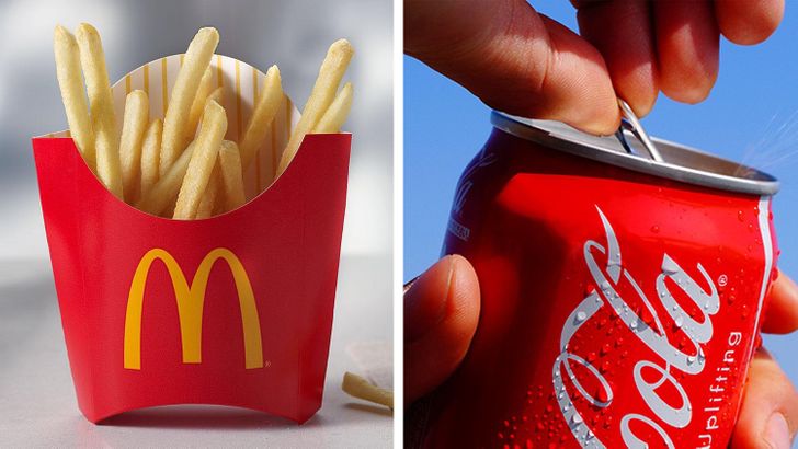
4. When we see red, we snack less.
Contrary to popular belief, the color red does not actually rev up our appetite. This myth has probably appeared because most fast food logos happen to be red. In fact, red has been shown to make people eat less food and consume fewer soft drinks. So red actually works as a subtle stop signal.
5. We might do things quicker when we see red.
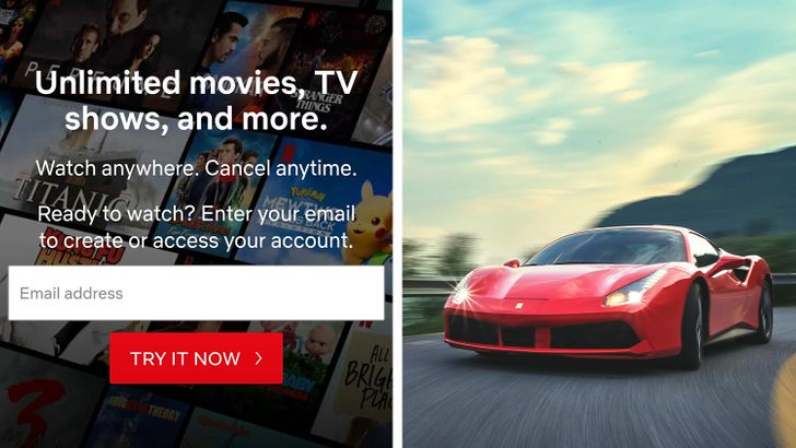
HubSpot did a test to see if the red or the green button would make people click more and found that the red button outperformed the green button by 21%. Perhaps this is why Netflix only uses red buttons for actions that will bring in more customers. Another experiment was done to see if people are affected by the color of the car that blocks their way. The results showed that if the blocking car was red, people gave an aggressive response much quicker.
6. We’re more likely to trust companies with blue logos.
If you have noticed that the logos for credit cards, insurance, and computer companies are often blue, you are right. Blue gives off a feeling of security, so we are more likely to find companies reliable if they use more blue in their logos or products.
7. Blue may be able to save our lives and reduce crime.
Blue goes even further because it may be able to help us choose life over death. Some train stations in Japan have installed blue lights in order to prevent people from jumping on the tracks to commit suicide.
8. Color-coded labels can make us choose healthier food.
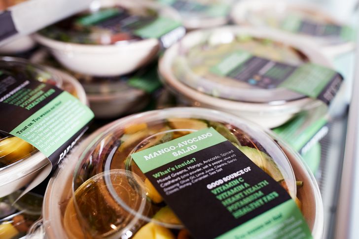
Colors may also be able to help us change our diets. A cafeteria intervention was done in a hospital where the foods being sold were labeled green for “healthy” and red for “unhealthy.” The test concluded that color-coding our food can assist us in improving our food choices. A more recent study done by using the traffic-light system to also include yellow, to label “less healthy” foods, also showed better food choices.
9. Men and women see colors differently.
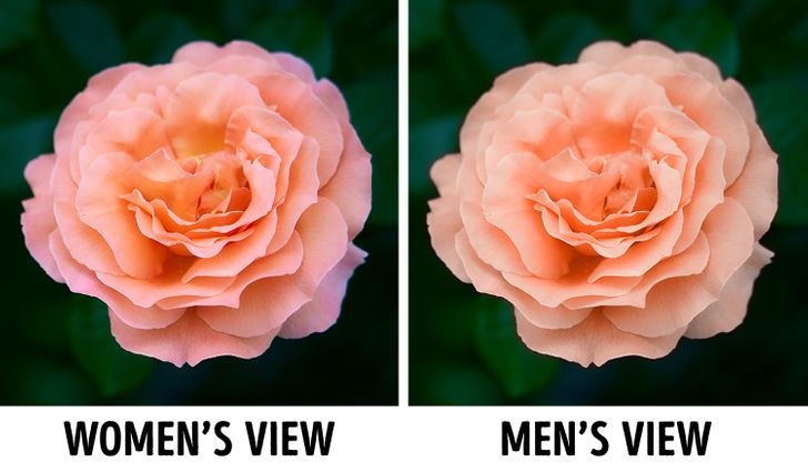
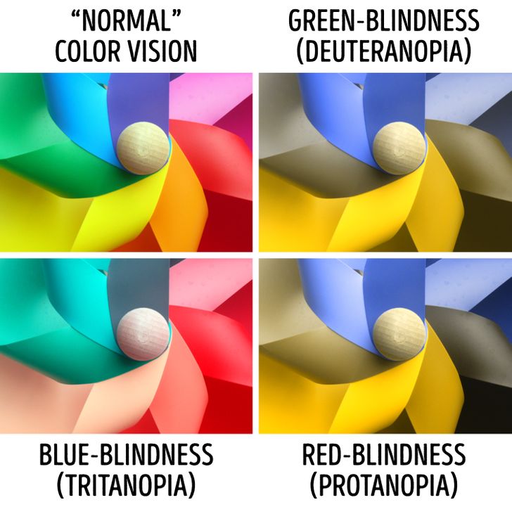
If you can remember the debate of the blue/black versus white/gold dress, it feels crazy that people can see the same colors differently. But the truth is, everyone does see colors differently and there is also a difference between how men and women see colors. Men are better at detecting fine details that change quickly from afar, while women are better at distinguishing shades of a color.
10. Orange makes us think of good value.
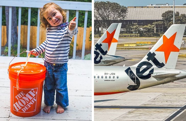
The color orange stands out, which is why it is usually used in traffic cones and prison uniforms. But the color also makes us think of fun and entertainment, like the shades used by Nickelodeon and Fanta. We tend to associate the color with value for money as well. Home Depot and Jetstar did the right thing by making their memorable branding orange.
11. Green can boost our visual creativity.
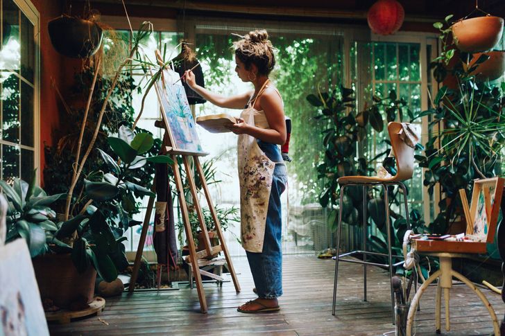
It’s not unusual to hear people saying that we should have plants at our workplace, but it turns out that even a green wall and green paper can have a positive impact on us. Although green may not help in verbal creativity (for example when we’re writing a storybook), it may enhance our visual creativity. This is definitely good news for artists, people in the advertising industry, and students who work with visuals!
12. Ice hockey players who wear black get more penalties.
Teams who wear black jerseys when playing ice hockey get more and longer penalties than teams who don other colors. Some say that this means people tend to feel more powerful and be more aggressive when they wear black. But there are researchers who’ve argued that it could be that referees are more biased against the color black.
13. Color can trick us when it comes to temperature and weight.
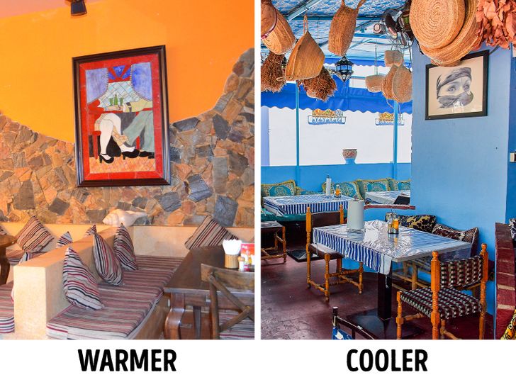
Red is often seen as hot and blue as cold, even if there is no difference whatsoever in the actual temperature. Surprisingly, when direct touch is involved, a blue object is judged to be warmer than a red object. Colors also give an illusion to the weight of an object, where the exact same object with the same weight can look heavier if it is painted red and lighter if it is yellow.
14. We make more errors when we work in a white office.
It seems to make sense that white gives off a fresh, non-distracting feeling, which is why some offices have white interiors. However, a study found that people in white offices made the most errors, compared to those in a red or green office. In fact, those working in the red office made the fewest errors even though more reported that the color of their room was more distracting than those in the white office.
15. We see purple as luxury because it used to be expensive.
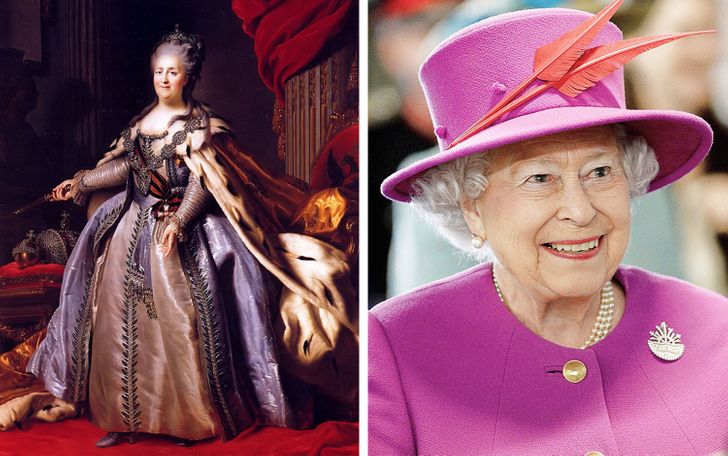
Purple fabric used to be ridiculously expensive because the process of making the dye from tiny shellfish was long and difficult. Only rulers and priests could afford to wear purple then. Luckily, an 18-year-old chemistry student accidentally made a purple dye and later mass-produced it so that even an ordinary person can wear purple.
Bonus: Did you know?
Have you ever made decisions based on colors that made you feel regretful or happy afterward? Tell us about how colors have pushed you to make choices in life.
Comments
Finally.. I confirm that I am not colorblind, good article. TQ
unbelievable
however, this is interesting
For number 10: why are prison suits orange then ? Lol
Related Reads
10 Comics That Show How Much Today Differs From the Recent Past

18 Photos That Prove Australia Is Full of Wonders
15+ Bewildering Pics That Almost Fooled Our Brains
14 Celebrities Who Experimented With Permanent Makeup and Never Looked Back
15+ Situations That Made People Feel Like They Stepped Into a Parallel Universe
19 People Shared Stories About Their Shoes That We Won’t Forget Any Time Soon
15 Moments That Prove Quiet Kindness Is the Strength That Needs No Words
I Refuse to Let My Adoptive Parents Decide My Future in Silence
13 Mothers-in-Law Whose Kindness and Compassion Broke Every Stereotype
13 Parents Who Chose Their Kids Even When It Cost Them Everything
I Kicked Out My Sister and Her Son After His Behavior Crossed a Line
18 Real Vacation Stories People Could Never Forget
