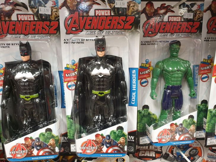
number 4 should have been called old york 😂
16 Designers That Turned Out to Be a Bit Too Creative for This World
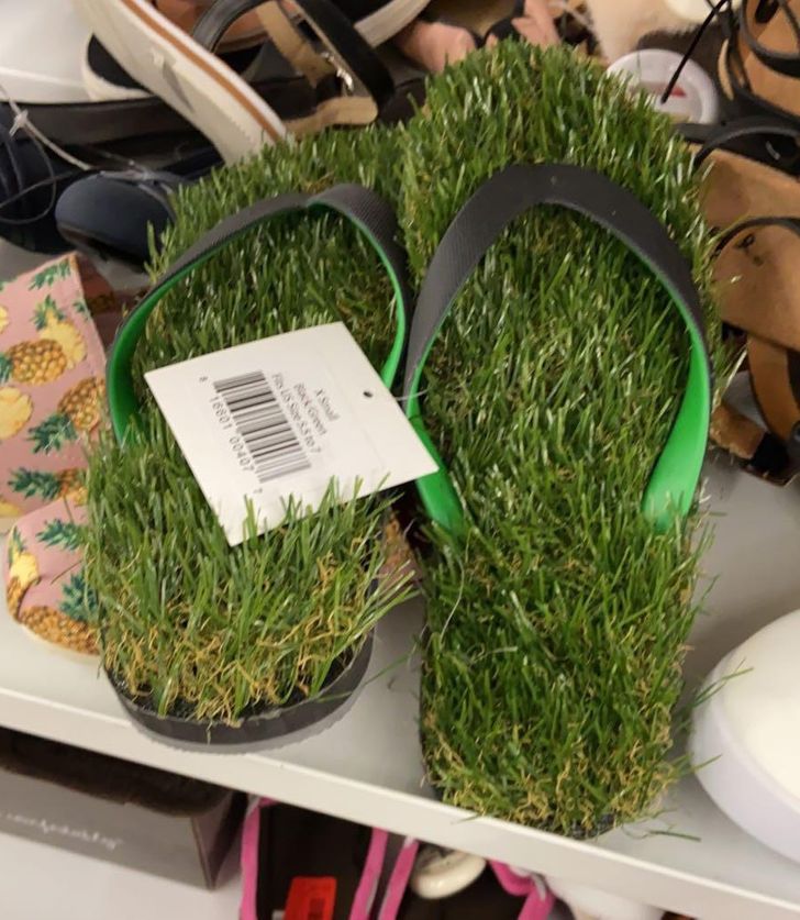
“To err is human,” as the popular saying goes, and it has often been thought of as a way to justify the bad result of a job that someone did. For many, what should have been perfect ended up being a terrible nightmare. Sandals with grass insoles, Batman being marketed as a part of The Avengers world, and advertisements that change the faces of the models are just some of the funniest pictures that people have managed to capture and share online to prove that sometimes designers can be a bit too creative. And believe us, there are some examples here that go far beyond the word “creativity...”
At Bright Side, we made a new compilation with 16 images of designs that made us laugh out loud.
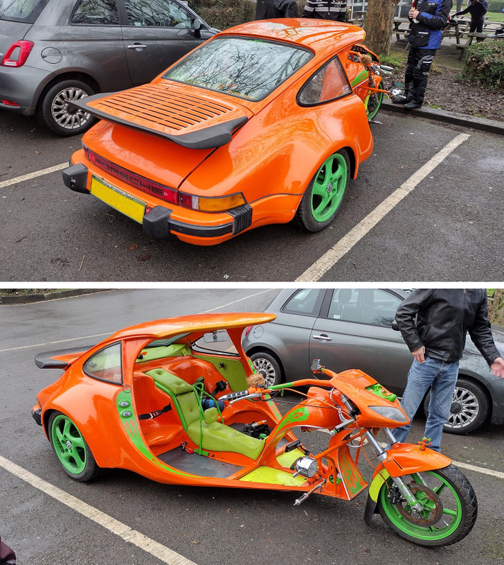
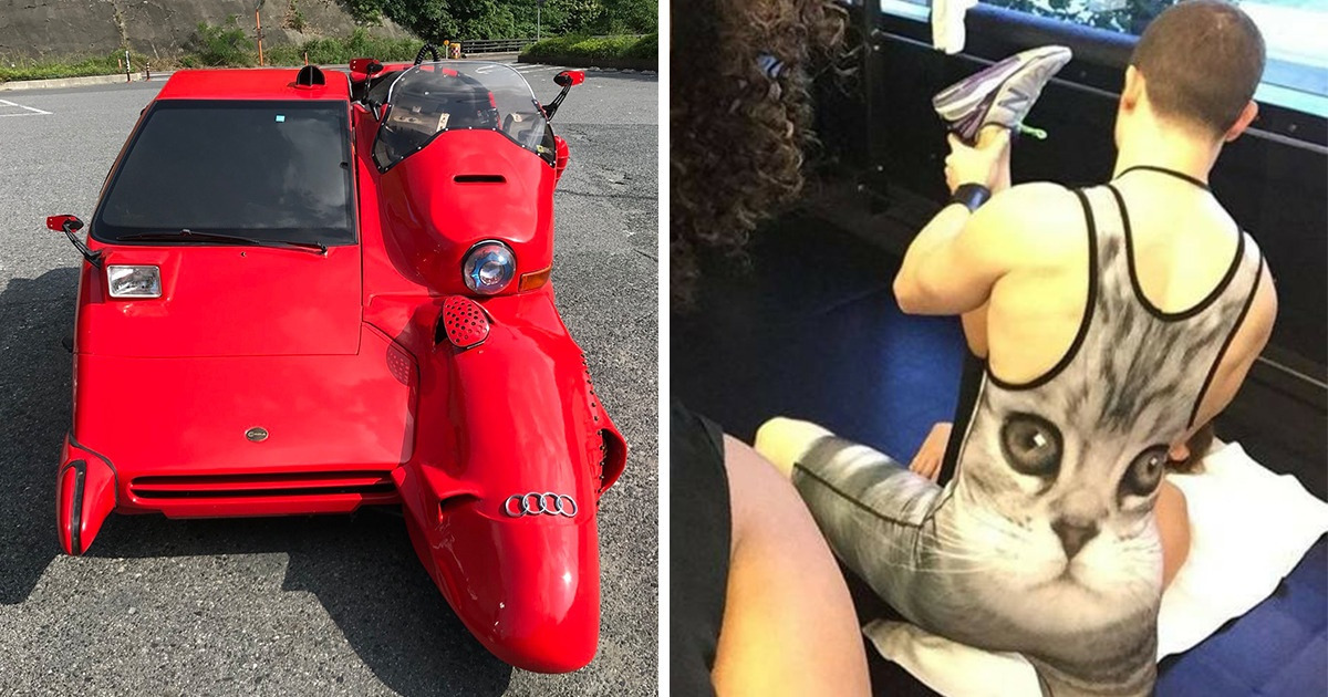
1. ’’I feel sorry for the Porsche.’’
2. ’’What in the world.’’
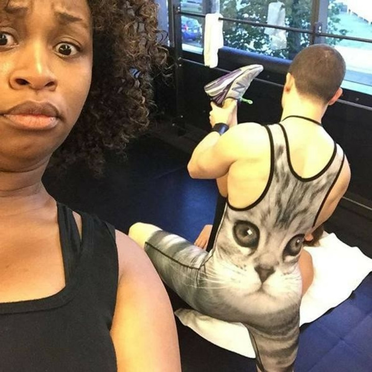
3. ’’As workout attire though.’’
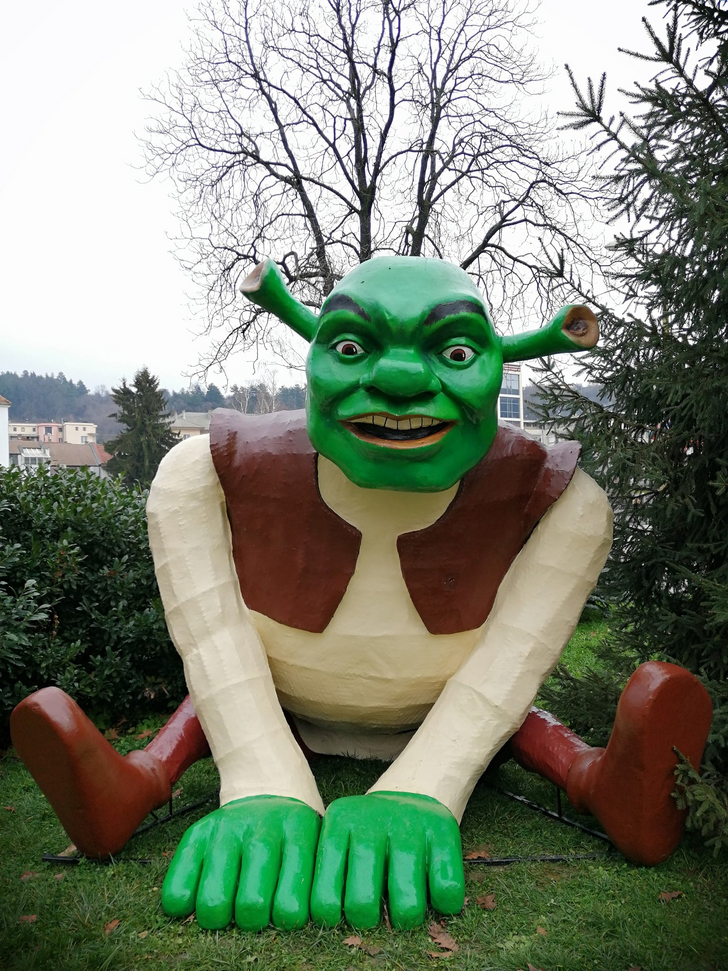
4. “Hundreds of kids are seeing this abomination every December in my city. For size comparison, a regular kid is around the size of his shoe.”
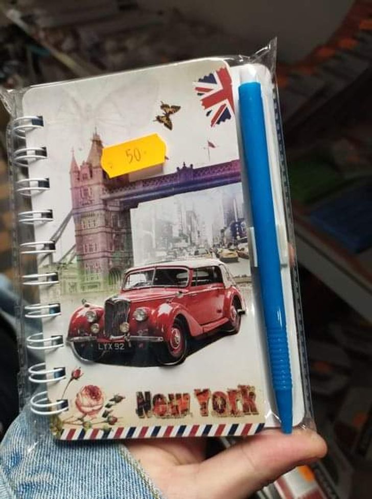
5. New York kind of looks like London...
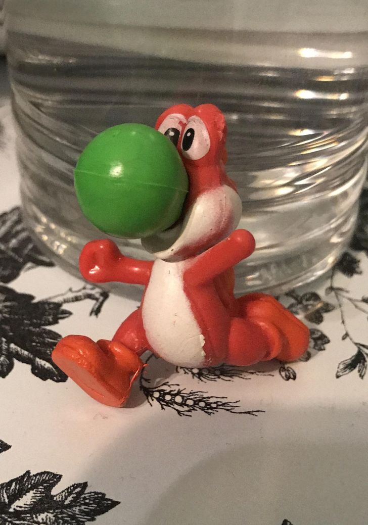
6. Yoshi not only had his colors inverted, but he also had a hand removed.
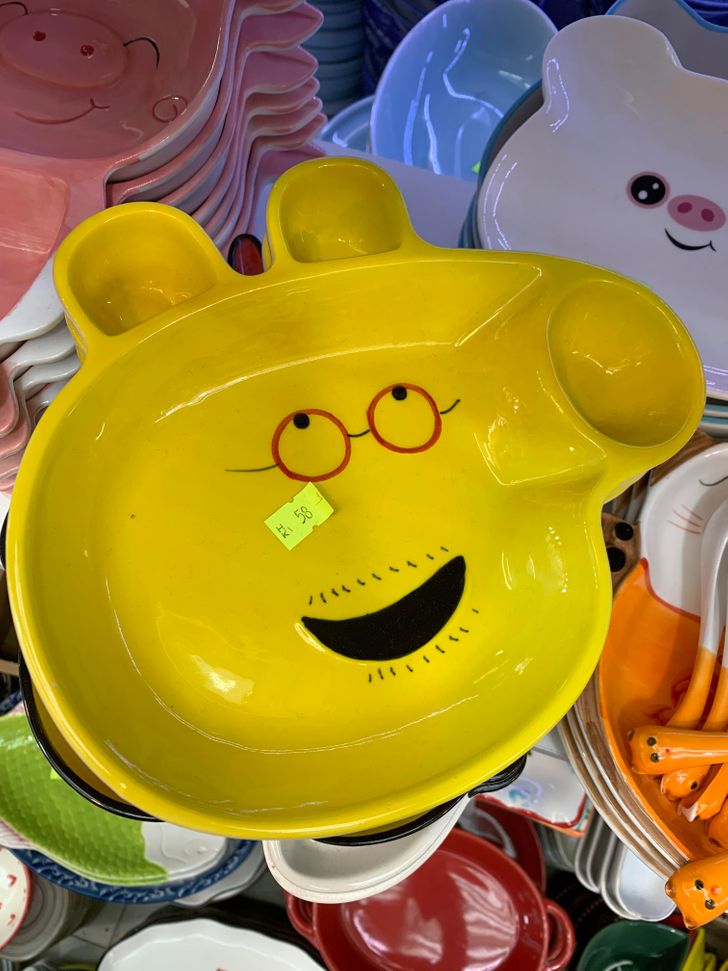
7. Papa Pig as a Simpsons character!
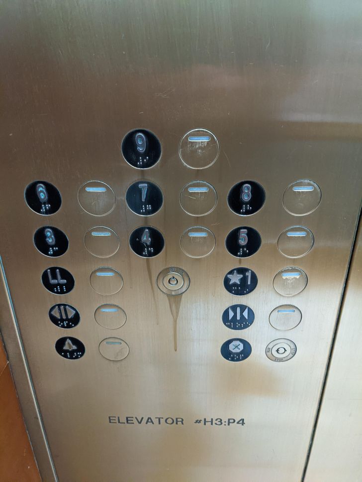
8. “I just want to find my floor...”
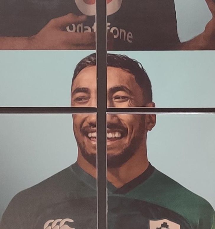
9. “A rusted sink at a restaurant”
10. “Let’s just go with it, they’ll never notice!”
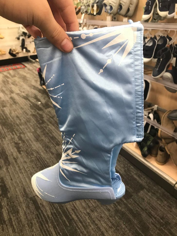
11. “Cowboy boots, Frozen-themed, and a random hole — yep, they’re SHOES!!!!”
12. “I just...don’t understand.”
13. What kind of giraffe is this?
14. “This bathroom with too many stairs”
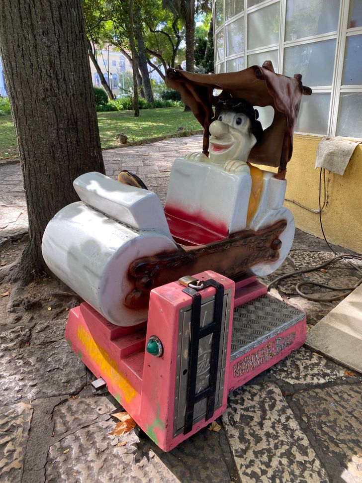
15. “Yabba-dabba-boo!!!”
16. Really?
Have you ever bought a product with memorable design features? Share your images in the comments!
Comments
ok but where is floor 2 on picture 7?
who wants to buy it
Hey c'mon, its not batman, its Captain America trying his suit
And #13 unless there's something anatomically wrong with the giraffe, it should not be on this list... it's for a kid, it's a fantasy color, I think it looks very cute and actually not at all strange.
Related Reads
18 Famous Women Who Have Aged Gracefully

15 Celebrity Facts That Might Surprise Even the Biggest Fans

15+ Pics That Scream the Word “Perfection” in All Languages
14 People Who Bet on Self-Irony and Won Big Time
25 Pictures That Prove Nature Is a Continuous Delight

15 Things That Prove the Secret to Ingenuity Is Simplicity
I Refuse to Let My Husband Turn My Stepson’s Cruelty Into “Sibling Drama”
15 Stories That Prove Meeting the Parents Is Funnier Than a Comedy Movie
12 Heartwarming Moments That Show How Family Kindness Saves Lives

My Neighbor Refused to Help My Autistic Son, She Wasn’t Ready for My Revenge
I Won’t Help My Jealous Sister Anymore After She Isolated Me From Her Family
12 Dates That Prove Not Every Romantic Night Ends in Romance
